What is card design in UI and when should you use it? Learn all about card design here, including a step-by-step guide and real-world examples.
If you’ve ever used a streaming service like Netflix, swiped on a dating app like Bumble or Tinder, or scrolled through a social media feed, you’ve likely encountered card-based design.
In UI design, cards are square or rectangular containers that present a concise unit of content. This is especially useful when you want to display many different types of content on one page without overwhelming the user.
When used in the right context, UI cards don’t just look great. They can also enhance the user experience significantly.
So when is it appropriate to use a card-based layout? And what are the exact benefits of card design? Discover everything you need to know in this guide, updated for 2026 to reflect the latest developments.
What is card design in UI?
When designing a user interface, you want to present information in a way that’s aesthetically pleasing, easy to digest, and straightforward to navigate. Card design is one solution.
Card design involves dividing your content up into a series of cards—with each card representing just one item. The Nielsen Norman Group provides the following definition of a card:
“A card is a UI design pattern that groups related information in a flexible-size container visually resembling a playing card.”
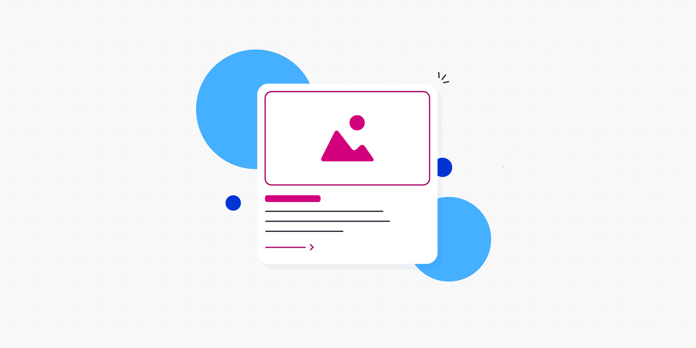
You can think of each card as a content container with a clear border. This conveys each card as a distinct element, signalling to the user that all the information contained within that border is related—and should be perceived as such.
What should a UI card include?
A UI card typically contains:
- An image
- A heading (and, if necessary, a subheading)
- A short description
- A call-to-action
UI cards are clickable, providing the user with a snapshot summary and inviting them to click on their chosen card to expand on a particular piece of content. As such, UI cards are a doorway to further information—usually housed on a separate page or screen.
UI card design examples
Once you know what card design is, you’ll start to notice it in many of your favourite digital products and services. Here are some real-world examples of UI card design that you may already be familiar with.
ITVX online streaming platform
Consider the home screen for ITVX, a British streaming service. Each show is contained within its own card, and if you click on a card, it expands to provide more information about that particular program.
Click the play button (that all-important call-to-action) and you’ll be taken to a new screen to stream your chosen show.
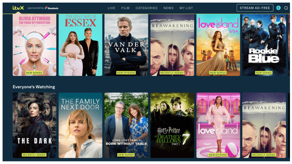
This type of card design is found across most streaming services. Keep an eye out next time you’re using platforms like Netflix, Disney+, and similar.
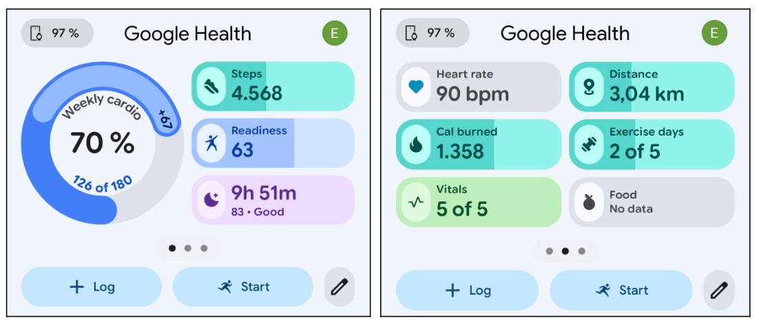
The Google Health app (formerly Fitbit)
The Google Health mobile app is another great example of card design in action. Each card represents a different data point on the dashboard: sleep duration, heart rate, daily step count, and so on. Click on a card and you’ll be taken to another screen with a more detailed breakdown of the data.
And, what’s exciting about this type of card design is that it’s customisable. You can choose which cards you want to see on your dashboard and move them around to suit you. So, rather than everyone seeing the same set of cards in the same order, you can put the information you care about most front and centre.
This is also where cards start to get especially interesting in the age of AI. As apps become more personalised, cards offer a simple way to show different users different information, without completely redesigning the interface each time.
UI card design in Generative AI (e.g. Gemini and Perplexity)
Card design is also popping up more and more in generative AI. Instead of responding with large blocks of text, tools like Gemini and Perplexity are becoming much more visual in how they present information.
Cards are especially useful when an AI tool has lots of information to share.
Imagine asking Gemini “Where should I stay in Lisbon?” A long paragraph describing five different hotels or neighbourhoods would be pretty cumbersome. Five separate cards for each hotel, on the other hand, makes the information much easier to scan and compare.
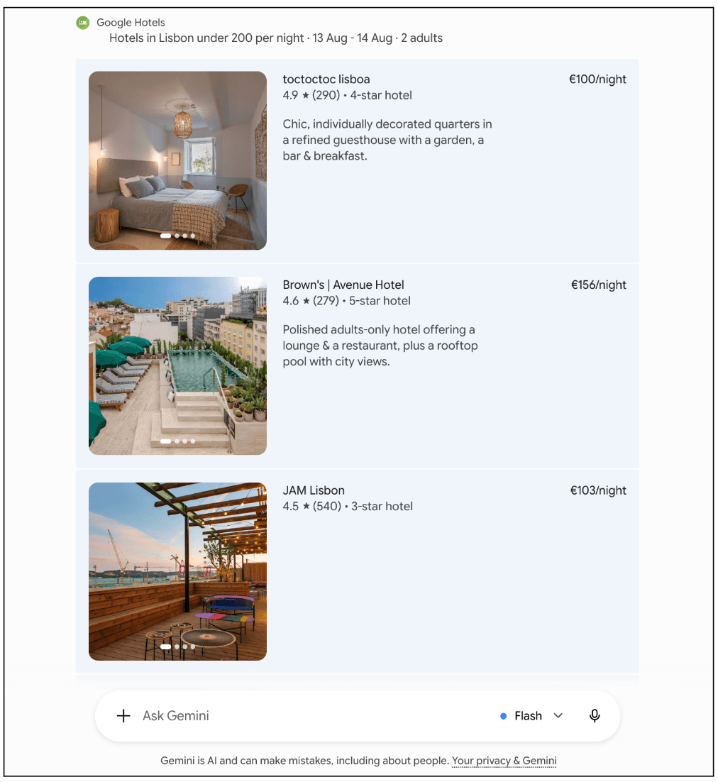
And that’s where cards really come into their own. Instead of burying recommendations in a wall of text, AI tools can break them up into clear, visual chunks. You can quickly see what catches your eye and click through to explore anything you’re interested in.
As generative AI becomes more visual and interactive, we’re likely to see cards play an even bigger role in how these tools organise and present information.
Cards are just one of many interaction patterns you might use when designing for AI. For a deeper dive, check out this practical guide to designing experiences for AI agents.
Card design in AI-powered search
Google Search is another great example of how card design is evolving alongside AI.
Search results have used cards in one form or another for years. Search for a restaurant, product, or local business, for example, and Google can pull key information into its own clearly-defined section, so you don’t have to click through several websites to find what you need.
Now, cards are taking on an even bigger role as Google brings generative AI into the search experience.
In AI Mode, Google can combine a generated response with visual cards for relevant products, places and websites. So, instead of getting a long AI-generated answer and a separate list of traditional search results, you can explore different types of information within the same experience.
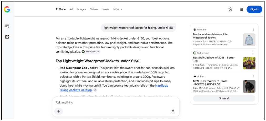
This is another reason cards work so well for AI-powered interfaces. They help break up large amounts of information and give you clear places to click, explore and keep searching.
Want to learn more about designing AI interfaces that users feel confident interacting with? Explore these 7 best practices for designing trustworthy AI experiences.
When to use UI cards
Card design is ideal when you want to present heterogeneous content items—that is, many different types of content—on one page or screen.
Think of a dashboard that displays various data in different formats; say, bar charts, line graphs, pie charts, and percentages. Cards are a great way to separate each content type into its own distinct container, giving the user a clear overview of all key information on the page.
Card design also works best in contexts where the user is browsing rather than searching. When you log onto Netflix, for example, and don’t know what you want to watch, it’s useful to have a series of cards that you can scan through to find something you’re interested in. If you’re searching for something specific, on the other hand, you’d probably want the results presented in list format.
Card design is a popular choice for:
- Social media feeds. Think of sites like X and LinkedIn, where each individual user post is presented within its own distinct container.
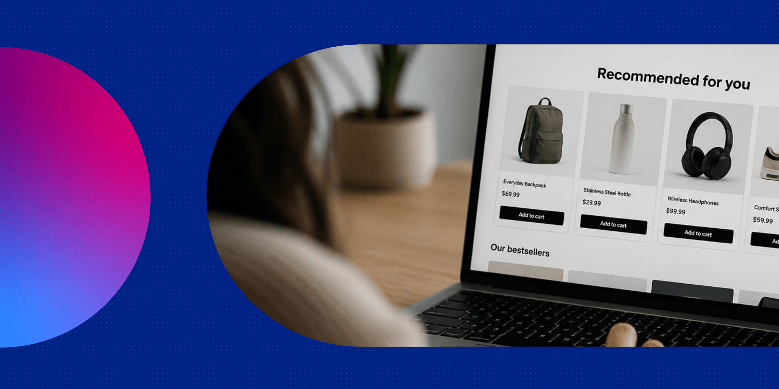
- E-commerce sites. Card design is useful for showcasing individual products—think of sites like Etsy and ASOS.
- Blogs and online magazines, where each card represents a different article.
- Analytics dashboards. Many analytics platforms use card design to present different data points in a variety of formats.
- Project management tools. If you’ve ever used a tool like Asana or Trello, you’ll be familiar with the “Board” view where each project or task is represented by a UI card. You can then drag and drop these cards to categorise them.
- Dating apps. Swipe through apps like Bumble and Tinder and you’ll find individual UI cards to represent different user profiles. Click on a UI card and you can learn more about a potential match.
Now we know what card design is and when to use it, let’s delve deeper into the benefits.
The benefits of card design in UI
There are several benefits of using card design for your UI:
- UI cards are versatile. They can be used for many different content types, and they work well for a variety of digital products—from weather apps to accounting software to dating platforms, and many more.
- Card design is conducive to responsive design. UI cards are easily scalable and can adapt to different devices, screen sizes, and page orientations—ensuring a seamless user experience no matter what.
- UI cards are scannable. People don’t want to be overwhelmed with dense blocks of information; they want bite-size snippets that are easy to scan and digest. With UI cards, you can present many different types of content on one page or screen without sending your users into cognitive overload. That’s crucial for providing a positive user experience!
- Card design helps with consistency. Even if you’re displaying lots of different content types on one screen, UI cards will ensure that your interface is visually coherent. This creates a predictable user experience, enhancing the usability of your interface.
- UI cards are great for creating a clean, clutter-free aesthetic. Card design organises your content into neat containers, bringing structure to the page and creating interfaces that are visually pleasing.
How to design UI cards: a step-by-step guide
Want to incorporate UI cards into your next design project? Here’s a step-by-step guide to get you started.
1. Define the content
Consider the purpose of your UI cards. What kind of content will they present? This will help you determine what elements to include in your cards, and how much real estate to allocate to each.
If you’re designing UI cards to display user profiles on a dating app, for example, you may want most of the card to be taken up with a photo. If you’re designing UI cards for blog articles, on the other hand, you might opt for a smaller thumbnail image and more text.
2. Sketch the layout
With pencil and paper (or a simple wireframing tool), sketch the basic layout for your UI cards. Think about where each element will sit. Will you place the headline at the top with an image beneath, or the other way round? Where will you position the call-to-action? Experiment until you’re happy with the structure.
3. Design your UI cards
You’ve got a basic layout in mind. Now it’s time to design your cards. Open up your chosen design tool—Figma, Sketch, and Adobe XD are all popular choices, or you can find more UX and UI design tools here.
Starting from a blank canvas, design your UI card bit by bit. Use the shape tool to create a square or rectangular container, then add your desired elements such as heading and subheading text, an image, and a call-to-action.
As you build out the card, think about accessibility. Give each card a clear heading, use descriptive text for buttons and links, and don’t rely on an image alone to communicate important information. If the image adds meaning or context, make sure it has appropriate alt text so people using screen readers aren’t excluded.
4. Style your cards
Next, style your cards to make sure that they’re visually appealing, on-brand, and accessible for the end-user.
Define your colours, ensuring plenty of contrast between text and the card background, and choose a typeface and font size that are easy to read.
And remember: colour shouldn’t be the only way you communicate meaning. If a card uses colour to show that something has changed or needs attention, for example, add an icon or text label too. That way, the information doesn’t get lost for users who can’t easily distinguish between certain colours.
Want to learn more about putting accessibility into practice? Check out this guide to accessible design in Figma.
5. Define interactive properties
Last but not least, think about how the user will interact with your UI cards. Will they be able to hover over them? Click to expand them and reveal more information? Swipe them? The interactions you define will depend on the context.
These are also important accessibility considerations. Whatever interactions you choose, make sure they don’t depend on just one input method. Someone navigating with a keyboard should still be able to move between cards and activate buttons or links, for example. And if hovering over a card reveals important information, there should be another way to access it on a touchscreen or with a keyboard.
It should also be obvious which card or element currently has focus. Just as a hover state tells a mouse user where they are, a clear focus state helps someone navigating with a keyboard keep track of their position.
Thinking about these details from the start will help you design cards that work well for as many people as possible. For more guidance on designing accessible digital experiences, check out our complete guide to the Web Content Accessibility Guidelines (WCAG).
Once you’ve got a working prototype, test your designs to make sure that they look great and function correctly on different devices and screen sizes.
UI card design FAQs
We’ve covered almost everything you need to know about UI card design. Here are some additional FAQs before you start your own project.
What are some UI card design best practices?
Good UI cards should be simple, easy to scan and consistent with one another. Give each card a clear purpose, and only include the information the user actually needs at that point. If there’s more to say, let them click through to find it.
Keep the layout consistent across similar cards, with clear headings and plenty of space between elements. And, of course, keep accessibility in mind. Use readable text with sufficient colour contrast, make interactive elements easy to identify and ensure that users can navigate your cards without relying on a mouse.
How can you use UI cards in AI products and experiences?
Cards can be a great way to turn AI-generated content into something more visual and manageable.
Say you’re designing an AI-powered travel planner. Instead of generating a long paragraph with several hotel recommendations, you could give each hotel its own card, complete with the information someone needs to compare their options. The user can then explore whichever recommendation interests them without having to dig through a long response.
The same idea can work for product recommendations, search results and other AI-generated content. Just remember that cards should make the output easier to use. There’s no need to turn every part of an AI response into a card simply because you can.
When should you avoid using UI cards?
Cards aren’t always the best way to present information. If users need to scan lots of detailed information quickly or compare items across the same criteria, for example, a table or list may work better.
You should also be wary of using too many cards at once. What starts out as a neat, organised layout can quickly become overwhelming if the screen is packed with competing cards.
Ultimately, the format should fit the task. Use cards when they genuinely make the content easier to browse and understand—not just because they look good.
What are the best tools for UI card design?
You can design UI cards with pretty much any UI design tool. Figma is one of the most popular options, and gives you everything you need to create, reuse and experiment with different card components.
Other options include Sketch and Penpot, an open-source design tool that runs in the browser. And, if you want some inspiration before starting from scratch, you’ll find plenty of UI kits and card templates online that you can adapt to your own designs.
Ultimately, the best tool is the one that fits your workflow. The same card design principles apply whichever platform you use.
|
The takeaway
With well-designed UI cards, you can present diverse types of content in a clear, organised, and digestible format. This achieves a clean, clutter-free aesthetic—and, most importantly, it provides a positive user experience, ensuring that your interface is intuitive, responsive, and easy to navigate.
Want more UI design tips and inspiration? Check out these guides:
- Designing for mobile: 5 best practices for UI designers
- A complete guide to responsive grids (and how to use them)
- 8 UI design dos and don’ts (with examples)

Emily is a professional writer and content strategist with an MSc in Psychology. She has 8+ years of experience in the tech industry, with a focus on UX and design thinking. A regular contributor to top design publications, she also authored a chapter in The UX Careers Handbook. Emily also holds a BA in French and German and is passionate about languages and continuous learning.