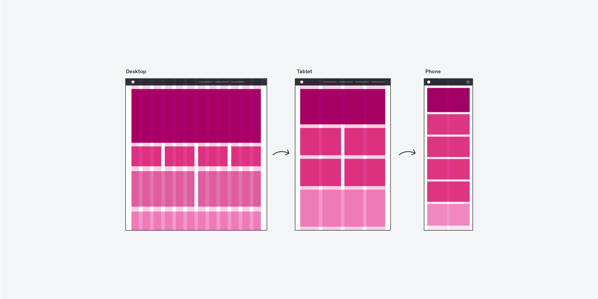
Responsive grids are a powerful tool for creating sleek web designs that adapt to different screen sizes without getting distorted. By incorporating responsive grids into your designs, you’ll ensure your website is easy to navigate across all devices and browsers.
Whether you’re tackling a website redesign or building a completely new design from scratch, it’s important to understand how grid systems can elevate your user experience. To help you along your way, we’ve created this comprehensive guide covering everything you need to know about responsive grids; from why they matter, to best practices for incorporating them in your next project.
- What are responsive grids?
- What are the elements of a responsive grid?
- How to create responsive grids
- Best practices for responsive grids
- Round up
What are responsive grids?
A responsive grid in web design is a guiding structure that helps designers organise elements on the page for a unified, consistent look and feel. Responsive grids are built using proportions, which helps elements line up properly when users view the site on different screens.
So, why are responsive grids such an important part of the web design process?
By using responsive grids, web designers can ensure that the overall page layout looks consistent on any device. Responsive grids also mean content can be sectioned into modules—making it much easier to create dynamic websites without having to worry about compatibility issues across different browsers or devices.
Responsive grids can also help speed up page loading times by eliminating unnecessary code from multiple versions of the same layout for different devices.
There are three main types of responsive grid systems:
- A fixed grid consists of columns that have a consistent width regardless of the size of the screen they’re viewed on.
- A fluid grid uses percentage-based widths instead of fixed widths, which means that the columns will resize automatically depending on the size of the screen they’re viewed on.
- A hybrid grid combines both fixed and fluid elements in order to create an optimal user experience across all devices and screens.
Using a fixed grid can help ensure consistency between devices, while a fluid grid allows for more flexibility as websites adapt to changing viewport sizes. Ultimately, the type of grid you use depends on your design objectives, so it’s important to weigh up the pros and cons of each grid when selecting the right one for your project.
What are the elements of a responsive grid?
When it comes to the anatomy of a responsive grid, there are five key terms every web designer should know.
Let’s look at the elements of a responsive grid at a glance.
Columns
Columns are perhaps the most essential element of any responsive grid system. Columns allow you to divide your page into sections, making it easier for users to quickly scan content and locate specific pieces of information. The number of columns used in a layout will depend on the size and complexity of the project, but typically range from two to twelve.
Gutters
Gutters are the space between columns or rows in your design. They’re a crucial part of responsive grids, providing visual separation between different elements while giving your page a cohesive look and feel. Gutters also provide balance to your design by creating a uniform flow and establishing relationships between elements.
Margins
Margins help establish visual hierarchy and ensure that elements don’t overlap unnecessarily. By adding white space between elements, margins make it easier for users to differentiate between different sections on the page without being overwhelmed by too much information at once.
Breakpoints
Breakpoints allow designers to optimise their design for different screen sizes. In essence, breakpoints refer to the specific points where a website layout changes. They trigger when certain criteria (e.g. specific screen size dimensions) are met, and help to ensure that content is displayed correctly no matter how the user is accessing it.
Fields
Fields refer to the ‘boxes’ that appear within the grid. How many there are—and where they’re placed—will dictate the types of content that can be used on a page, which makes them an extremely useful tool for more complicated web pages or layouts. Ultimately, fields can help designers create highly complex designs for every platform without having to spend hours readjusting the content.
How to create responsive grids
So now we know the anatomy of a grid—how do you actually go about creating one?
Worry not, we’ve created a practical step-by-step guide to follow when using responsive grids in your next design project.
Step 1: Decide on a screen size
The first step in creating a responsive grid system is to determine your target screen size. What size should the design be optimised for? What are the minimum and maximum sizes you need to support? This step will help you decide what kind of grid layout you should use, as well as which elements should appear at different breakpoints.
The most common responsive grid sizes are 960px and 1440px. The 960px grid works well for desktop layouts, while the 1440px grid is more suitable for mobile design.
Step 2: Choose your layout and measurements
Next, you need to decide on your layout and measurements. Do you want a one-column or two-column layout? How wide should each column be? Will there be additional columns at larger breakpoints? Are there specific measurements that need to be taken into account when designing the page?
Pro tip: The number of columns in your design will depend on its purpose and structure, but typically having more than 12 columns can make things look cluttered and hard to read. If possible, try to limit the number of columns to 8-10, as this allows more flexibility when designing without making things too crowded or difficult to use across different devices. Additionally, using column counts divisible by four (e.g., 4, 8, 12) makes it easier to distribute elements evenly throughout each page or section of your website.
Step 3: Set the width of your gutters and margins
The next step in creating a responsive grid is to configure the widths of gutters and margins. By default, most websites come with predefined values for these elements, but they might not be suitable for your needs.
Both the gutters and margins should be set to provide enough breathing room between elements so that everything looks consistent no matter what size device it is being viewed on. When it comes to gutter sizes, you’ll need to experiment to figure out what works best for your design. Generally speaking, the narrower the gutters, the more it feels that all of your field elements are part of one single group with a seamless flow between them. On the other hand, wider gutters feel like each field belongs to separate entities or categories (think about creating space between two separate paragraphs).
Step 4: Start building your grid
Once you’ve determined your screen size and chosen your layout, it’s time to start building your grid system. This involves creating classes for each element on the page (e.g., header, footer, sidebar), assigning widths and heights, and setting margins and padding where necessary. It’s also important to remember to consider mobile devices when designing your desktop grid—even if someone is viewing the page on their laptop or desktop computer, they may still want access to certain elements from their mobile device (e.g., navigation menu).
During this stage, you’ll also define your breakpoints—in other words, how your design will respond when it reaches certain thresholds. When you set two breakpoints, the screen size between them will inherit the dimensions of the smaller-sized breakpoint. You’ll want to take your time to figure out where to place your breakpoints, and which elements will be hidden or re-adjusted when viewed on different screen sizes.
Step 5: Test
How do you know if your grid has helped you create a functioning, responsive site? Test! Once you’ve designed your site using a responsive grid, you can test your designs by viewing the site on various screen sizes—and iterating on anything that doesn’t look quite right.
5 best practices for responsive grids
When used correctly, responsive grids can make your website look sleek and professional. But how do you know you’re on the right track?
Here are five best practices to keep in mind when working with responsive grids.
Place elements inside column sets
When designing with a responsive grid, it’s best to place elements inside of column sets so that they stay organised and consistent throughout the webpage. Not only will this ensure all elements have the same size and positioning across different devices, but it’ll also make it easier to add or remove elements from your page without having to redesign the layout from scratch.
Don’t use columns as paddings
Another golden rule when working with a responsive grid is not to use columns as padding for white space within the design. Instead of using empty columns as separators between elements, use margins or paddings instead. This helps keep the layout clean and prevents items from being misaligned on different devices as a result of inconsistencies between browsers.
It’s okay to place elements outside the grid
There might be times when you need to place an element or two outside of the main grid structure—and that’s okay! As long as they don’t disrupt the overall flow of the page, placing one or two elements outside of the grid can make them stand out (and add some personality and hierarchy to the interface). Just make sure that the elements are still correctly sized, so they don’t cause any alignment issues on mobile devices.
Field elements should sit on a number of columns
When laying out content on your page, it’s important to ensure that field elements sit on multiple columns within the grid system. This will help keep them aligned correctly regardless of device size and prevent them from overlapping each other if one element is larger than another (in terms of width). For example, if you have two text inputs side by side on a desktop but only one column wide on mobile, then you should make sure that both input fields sit on at least one column in order for them to remain aligned when viewed on both devices.
Don’t leave field elements in the gutters
Leaving field elements in gutters can result in confusion when users view your page on different device sizes—especially if those gutters become too small or large depending on screen size. Ensuring field elements are always within columns will keep everything properly aligned across all devices.
Round up
In today’s digital-first world, you can’t always bank on users navigating the site in the way you intended. You might have spent weeks designing a beautiful desktop site, only for the majority of its visitors to access the site on mobile. To avoid losing out to the competition, it’s crucial that your websites are functional and user-friendly across all devices and browsers. Luckily, by mastering responsive grids, it’s never been easier to achieve that goal.
Hopefully, this guide provided you with an overview of what responsive grids are, and the steps to take to start implementing them in your design processes. Before you know it, you’ll be designing sleek, fully-optimised sites that your users can enjoy wherever they are!
To learn more about dynamic web design, check out these resources:
- 7 Examples of good digital UX design
- 8 helpful tips for UX designers collaborating with developers
- Good UX vs. Bad UX


