The goal of good UX design is to create intuitive and easy to navigate experiences that users will enjoy interacting with. However, that’s often easier said than done and bad UX design can often seep into end products.
Between business imperatives, long lists of features and time and money constraints, it can be hard for even some of the world’s biggest companies to create the perfect user experience. Still, there are plenty of examples of innovative and thoughtful UX design that ensure users’ interactions with a product are seamless and smooth.
The good news is that we can learn from both good UX and bad UX. While good UX gives us something to aspire to, bad UX shows us what we should avoid. Here, we’ll provide examples of each as well as two examples of redesigns that took a product’s UX from bad to good.
These are the examples we’ll explore:
- Bad UX: Netflix’s autoplay previews feature
- Good UX: Google Search landing page
- Bad UX: Disney Park’s COVID messaging
- Good UX: Apple compare feature
- From Bad to Good: Rev.com redesign
- From Bad to Good: Prime Video redesign
Bad UX: Netflix’s autoplay previews feature
Netflix is one of the most popular streaming services around and part of the reason for that is the relative success of its UX. Of course, that doesn’t mean it got everything right.
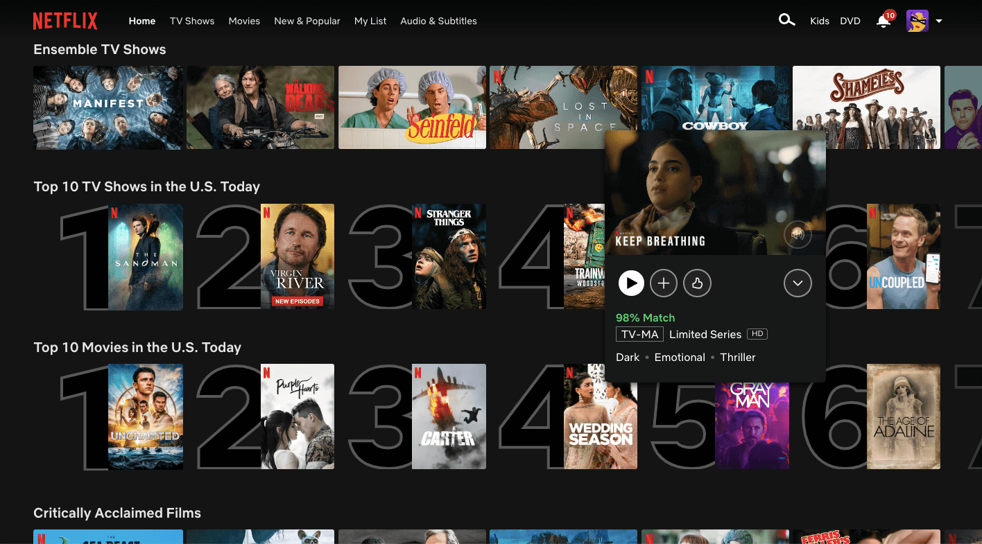
One example is Netflix’s autoplay previews feature. When users navigate to Netflix’s homepage, the preview for a movie or TV show featured at the top of the screen starts playing automatically. When users hover over thumbnails for other movies and TV shows that appear further down the page, trailers for those titles autoplay as well. This makes it impossible to access information about a given title without triggering a loud video preview.
The business goal of the feature is to get users to engage with Netflix’s content by grabbing their attention. However the feature is also disruptive and annoying, forcing users to watch parts of trailers for titles they have no interest in just because they accidentally hovered over them for too long. While Netflix might argue the feature helps users discover content they wouldn’t otherwise, because it’s pushed on users, it doesn’t lend itself to a positive user experience.
Many Netflix users detest the autoplay previews feature, so Netflix finally created a setting that enables users to turn it off. Unfortunately, many users don’t know that, and even if they do, they have to figure out where in their account settings they can disable it. Click this link to learn how to disable the Netflix autoplay feature on all devices.
Good UX: Google Search landing page
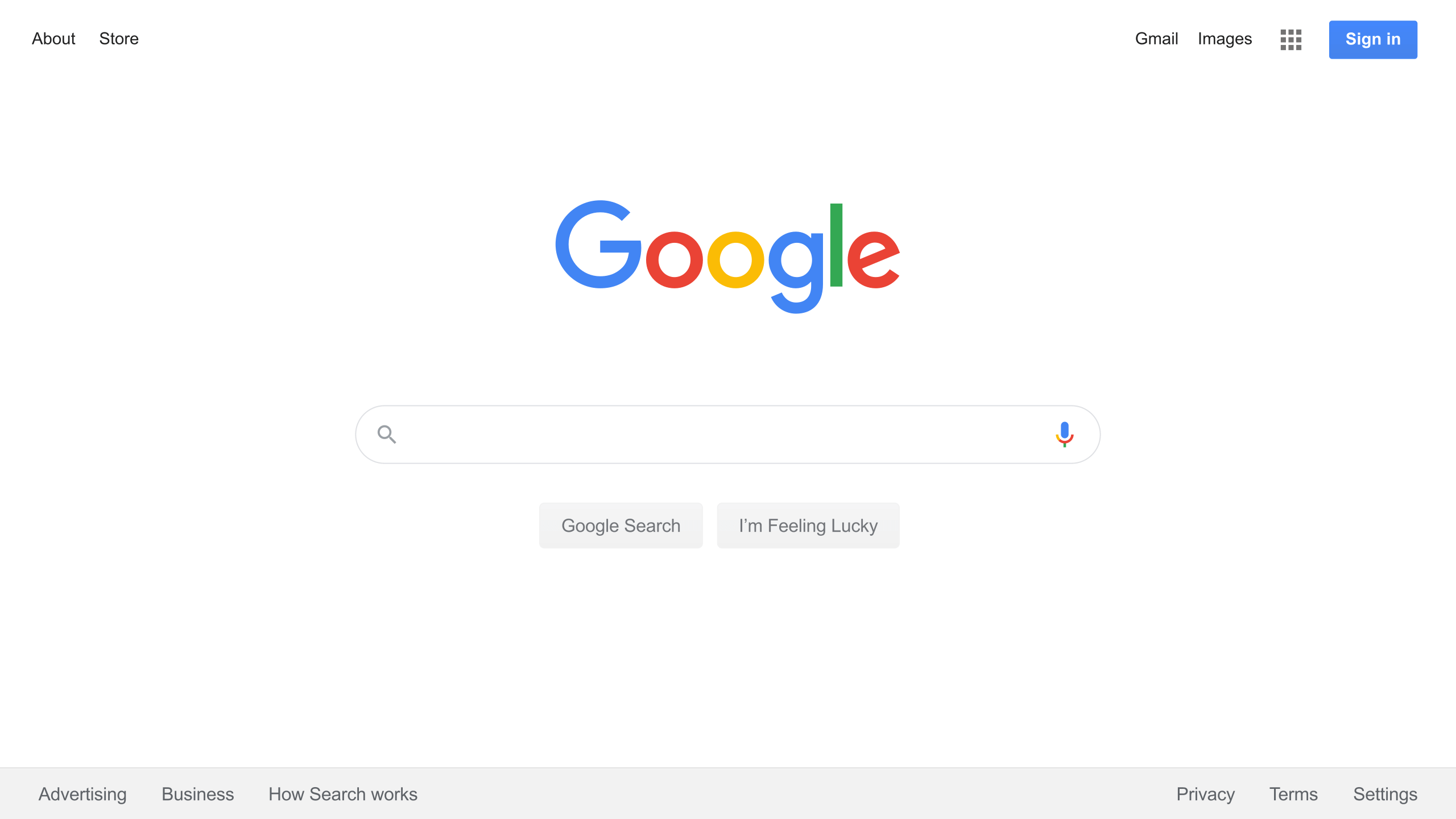
A classic example of good UX is the landing page for Google’s search engine. No matter what you think of Google as a company, its Search landing page is a triumph of minimalist UX.
Its main focus is a large text entry box in the middle of the page surrounded by white space. While Search was Google’s original product, the interface has barely changed in 25 years, outside of additional product and information links at the top and bottom of the page. This is because Google got it right the first time. The landing page does exactly what users need it to: perform a web search.
Other search engines include additional information like news and personalised widgets on their landing pages. However, this just pulls users’ attention away from the reason they navigated to a search engine to begin with. Google doesn’t make that mistake. Google Search’s landing page lets users focus on searching without distractions. It’s a fantastic example of a user experience where less is really more.
Bad UX: Disney Park’s COVID messaging
Disney is an entertainment powerhouse and its theme parks are among the world’s most popular attractions. However, the COVID-19 pandemic forced Disney to rethink when and how to welcome guests to its parks while weathering lockdowns, masking requirements and social distancing. While that certainly impacted the experience at the parks, it also impacted the various parks’ official websites as well.
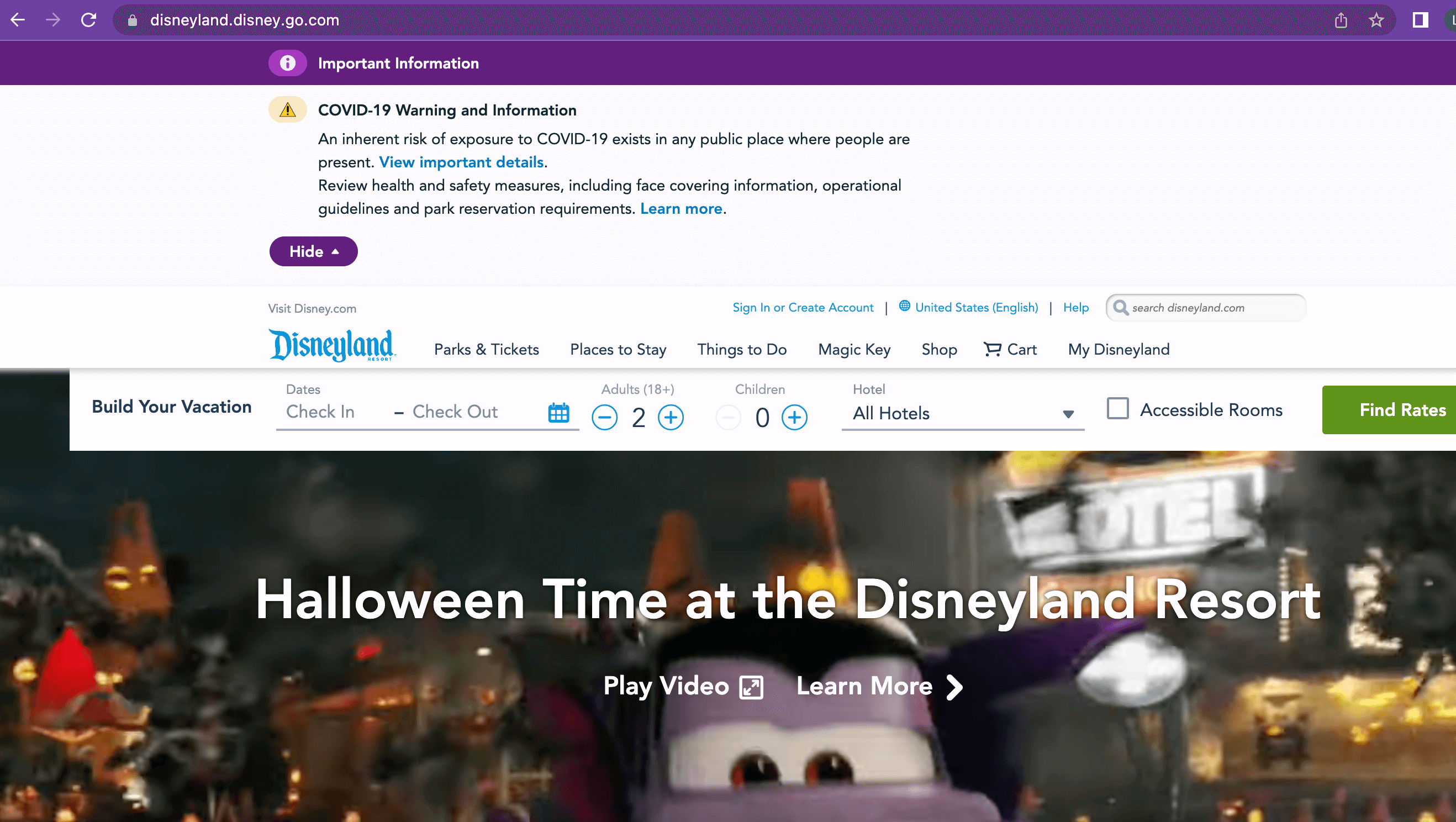
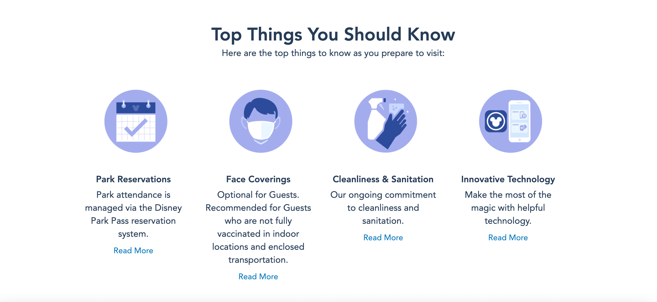
Although not every park has handled its website’s COVID messaging the same way, Disneyland in California, Disney World in Florida, Hong Kong Disneyland and Shanghai Disney Resort all employed a similar strategy. They all added an open tab at the top of the page with text information that updates users on the latest health, safety and reservation information for the park.
This tab creates a sobering reminder of the pandemic, while drawing attention away from the enticing images of people enjoying the parks that would typically dominate the parks’ homepages. As a result, the tab changes the entire mood of the user experience and ruins the flow of the interaction, more or less interrupting the fun and anticipation of planning a holiday at a Disney Park.
It’s quite possible this was its intention. After all, when the pandemic first began, Disney needed to quickly and efficiently communicate the status of its different theme parks to potential guests. However, almost three years later, this information has yet to be integrated into the sites. Also by presenting it as an uninteresting block of text ensures that most users won’t bother to read it.
If that weren’t enough, when users navigate to the links that appear in these tabs for additional details, they’re greeted by a long page full of even more text and very few images. Once again, making it unlikely users will read the information. Users tend to skim text online, so if a large amount of text information is essential, remember that less is more. To achieve a cleaner look, do it through the use of visual hierarchy, chunking it up in visually appealing clusters or using numbers and bullet points.
While Disney has done some of this, it hasn’t successfully prioritised the information that park visitors need the most. For example, highlighting the parks’ new reservation system or emphasising that some attractions may be more limited in capacity. As a result, accessing Disney Park’s websites has become a slog instead of a magical experience.
Good UX: Apple compare feature
Apple is known for creating devices that are not only beautiful to look at but easy to use and that extends to the company’s website. And one of the website’s most useful elements is the compare feature.
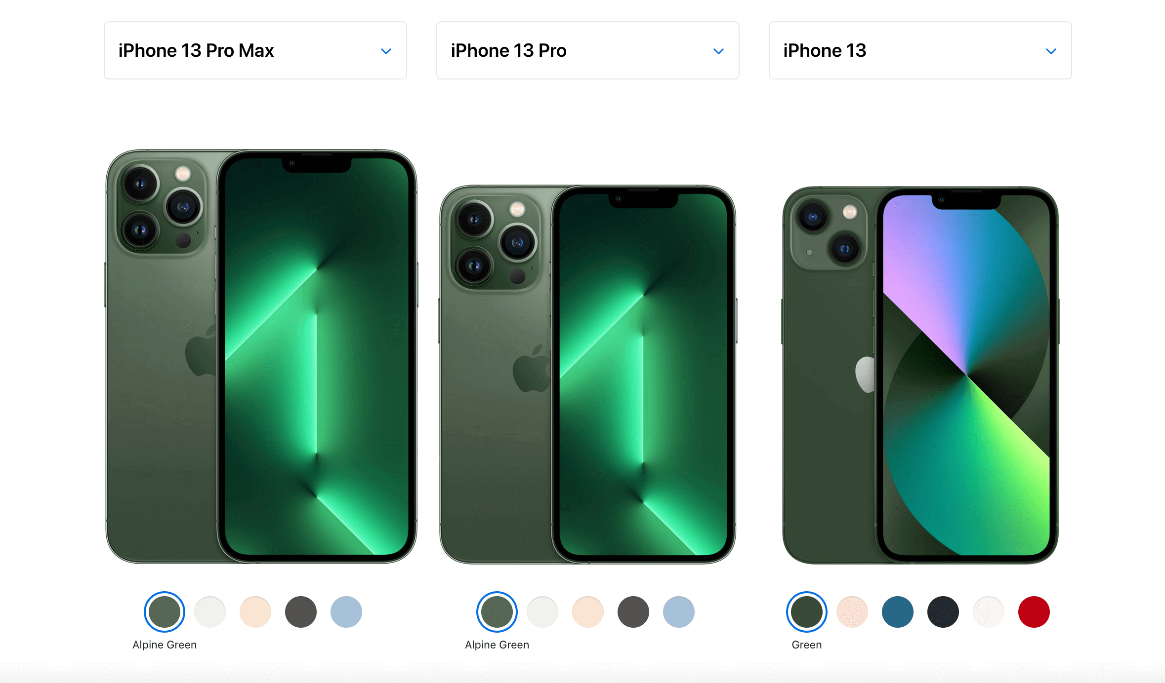
Whether a users is on a computer or a mobile device, the experience is the same. After a user navigates to a product grouping, such as iPhones or iPads, the secondary navigation at the top of the page includes a “Compare” option that. When selected, “Compare” brings users to a page that presents a side-by-side comparison of the two (on a mobile device) or three (on a computer) most recent product models.
This method anticipates that most users will compare the company’s latest offerings. This a reasonable assumption and its UX accommodate as many users as it can as seamlessly as possible. However, it’s also extremely easy to compare other models by selecting one of the dropdowns at the top of each of the product columns and choosing a different option.
The information is organised in an easy-to-scan hierarchy. The base price and “Buy” button are at the top of each column, followed by a “Quick Look” at the most essential product specs and more technical information further down the page. As users scroll, the name of each product stays anchored to the top of each column, ensuring users won’t forget which specs belong to which product.
The product comparison page is an excellent example of a user experience that genuinely helps users. For expensive, technical products, comparison shopping can be especially valuable and Apple enables users to do so quickly and efficiently. Not only does this create a user experience that’s enjoyable to use but it also helps reassure customers that when they select the “Buy” button, they’ve made the right choice for them.
From Bad to Good: Rev.com redesign
Rev is a transcription and captions service that recently redesigned its website for the second time in just a few years. Each new redesign has been a step forward for its UX design, especially when the homepage clearly conveys what Rev does and why users should trust Rev to do it.
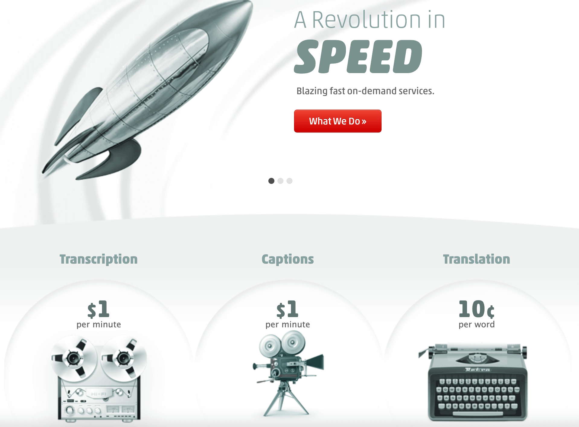
Just a few years ago, the home page featured a large carousel at the top that included three cards of images and text that informed users of the company’s values. What it didn’t do, however, was inform users of what services those values pertained to. The user either had to scroll further down the page to find out or click a link in one of the cards that led to more information. This UX design likely resulted in confusion or frustration for many users.
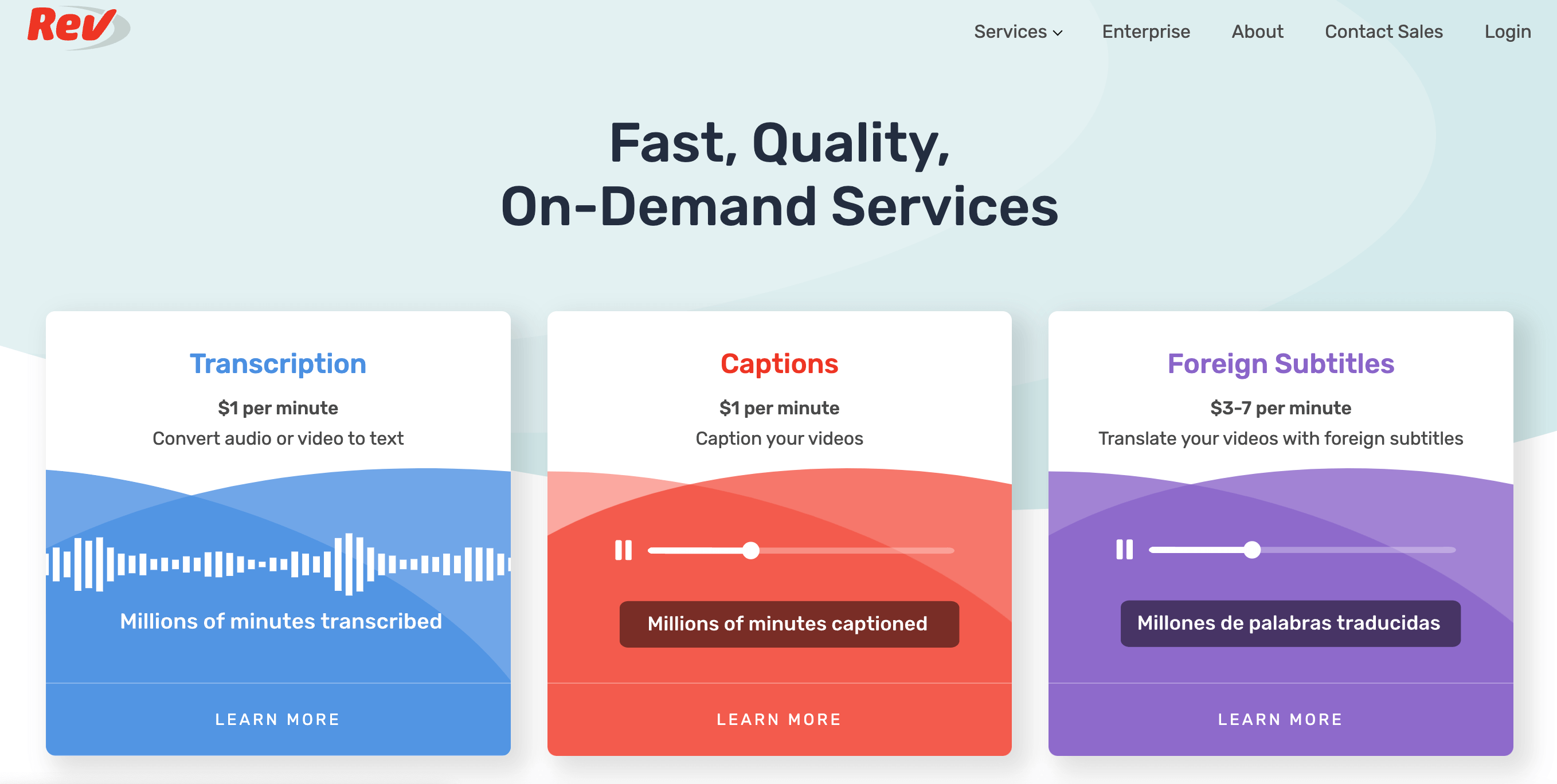
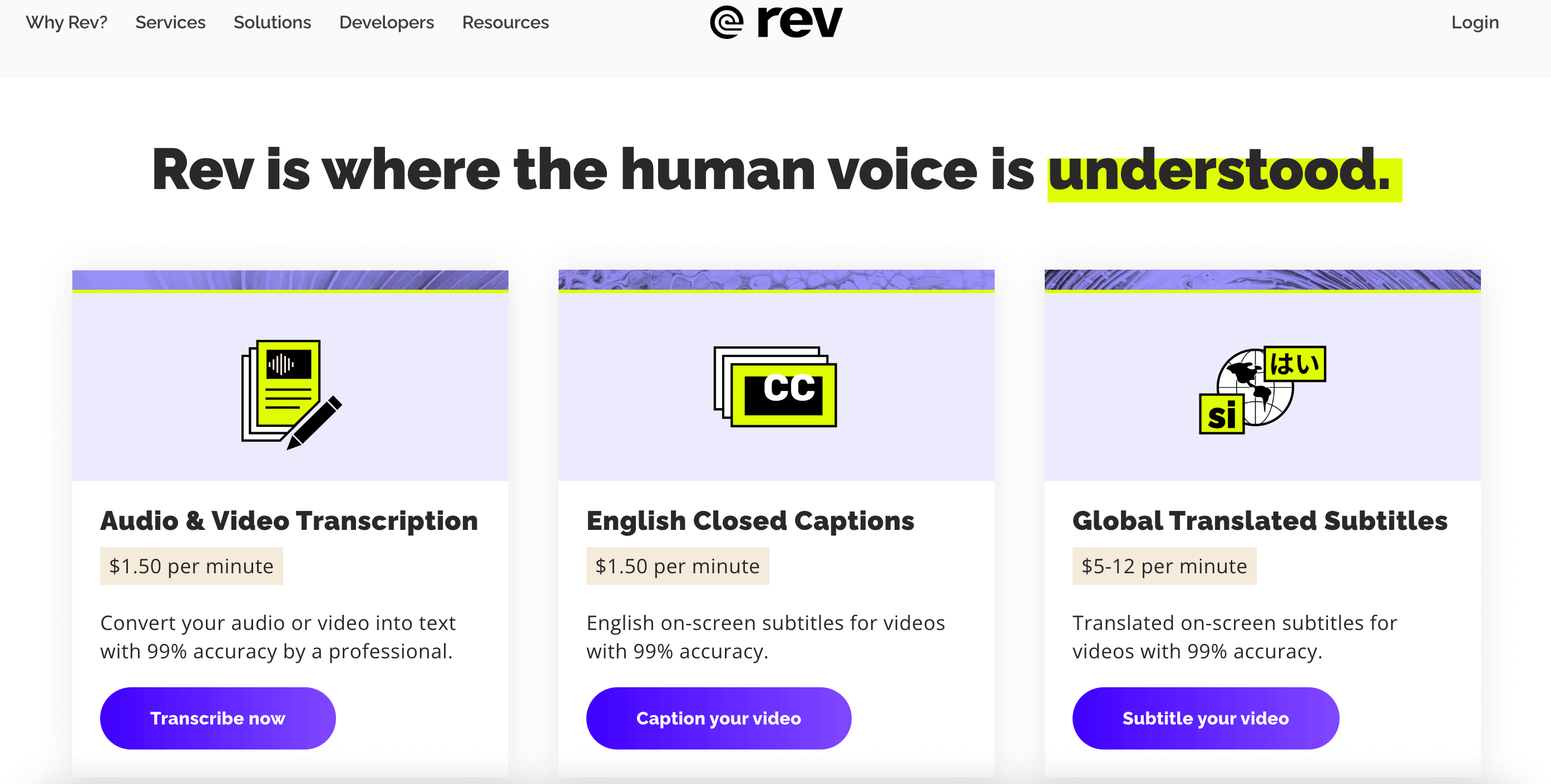
Luckily, the first redesign of Rev.com eliminated the carousel for a simple set of three side-by-side boxes at the top of the page. Each box identifies the company’s services, price range and a link to learn more. This was a much cleaner UX design; plus, the information it communicated was more valuable to users, making it more likely that they’d decide to find out more about Rev’s services.
The most recent redesign, which was implemented in the summer of 2022, builds on the first. It maintains the side-by-side boxes for each of the company’s services, while featuring a less colourful and more modern aesthetic. The design includes a brief but impactful tagline at the top of the page that integrates well with the information in each box.
Meanwhile, each box now includes a brief line about the accuracy of the transcription or captioning service, followed by an “Order Now” button. These are subtle changes, but they make the UX design of Rev.com even more seamless, while communicating the value of the service to users more effectively.
From Bad to Good: Prime Video redesign
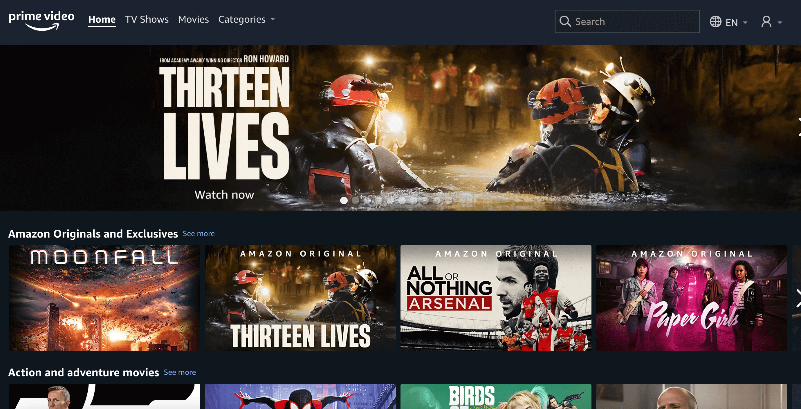
Amazon’s Prime Video service has weathered criticism for a long time. It was a challenge to find movies and TV shows on the streamer, much less understand what was free to Prime members and what cost an additional fee. Now, the company is finally rolling out a completely new user interface that makes navigating through Prime Video’s offerings far more intuitive.
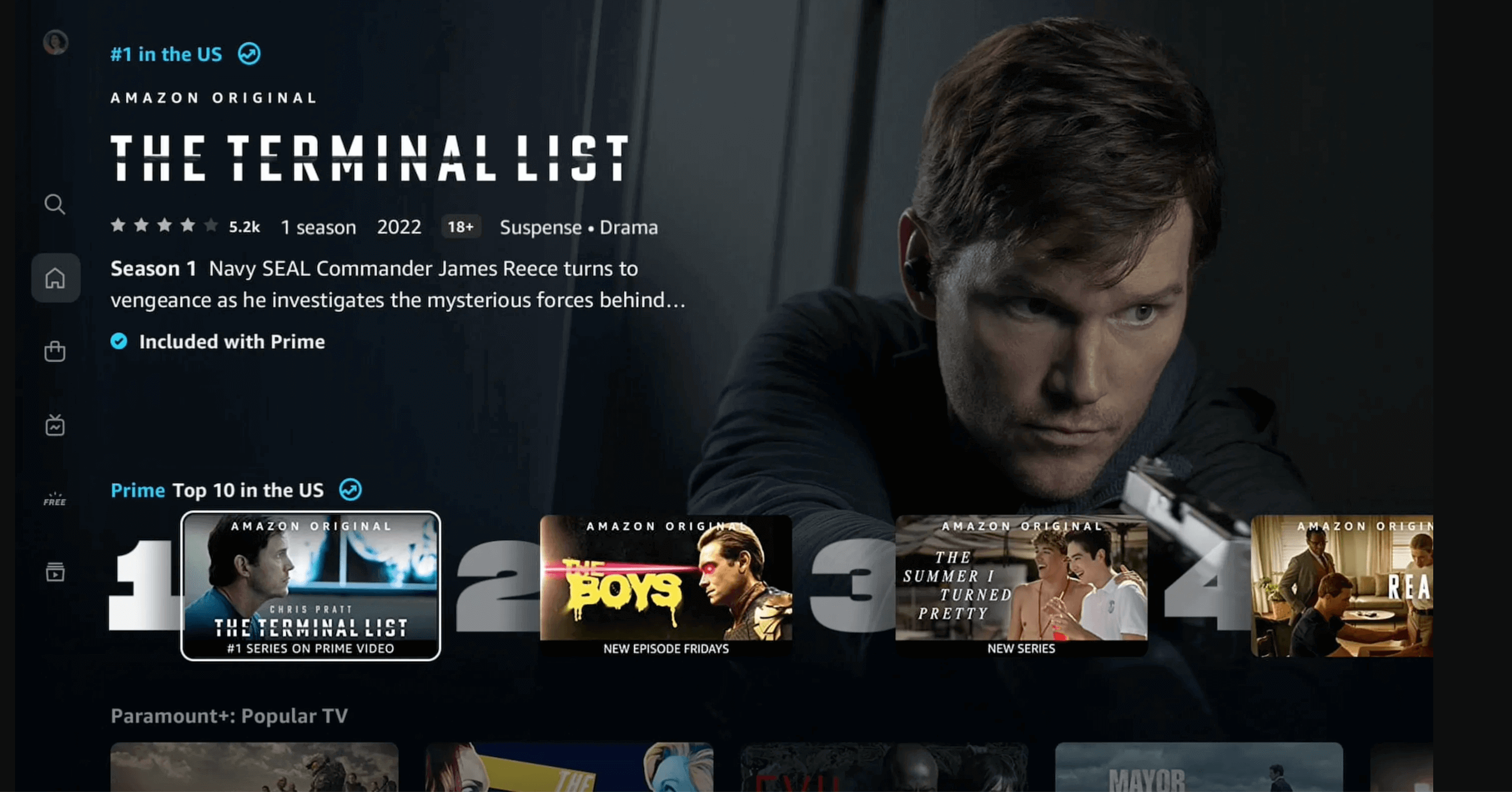
The redesign includes a set of small vertical icons to navigate to major sections of the service on the left side. It also includes a large carousel at the top of the page highlighting the service’s newest offerings and a series of smaller carousels of thumbnails identifying movies and shows that users might be interested in.
These thumbnails comes with titles specific to Prime towards the top and titles that users must pay to watch available further down. Much of Prime’s redesigned interface is reminiscent of other popular streaming services like Netflix.
Consequently, for many users, the most exciting change is also one of the simplest. Each piece of content is now colour coded to let you know if users must stream, pay, rent or buy it. A blue circle indicates that it’s included with a Prime subscription and a yellow shopping bag indicates that users must pay to rent or buy it.
This colour scheme is even carried into the labelling system, with the label for any carousel of Prime-exclusive content including the word Prime written in blue and the label for any carousel of paid content written in yellow.
The use of these simple icons ensures that Prime users will no longer have to navigate all the way to an individual title to find out if it’s included with Prime or not. This will help users make more informed choices as they browse the service’s vast library of movies and TV shows. It’s an elegant solution for overcoming a UX issue that’s negatively impacted users for years.
Learn more about UX
Now you know the difference between good UX and bad UX, there’s so much more to discover about the broad and varied field of UX, so don’t stop here. Discover more UX terms in our complete UX glossary, explore the fun side of UX in this post or learn about the skills needed to become a UX designer.


