UI design is a creative discipline, but it’s not just about aesthetics. Any interface you design should be visually pleasing—but, most importantly, it should be accessible and user-friendly.
So how do you strike the balance between beauty and usability?
There are certain rules you can follow to create gorgeous, user-centric interfaces. We call them UI Design Dos and Don’ts, and we’ve outlined them for you here:
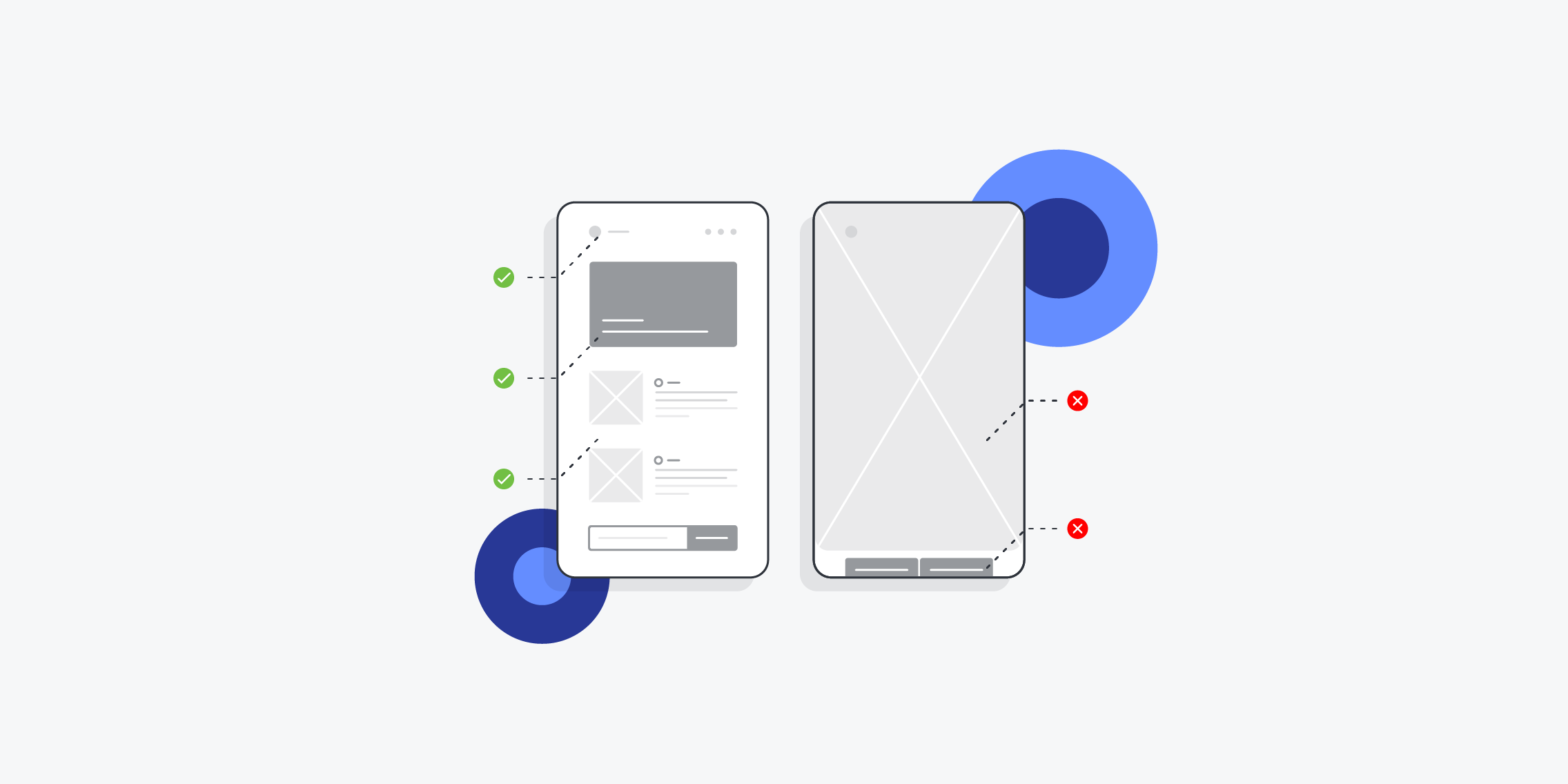
- DO design for all screen types and sizes
- DON’T underestimate the importance of good imagery
- DO use alignment to create neat, user-friendly designs
- DON’T let aesthetics compromise usability
- DO imitate real-world light
- DON’T forget about whitespace
- DO use sufficient contrast
- DON’T reinvent the wheel
Keep reading to learn more about what each rule means, with examples and actionable tips to guide you.
DO: Design for all screen types and sizes
This one should go without saying, but it’s surprising how often this golden rule is broken.
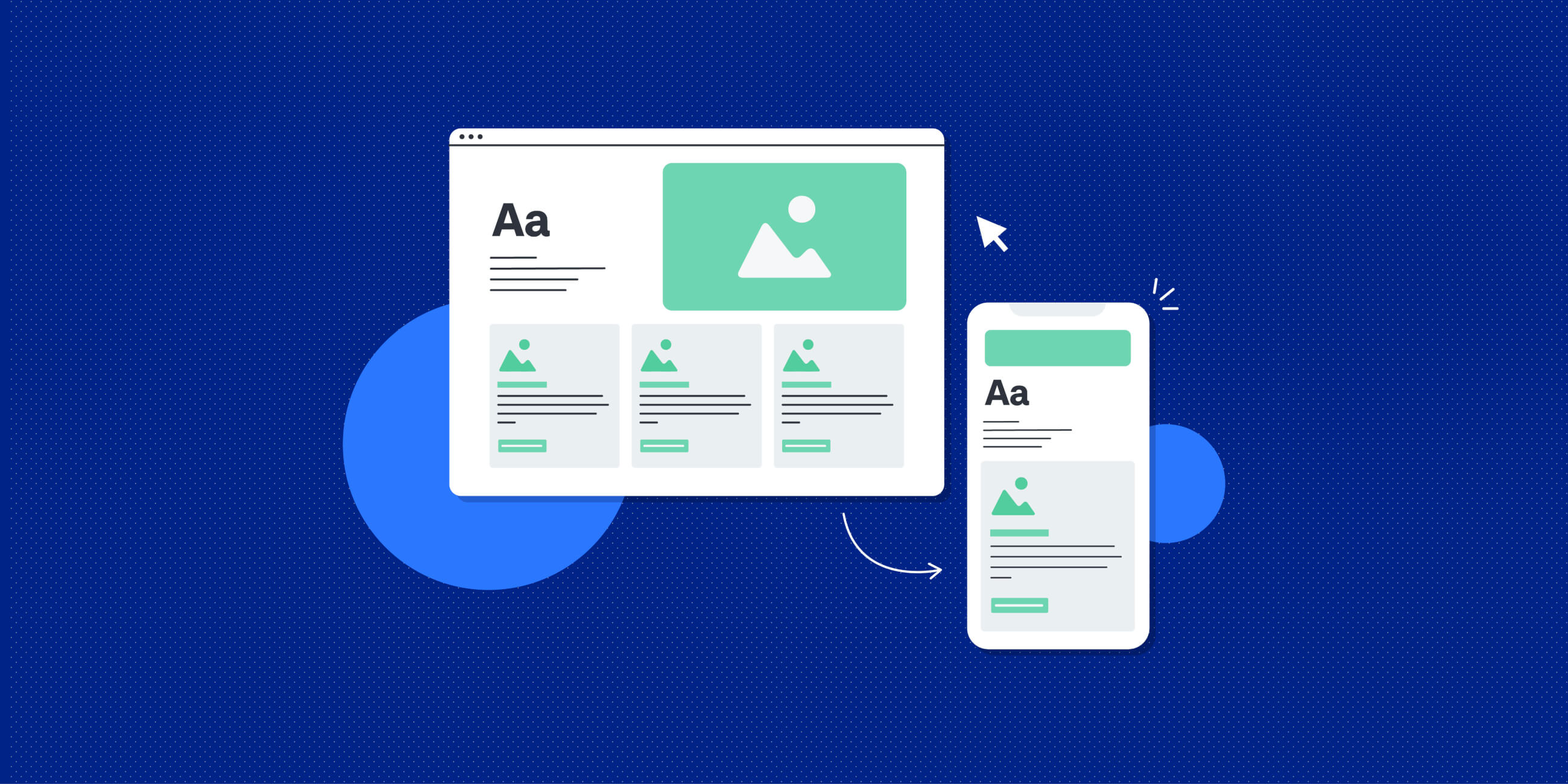
Whenever you’re designing a website, make sure you design for all screen types and sizes—otherwise known as responsive design.
Do:
- Take a mobile-first approach—design for mobile devices (i.e. smaller screens) first and then work your way up to the desktop version.
- Consider all the most common screen resolutions for mobile, tablet, and desktop devices.
- Use responsive grids. You can learn how to create responsive grids in this guide.
Don’t:
- Make users zoom or scroll horizontally to view important content on their mobile.
- Include overly large images that take up the entire screen.
- Place controls too close together (for e.g. two buttons next to each other which can easily be tapped by mistake).
DON’T: Underestimate the importance of good imagery
It’s astounding how much difference a single image can make to your entire UI design. In fact, good imagery is such a simple yet effective way to improve your UI, it’s practically cheating.
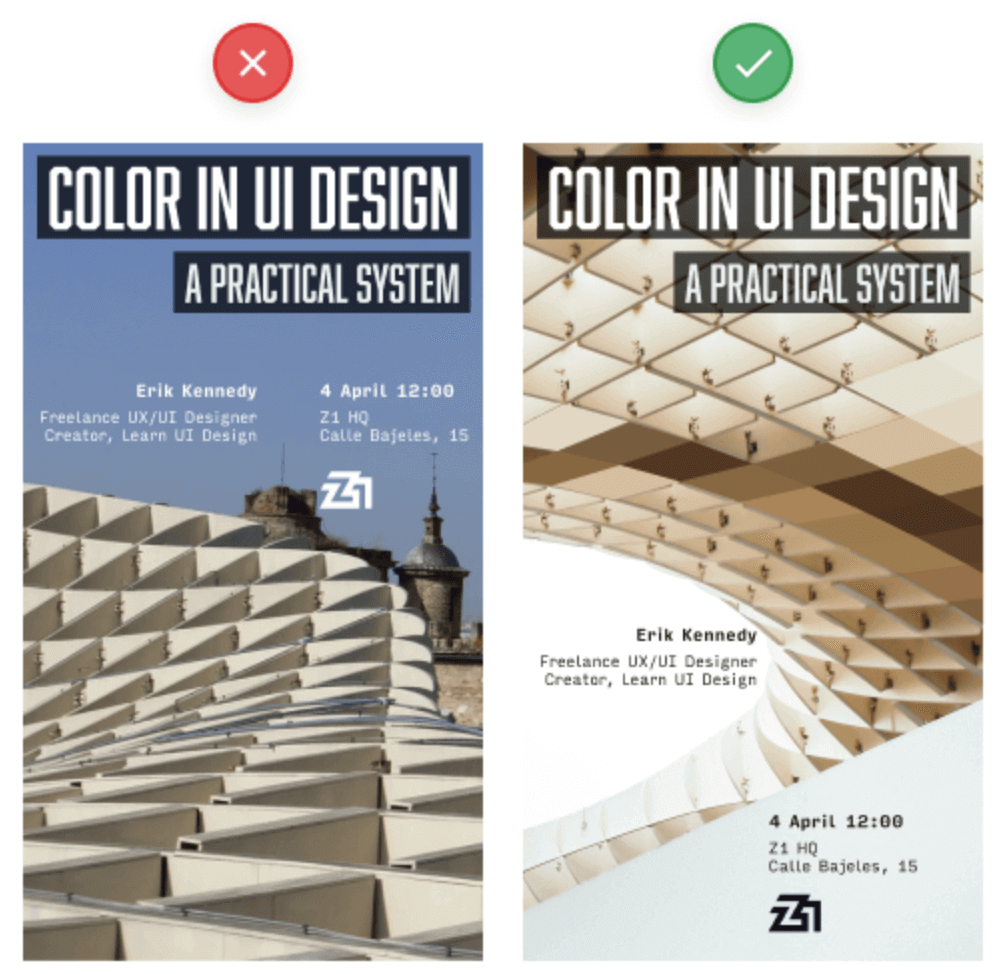
Consider the following example. Both designs use great fonts (Abolition and Input Sans), both have a similar layout, and both feature exactly the same text content. But they’re worlds apart in terms of quality—and it all boils down to a mediocre image.
The second image is miles better. It’s a more dramatic, sweeping composition—and it’s not competing with the background for attention.
Do:
- Use relevant images that help tell the right story.
- Use high quality, high resolution images.
- Ensure plenty of contrast between images and text (more on that later!)
Don’t:
- Rely solely on stock images.
- Use confusing imagery—you’re better off having no imagery at all.
DO: Use alignment to create neat, user-friendly designs
Alignment is a fundamental principle of UI design. Although it’s invisible to the user, it makes a huge difference to the overall design and the user experience.
Alignment provides structure, helps to organise elements on the page, and gives visual clues as to how different elements are related.
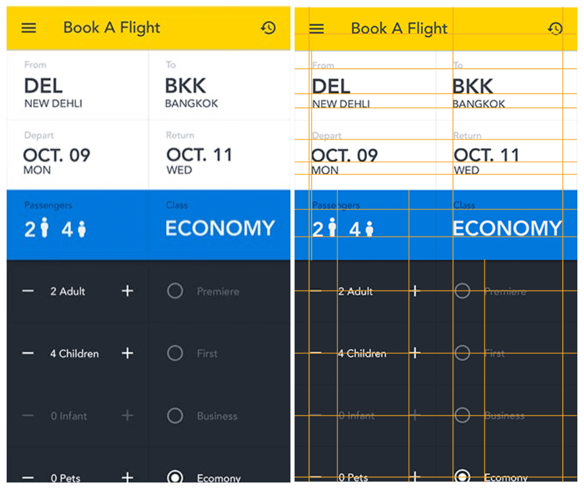
See how, in the flight booking example, alignment is used to create a neat, structured design without a single visible line? It feels easy on the eye—and, beyond that, it’s very clear which information belongs together.
Do:
- Learn about the different types of alignment (left, right, centre, justified, horizontal, and vertical) and when to use them.
- Consider how your users are likely to consume your content (based on the four most common reading patterns).
- Use grids to make the process easier (and adhere to these 5 golden rules of using grids in web design).
Don’t:
- Leave alignment to chance. It seems like a minor detail, but it can make or break the look and usability of your designs.
- Be inconsistent. In fact, this rule applies to most areas of UI design!
DON’T: Let aesthetics compromise usability
Don’t let anybody tell you that UI design is just about ‘making things look beautiful’. That’s part of it, sure—but, just like UX design, it’s primarily about usability and helping the user to complete their tasks.
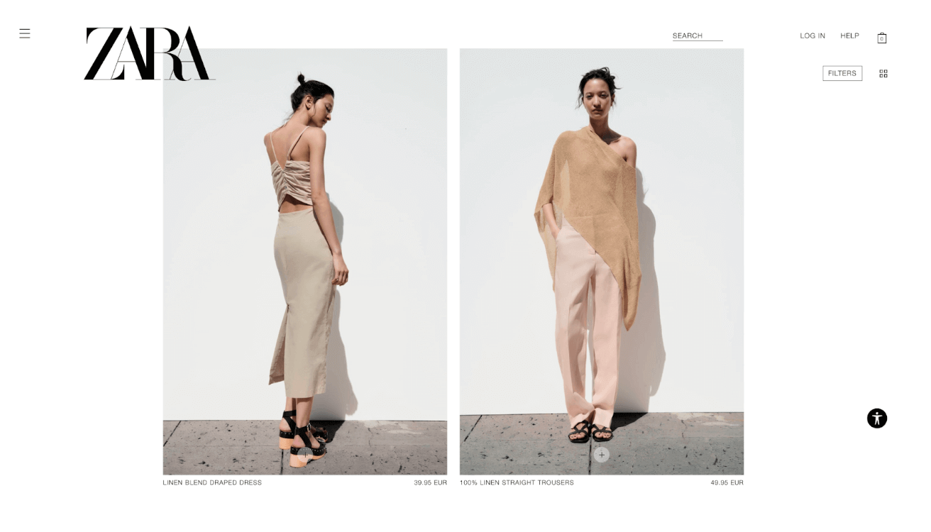
Consider the ZARA website. It looks great, like the pages of a glossy fashion magazine. Is it easy to read, navigate, and ultimately, to shop? Not so much. Locating the “add to cart” icon may take you a while, and there’s no breadcrumb navigation to show you where you’ve come from.
The website may look nice, but they’ve compromised usability for the sake of aesthetics—which is ultimately not a good look.
Do:
- Prioritise usability and accessibility when making design decisions. Does it look great but hinder the user experience in some way? Then it’s got to go (or be redesigned).
- Make icons and navigation clear and easy.
- Find a balance. It’s not an either/or situation—the best UI designers create websites that are both beautiful and user-friendly.
Don’t:
- Be so minimal with your aesthetic that your users can’t find the information they need.
- Forget about the user’s end goal when designing your UI.
DO: Imitate real-world light
Our screens are flat, but UI designers have many tricks up their sleeves to make certain elements appear 3D. When doing so, make sure you’re following the rules of real-world lighting.
That is: natural light comes from above (i.e. from the sky). This casts shadows below the object, makes the top of the object brighter, and makes the underside of objects darker.
Do:
- Make the ‘top lip’ of the object/element the brightest, as if it’s catching the most light.
- Make the bottom section of the object/element the darkest, as though it’s angled away from the light.
- Cast the shadow below the object/element.
Don’t:
- Overdo it on opacity—subtle shadows work great.
- Create unnatural shadows that go against how light falls in the real world.
DON’T: Forget about whitespace
Whitespace isn’t just empty space that happens to be left over. It’s a crucial design element which should be used strategically.
Whitespace (or negative space) prevents your designs from becoming overly cluttered, and helps draw the user’s attention to important elements. For example, if you want to make a call-to-action button more visible, surround it with whitespace to make it stand out.
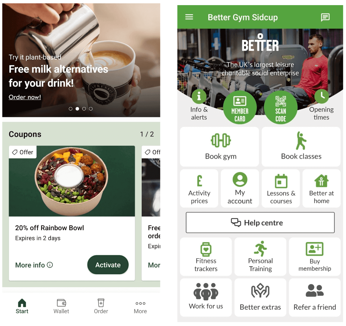
Compare the following two screenshots. The one on the left is from the Espresso House app; can you see how the ‘Activate’ button stands out because it’s surrounded by whitespace?
The one on the right is from the Better Gym app, and it’s pretty crowded and overwhelming; there’s no one element your eye is immediately drawn to. A little more whitespace would improve the design dramatically.
Do:
- Use whitespace to separate different elements or sections on the page.
- Use whitespace to help important call-to-action buttons stand out.
- Treat whitespace like any other design element—use it strategically and intentionally.
Don’t:
- Think that whitespace can only be white. The term refers to any empty space on the page, and it can be any colour.
- Leave whitespace as an afterthought or an accident.
DO: Use sufficient contrast
This one can really make or break your UI—and the user experience.
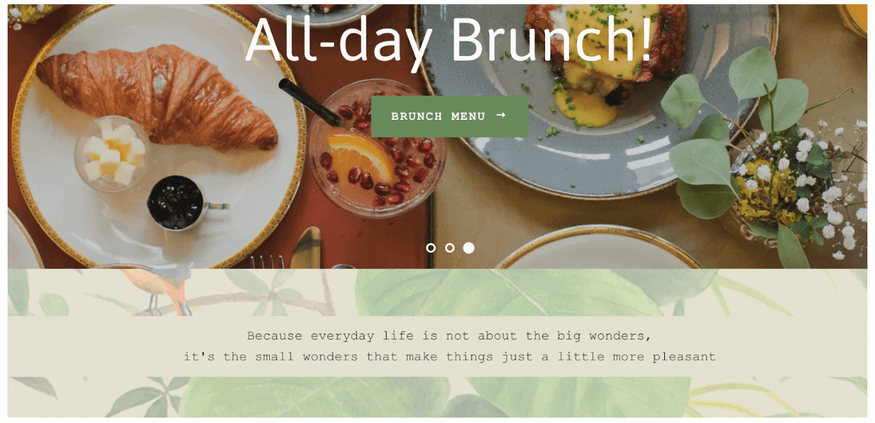
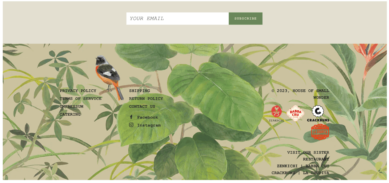
Here are some screenshots taken from the House of Small Wonder website. As you can see, there are several issues with contrast throughout the design. Some text is rendered practically illegible because there’s simply not enough contrast with the background.
At first glance, it’s a beautiful website—but trying to read what’s on it is, in places, a real strain.
Do:
- Ensure sufficient contrast between text and the background for optimal readability.
- Use colour contrast to highlight where new elements and sections begin.
- Play around with dark and light, different colour temperatures, and textures to create varying degrees of contrast.
Don’t:
- Use light coloured text on light backgrounds.
- Place text on overly busy backgrounds or images (as in the House of Small Wonder example).
DON’T: Reinvent the wheel
Last but not least, don’t feel inclined to reinvent the wheel. The fundamental principles of UI design exist for a reason, and users value consistency.
Imagine what it would be like if all your favourite websites and apps followed different rules and conventions. You’d feel like you’re starting from scratch every time—and would probably end up pretty confused and frustrated.
We’re used to certain icons meaning certain things (e.g. the house icon representing the home screen, or the magnifying glass representing the search function), and we expect certain experiences to function in a particular way (e.g. when shopping online for clothes, you expect to be able to filter by certain categories such as shoes, trousers, tops, and accessories).
As a UI designer, meeting these expectations will help you to ensure that your designs are usable and enjoyable.
Do:
- Design with your user’s expectations and mental models in mind.
- Make the most of UI component libraries and follow these user interface guidelines.
- Take inspiration from similar and competing products.
Don’t:
- Be creative for creativity’s sake. Ever heard the saying “If it ain’t broken, don’t fix it”? The same applies to UI design.
- Design in a way that requires unnecessary learning for your users.
Further tips and inspiration for your next UI design project
Looking for more advice and inspiration for your next UI design project? Check out our complete guide to icon design, follow these 9 expert tips on how to become a better UI designer, and see what you can learn from some of the best UI design examples on the web.


