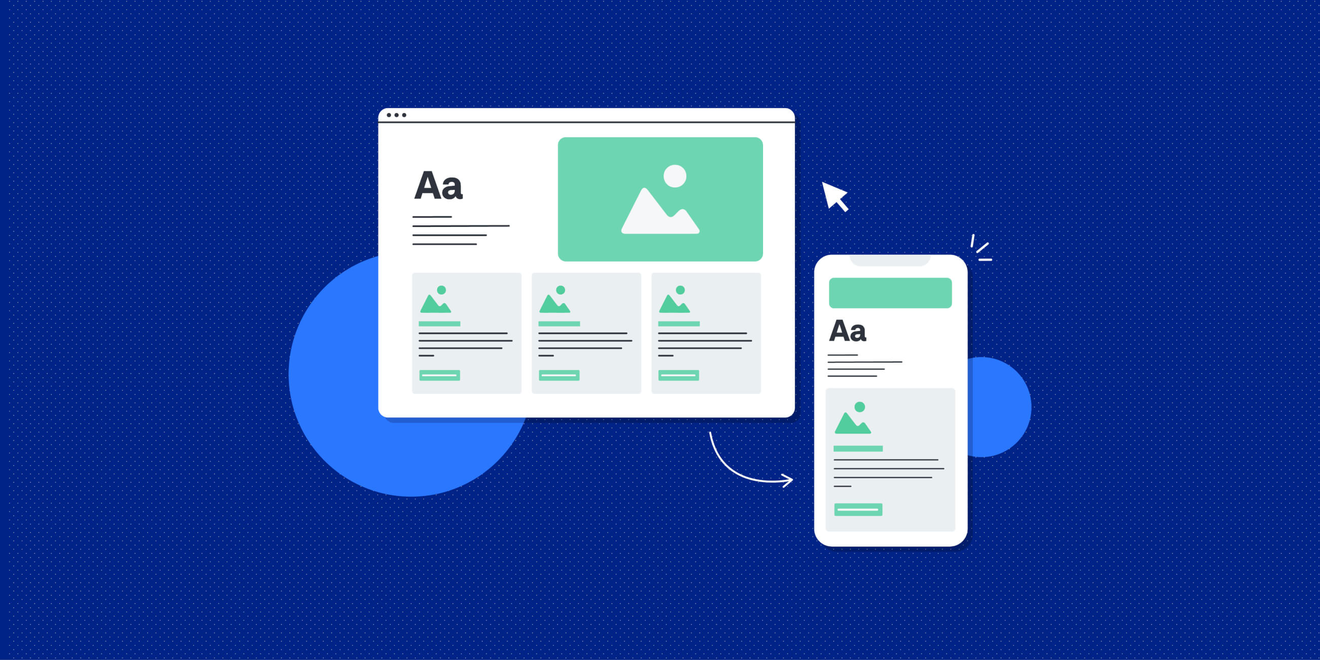
UI design (or user interface design) refers to the look, feel and functionality of a digital product. It covers the design and curation of buttons, graphics, typography, colour palettes, spacing, animations and more. It’s basically everything you see and interact with when you visit a website or use an app on your phone.
When UI design is done well, it has the power to delight the user, guide them through the completion of specific tasks and to convey brand values and personality.
But what does good UI design look like in action? Here are 9 examples of exceptional UI design.
1. Butter
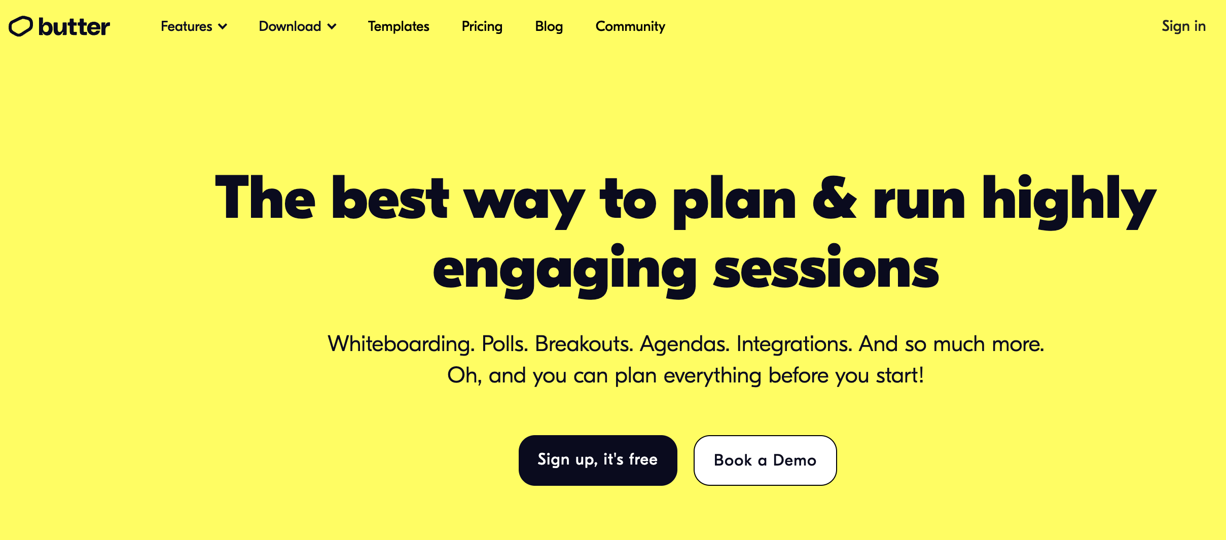
Butter is an online platform designed to make virtual collaboration “as smooth as butter” — and, if their UI design is anything to go by, they’re definitely nailing the “smooth” part.
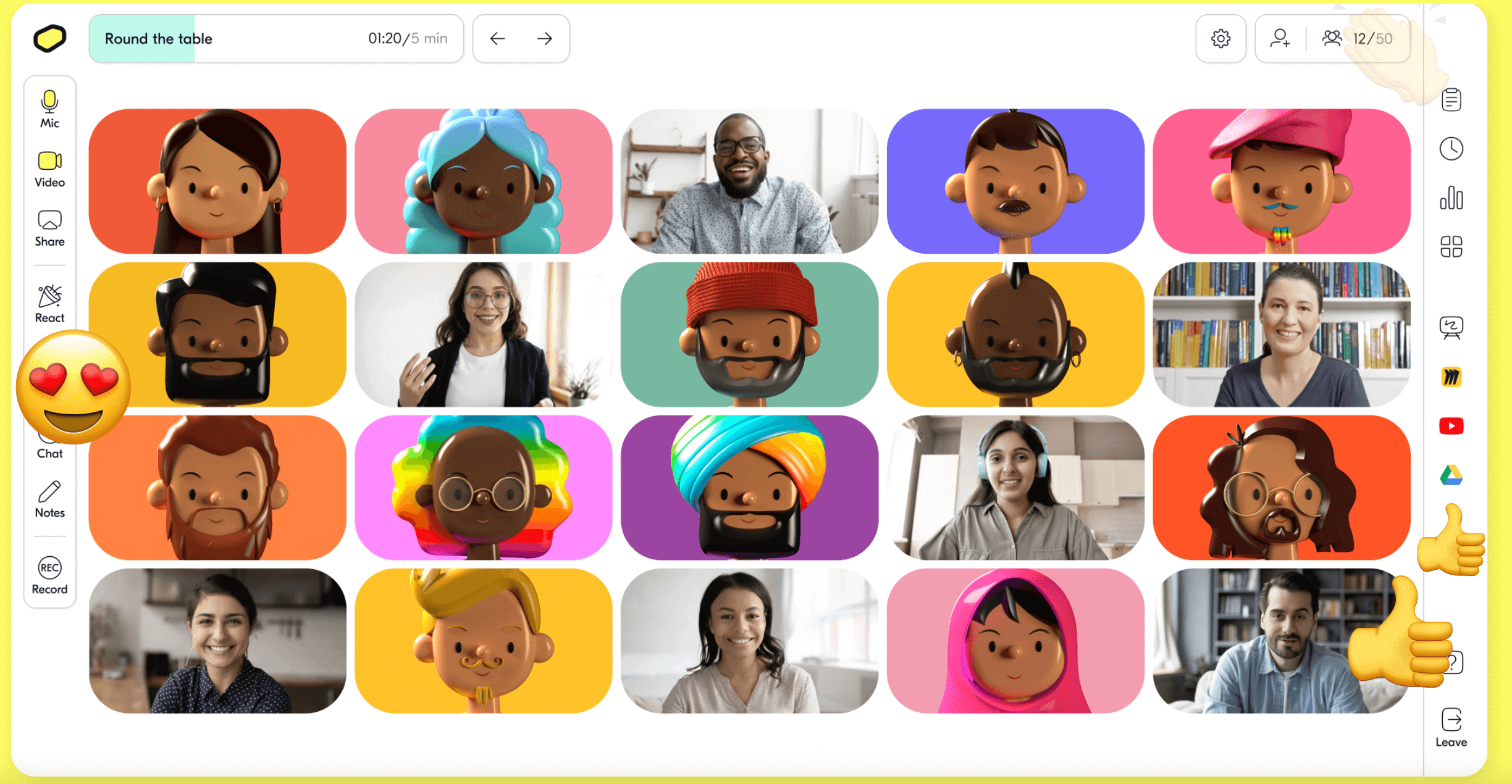
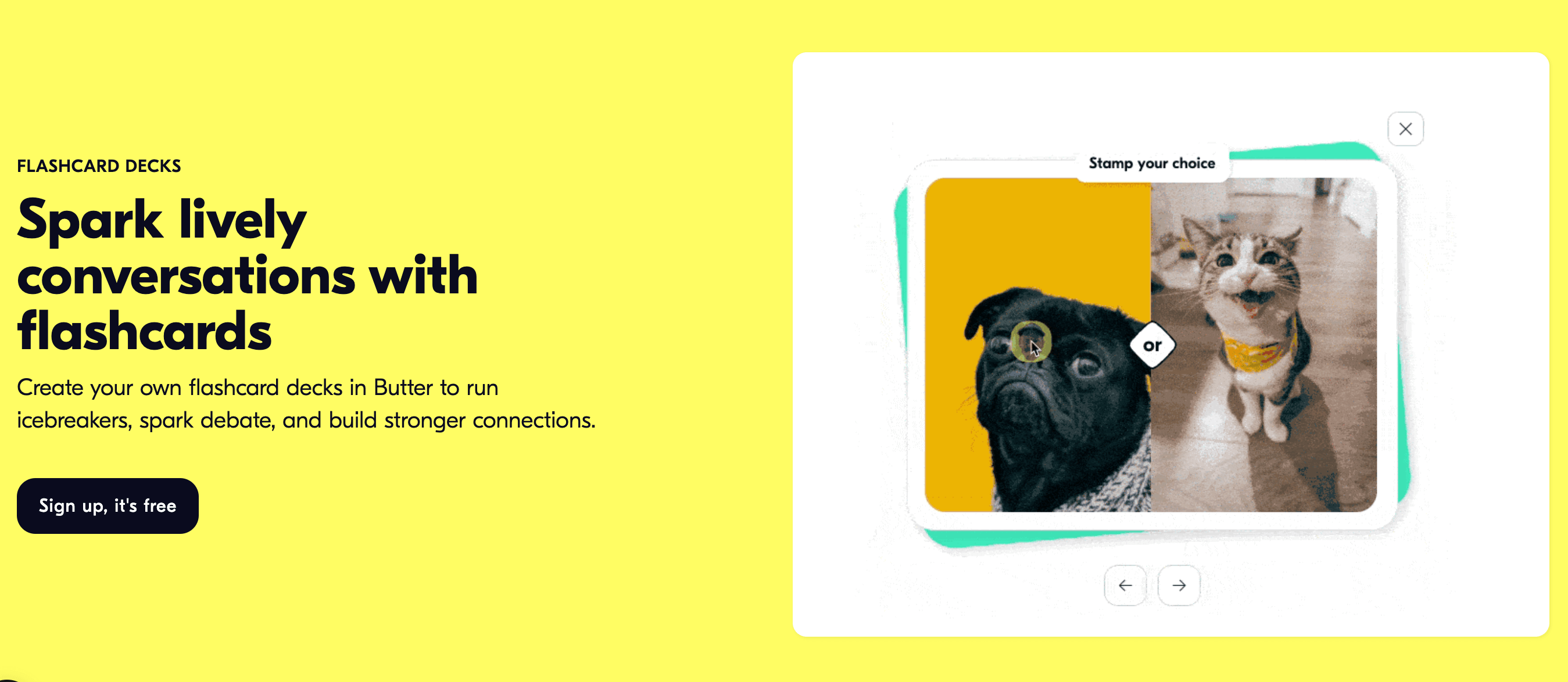
The Butter website is a delight to navigate. Popping colours, cute graphics, bold typography, and even the odd GIF or two perfectly convey the Butter brand: down to earth, straightforward, and fun to use.
Despite Butter’s bright colour choices and playful visuals, their UI design is clean and clear with plenty of white space and contrast, ensuring the website is not only aesthetically pleasing. It’s also easy to navigate—a true marker of good UI design.
See more on the Butter website.
2. Omio
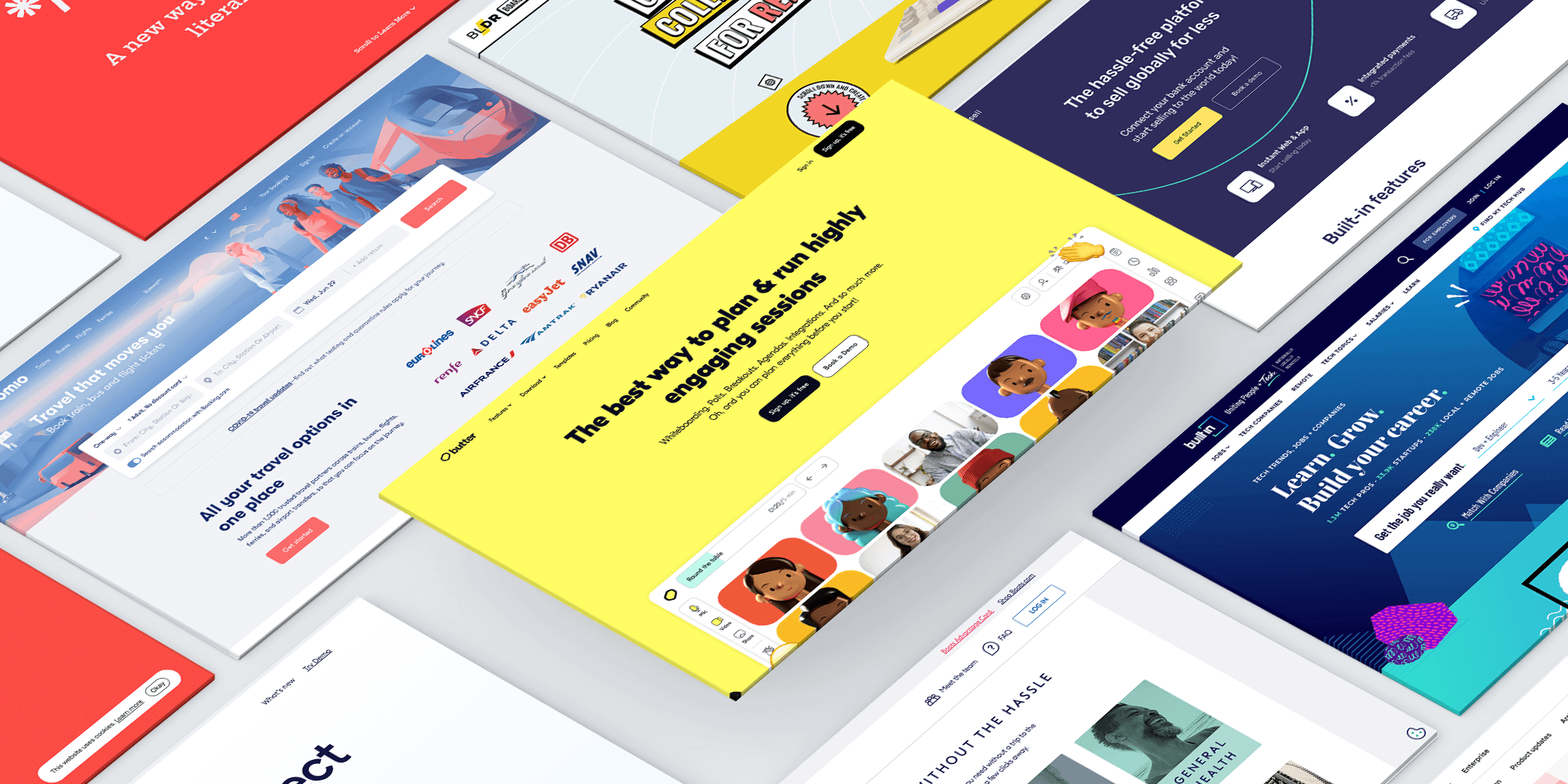
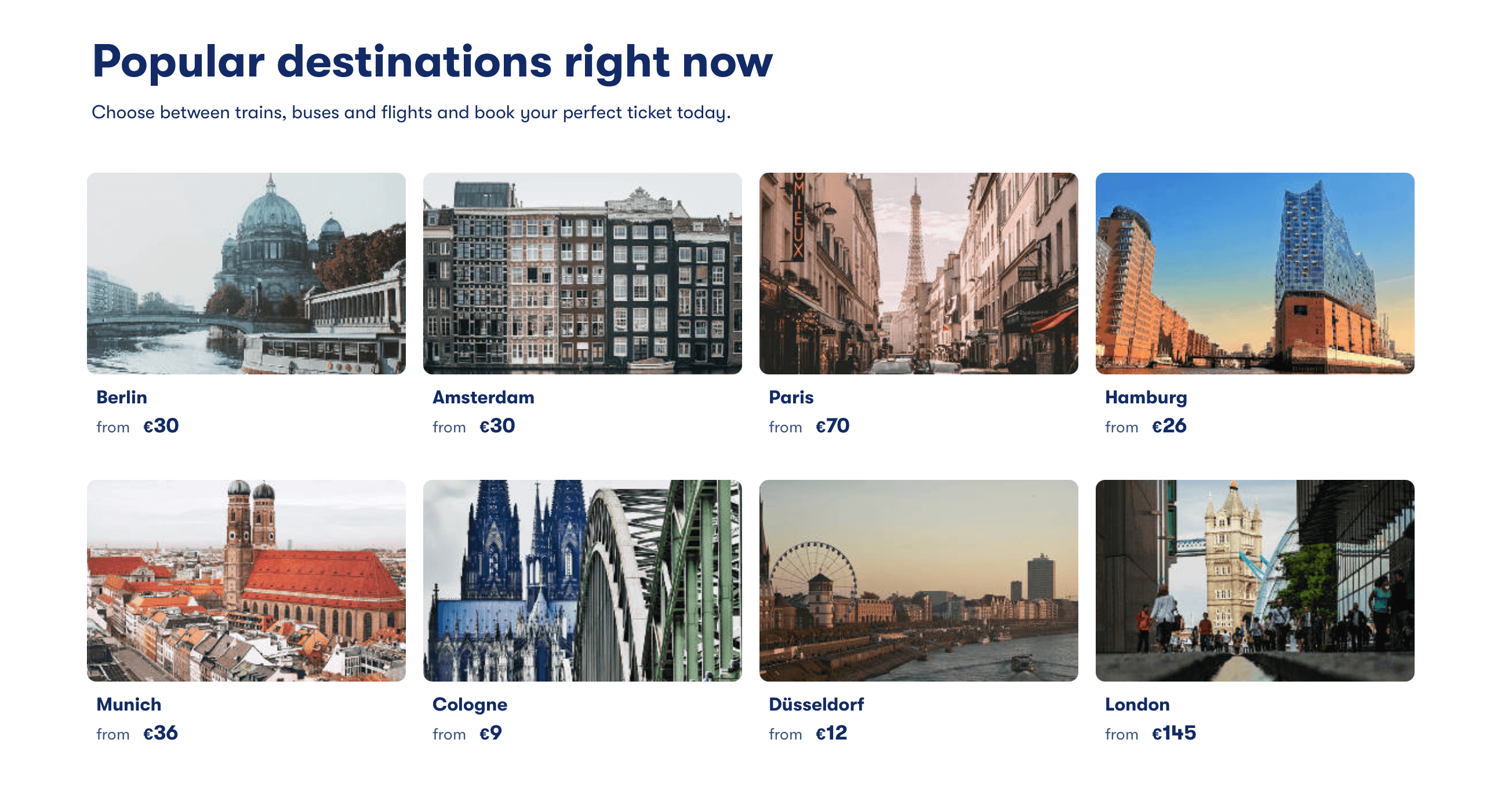
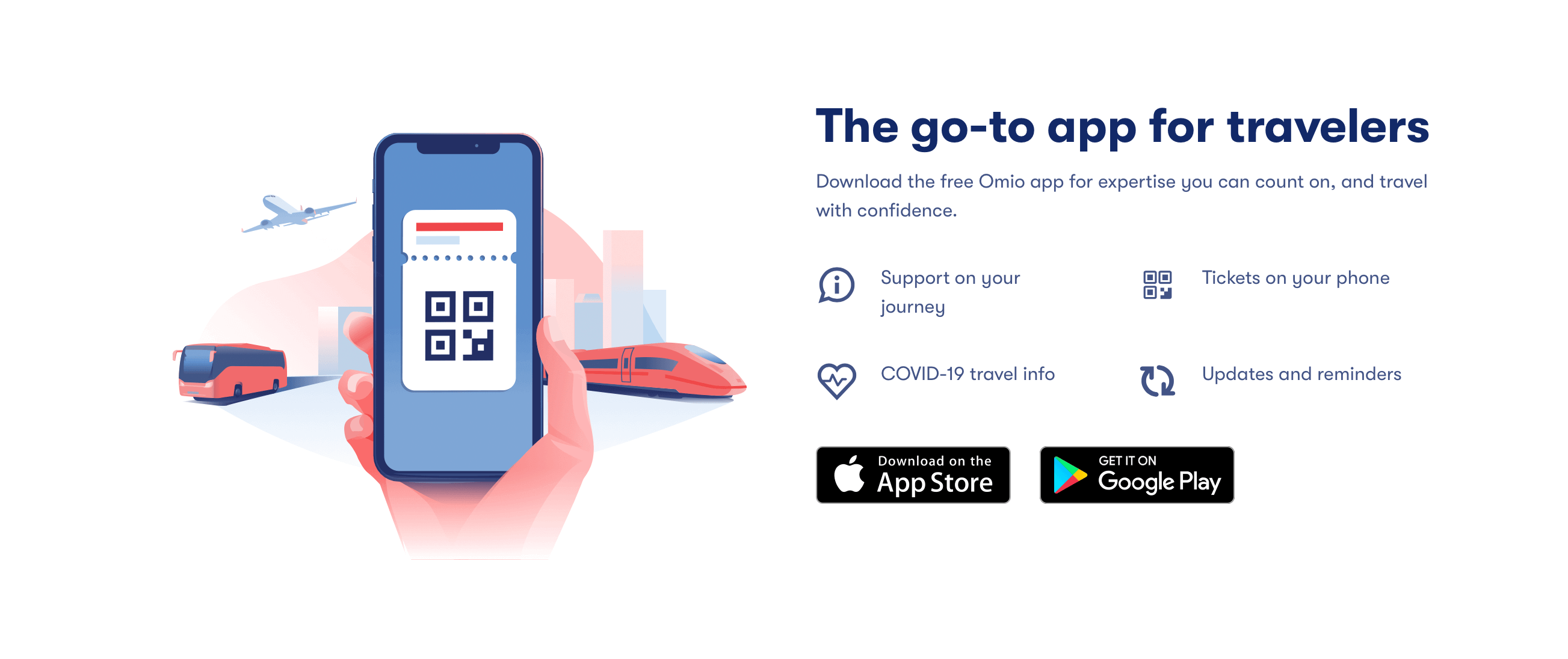
Omio is a travel website for comparing and booking train, bus, flight and ferry tickets. Unlike Butter (our previous example of good UI design), Omio has gone for a more understated — yet equally impactful — aesthetic.
As you scroll through the Omio website, you’ll find a calm colour palette, beautiful custom illustrations and seamlessly responsive design. You’ll also notice excellent use of visual hierarchy to highlight the most important elements on the page.
The Omio website is a good example of UI design that’s elegant, sleek and effortlessly guides the user to accomplish their goals.
See for yourself on the Omio website.
3. Protagonist
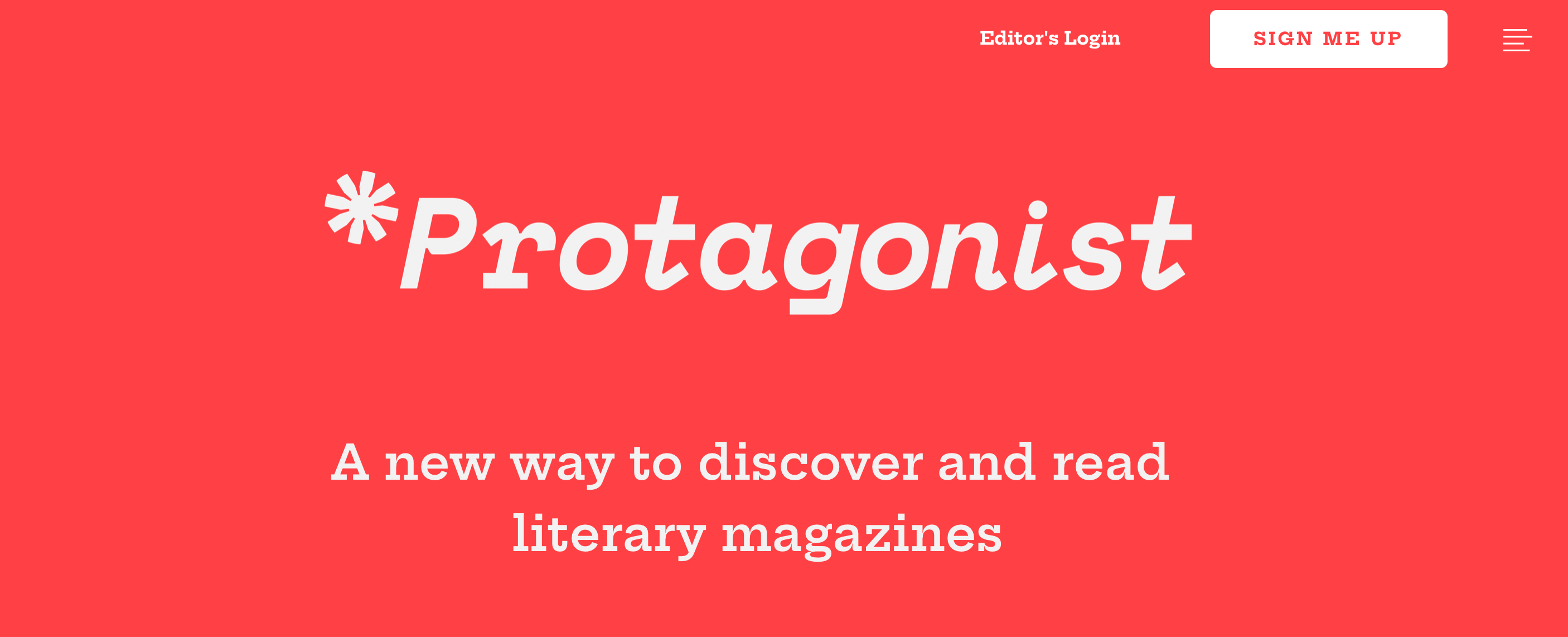
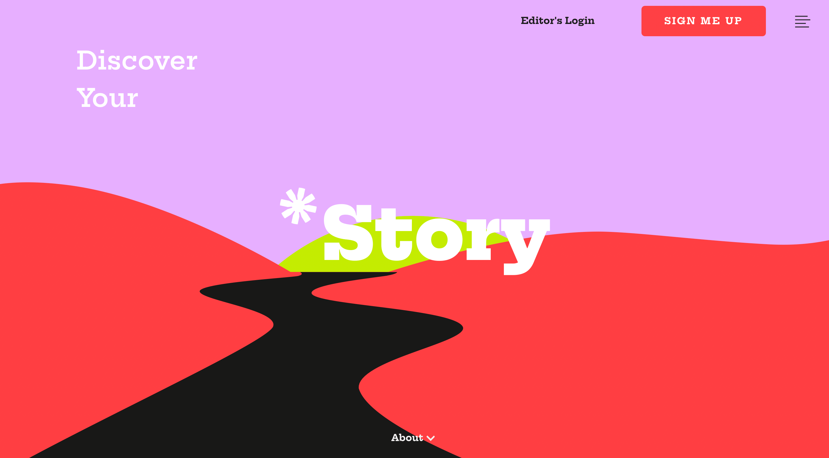
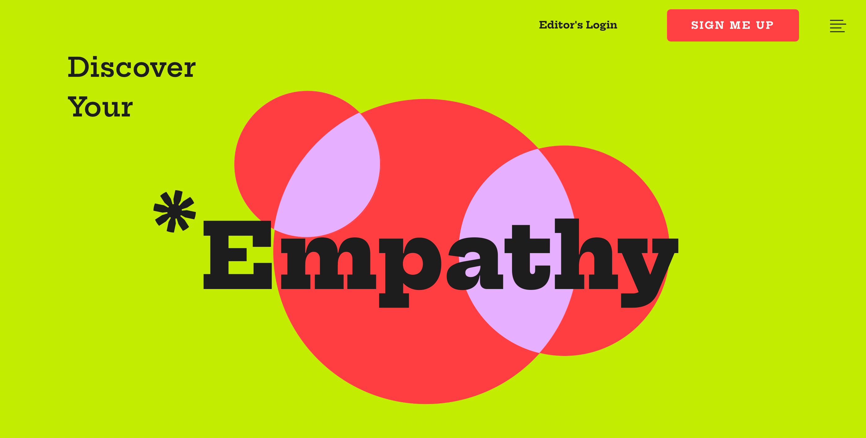
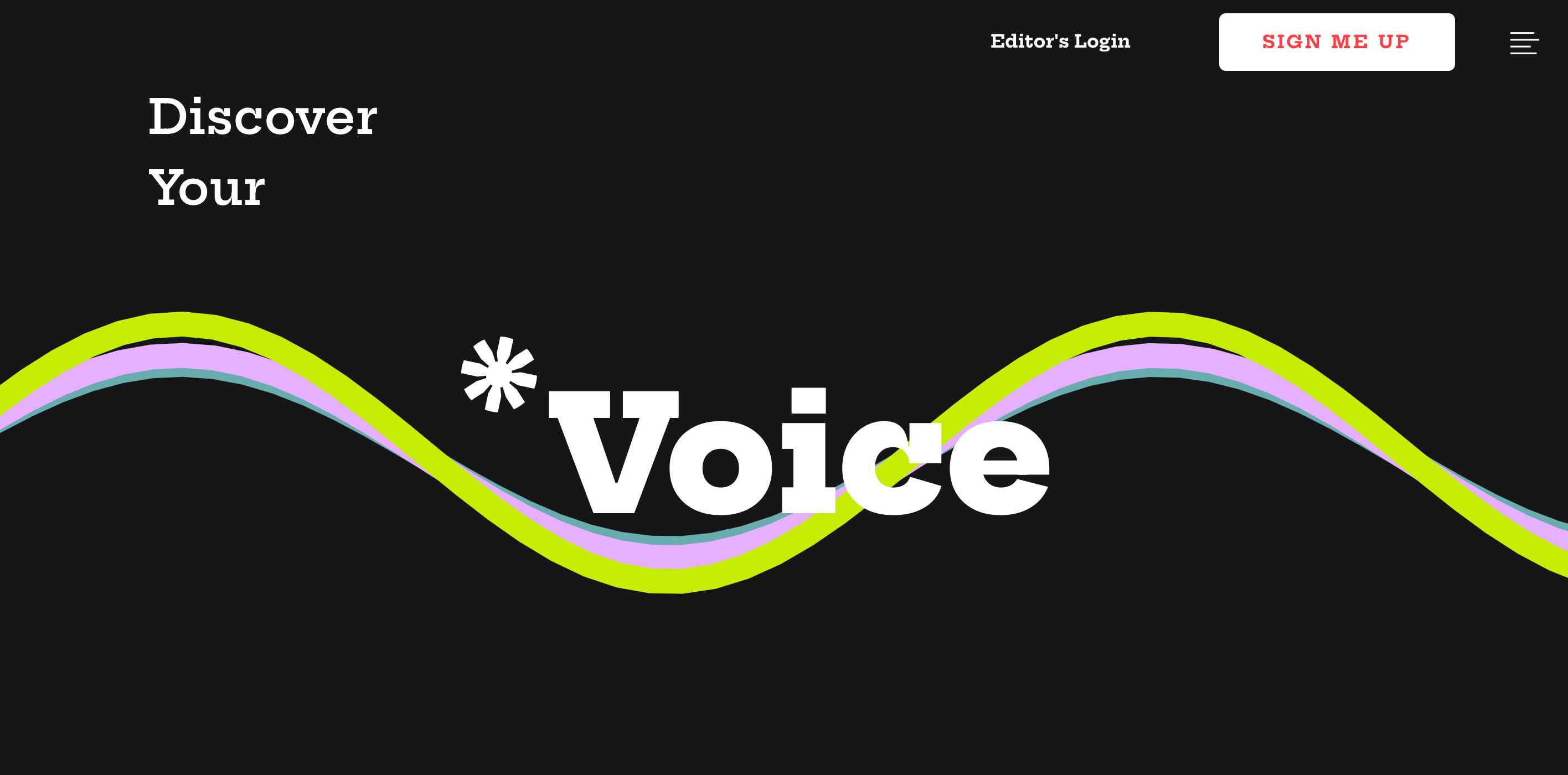
Protagonist is “an app for readers to discover, read, and love literary magazine stories, poems, interviews and more”. It’s also one of the most impressive examples of good UI design we’ve seen on the web to date.
Protagonist is all about eye-catching colours, clean, high-contrast text, out-there visuals and, of course, the overall “Wow” effect achieved through Parallax scrolling.
Parallax scrolling is a web design technique where the background moves slower than the foreground, creating a 3D effect as you scroll down the website. It creates the illusion of depth, giving you the feeling you’re moving immersively through the website rather than simply scrolling through it.
This is a truly powerful UI design you simply have to experience for yourself.
Visit the Protagonist website and scroll through for the full adventure!

4. Superlist
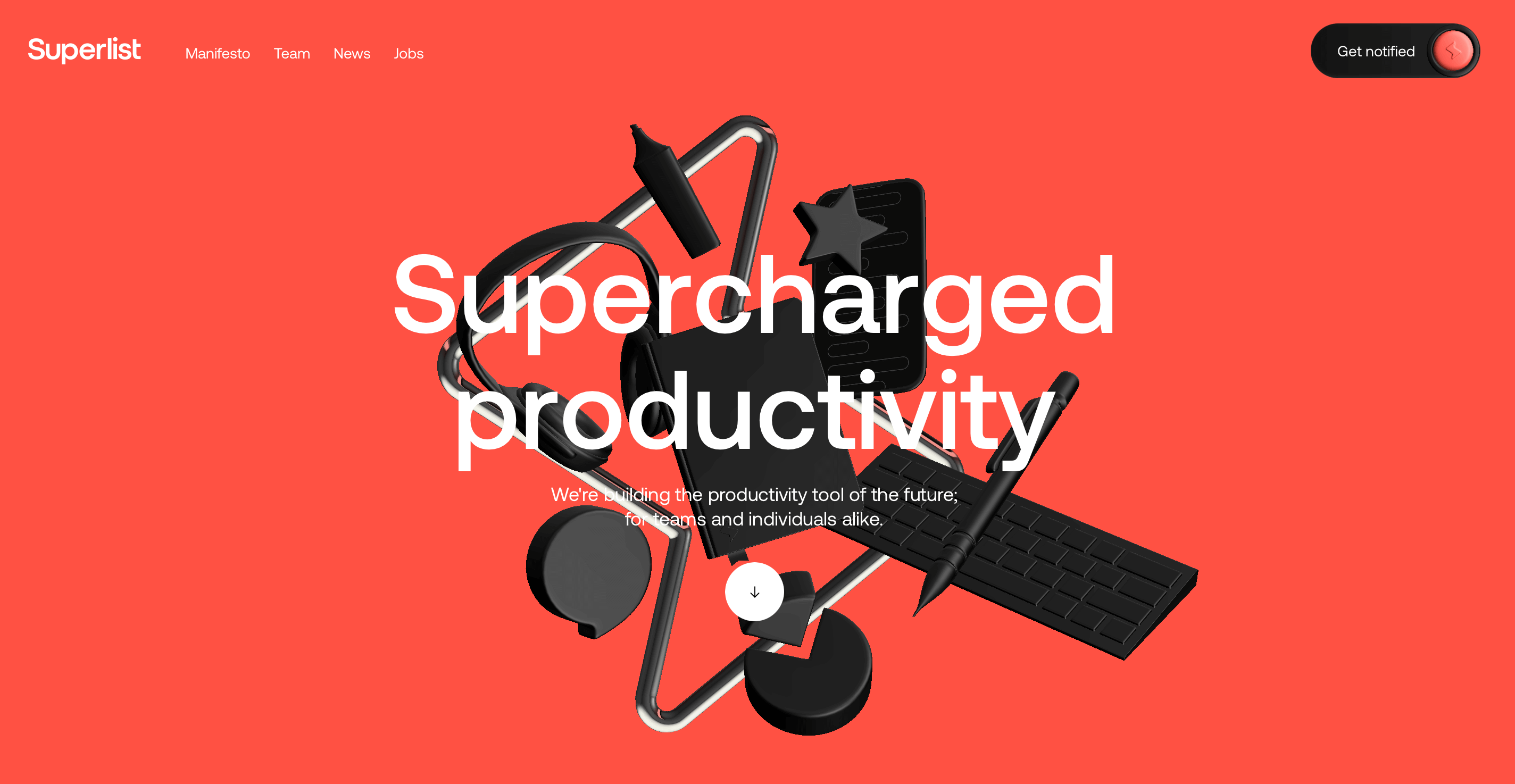
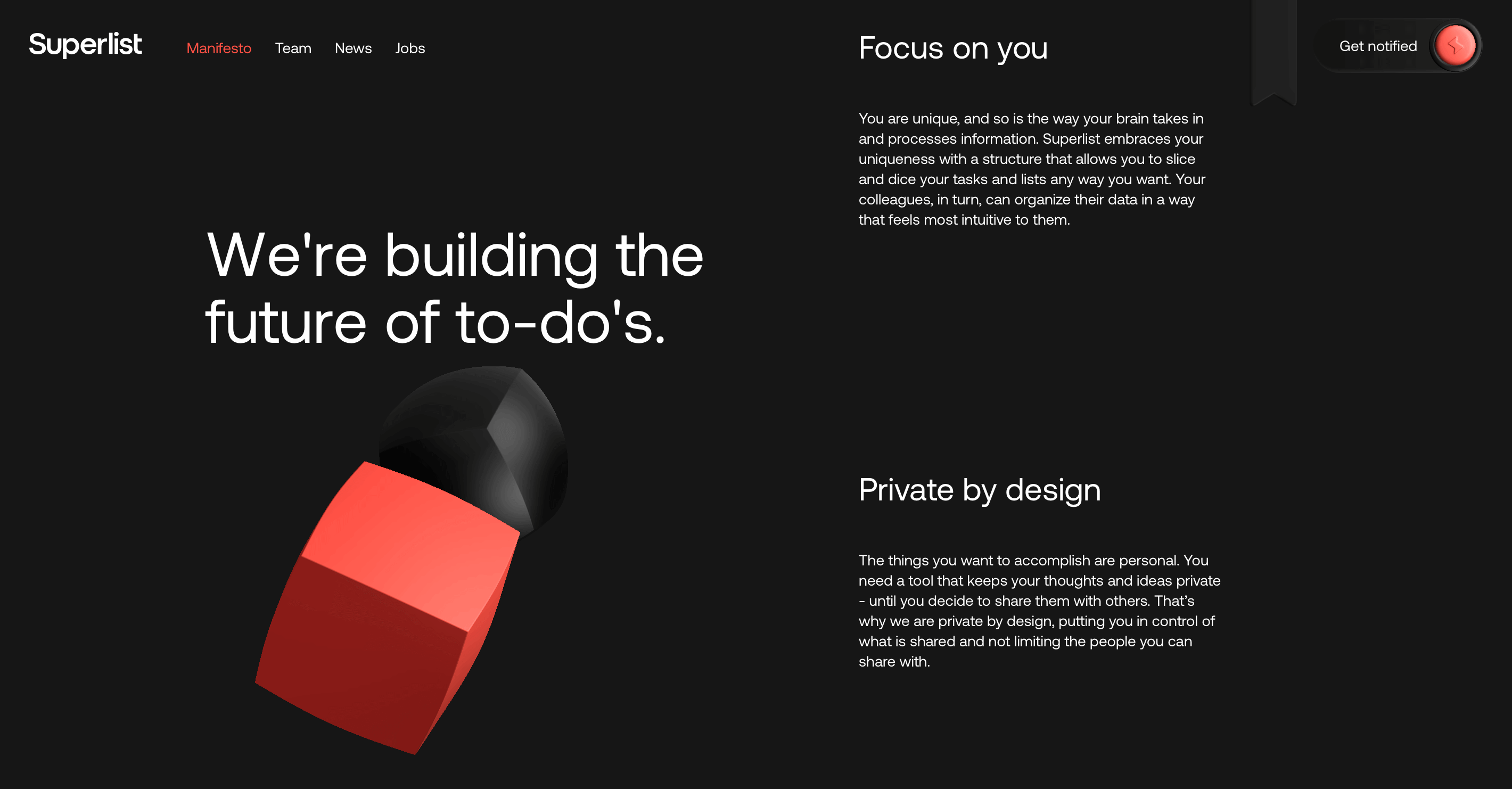
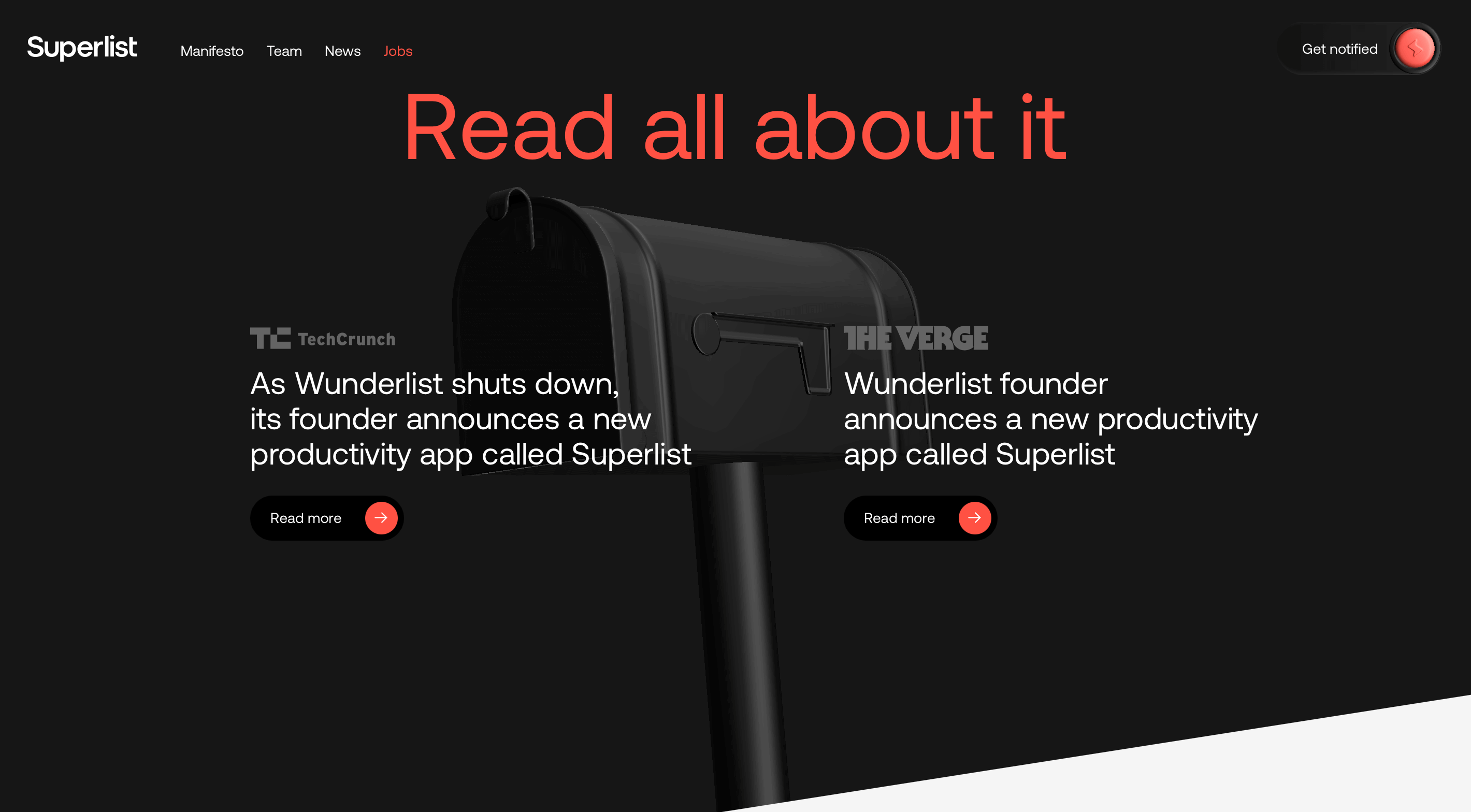
Superlist is a productivity tool in the making and their website is a great example of the elegant yet dramatic power of dark themes in UI design.
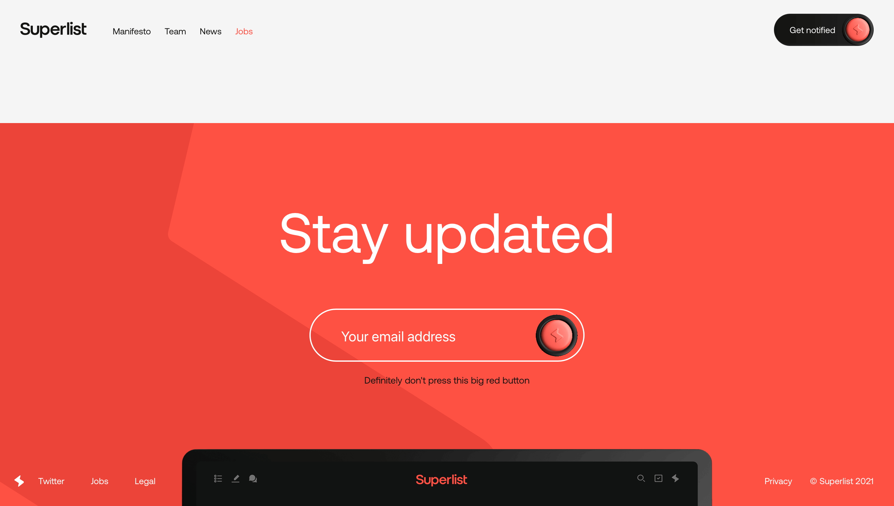
Superlist’s UI centres around a simple colour palette of red, white and black. As you scroll past the initial above-the-fold red, the background transitions to black with white text and slick 3D graphics. You can’t help but feel that Superlist is sleek, polished and professional.
Pay closer attention and you’ll spot some impressive button design and cheeky microcopy (for example: “Definitely don’t press this big red button”), adding a hint of personality.
Superlist’s UI is sophisticated, polished, and extremely powerful. A wonder to behold!
Experience this awesome UI design first-hand on the Superlist website.
5. Kukla Kit
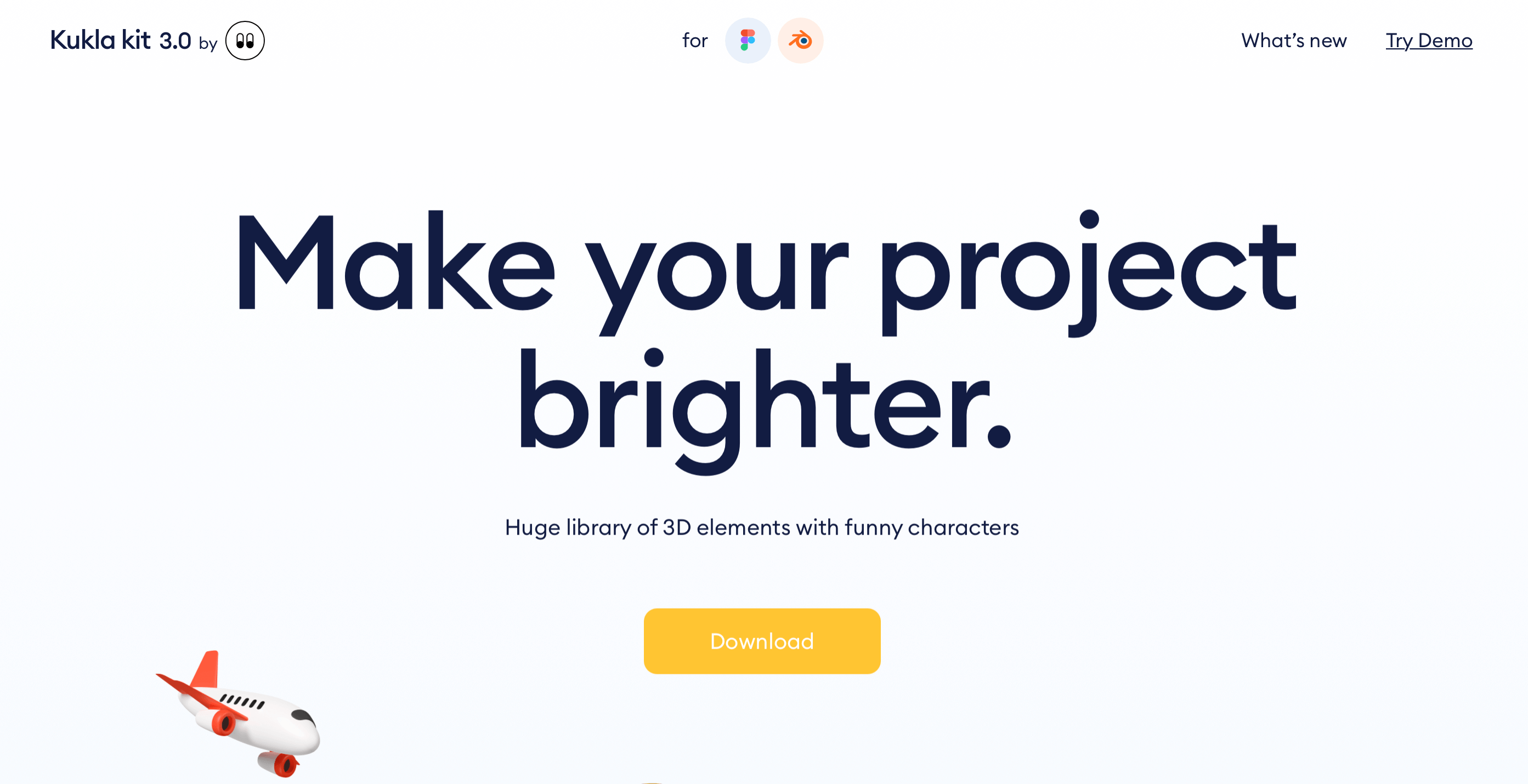
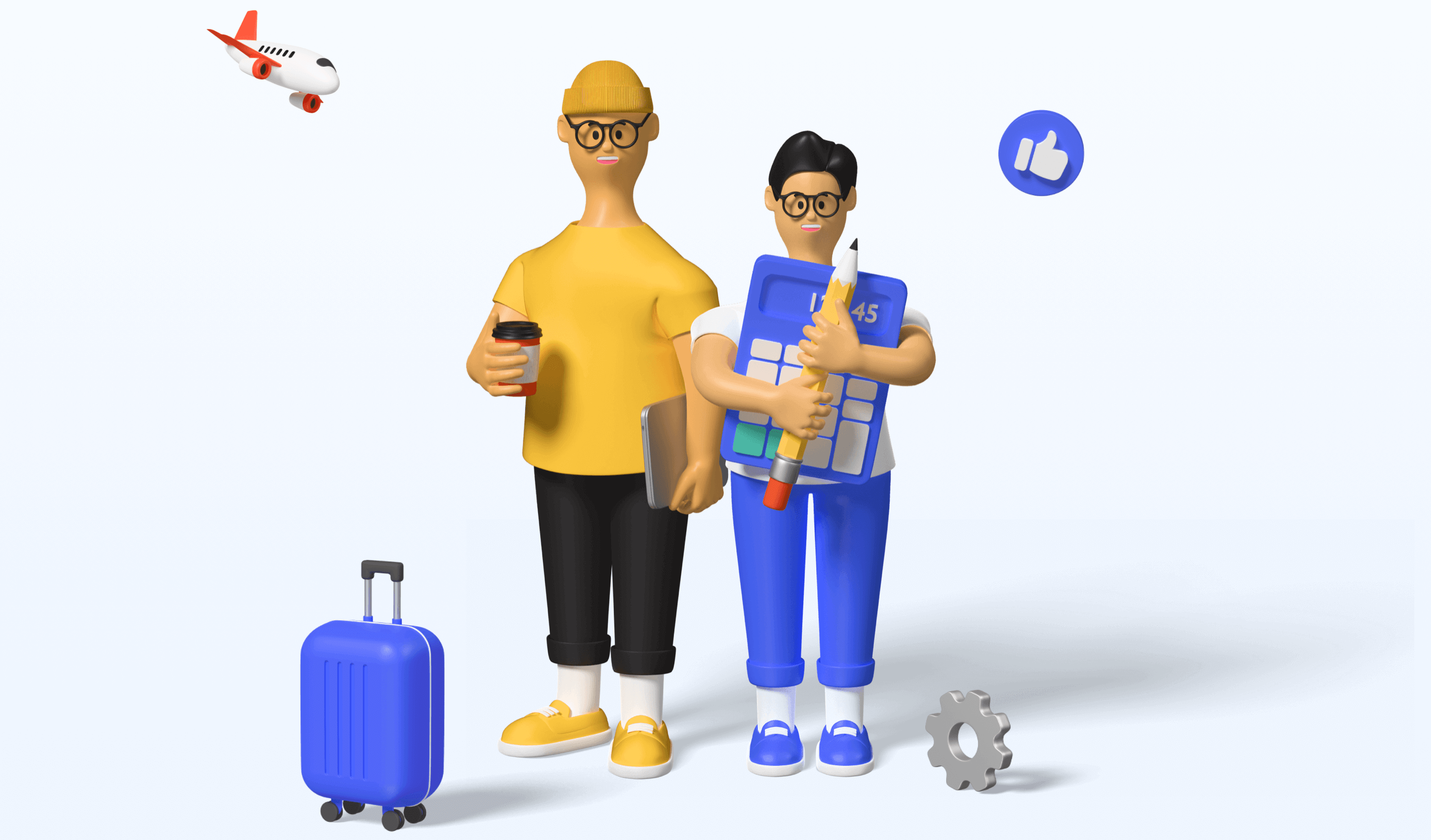
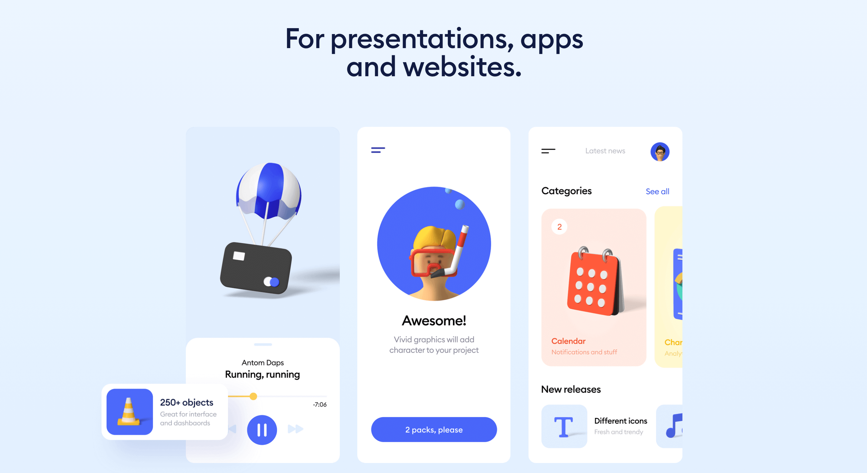
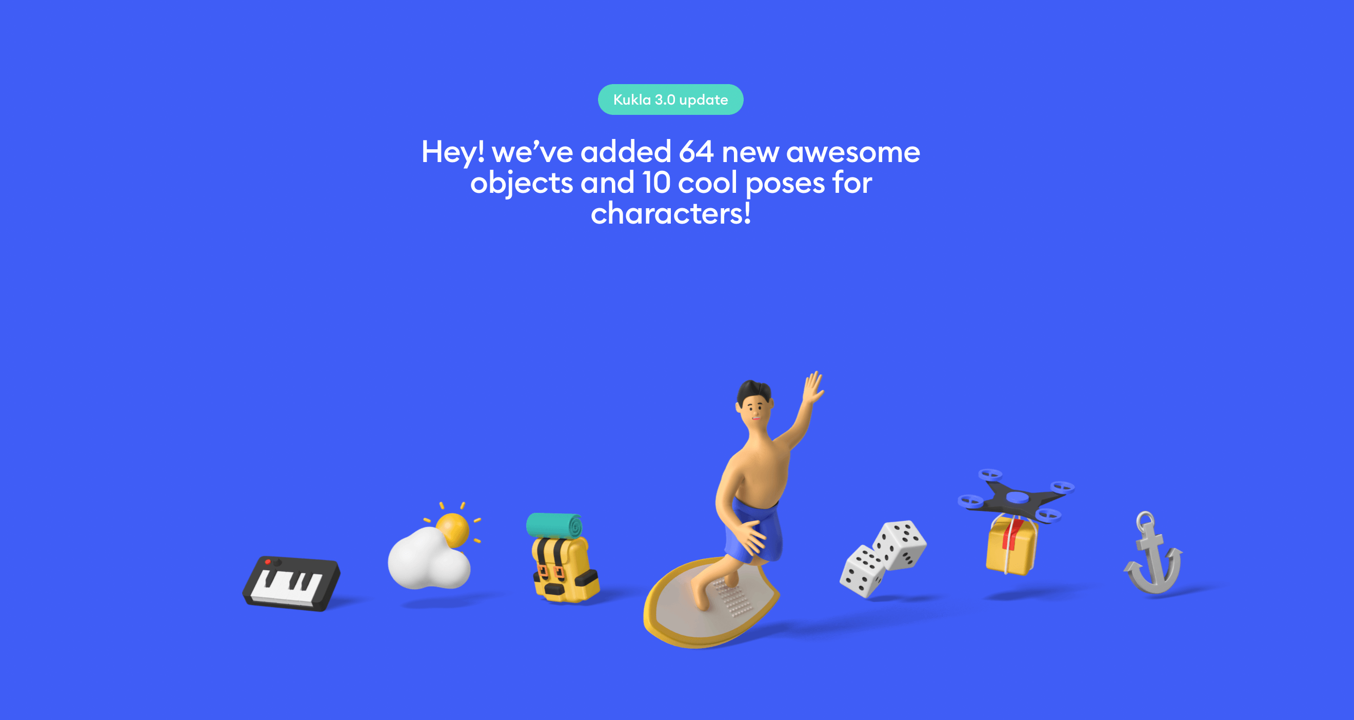
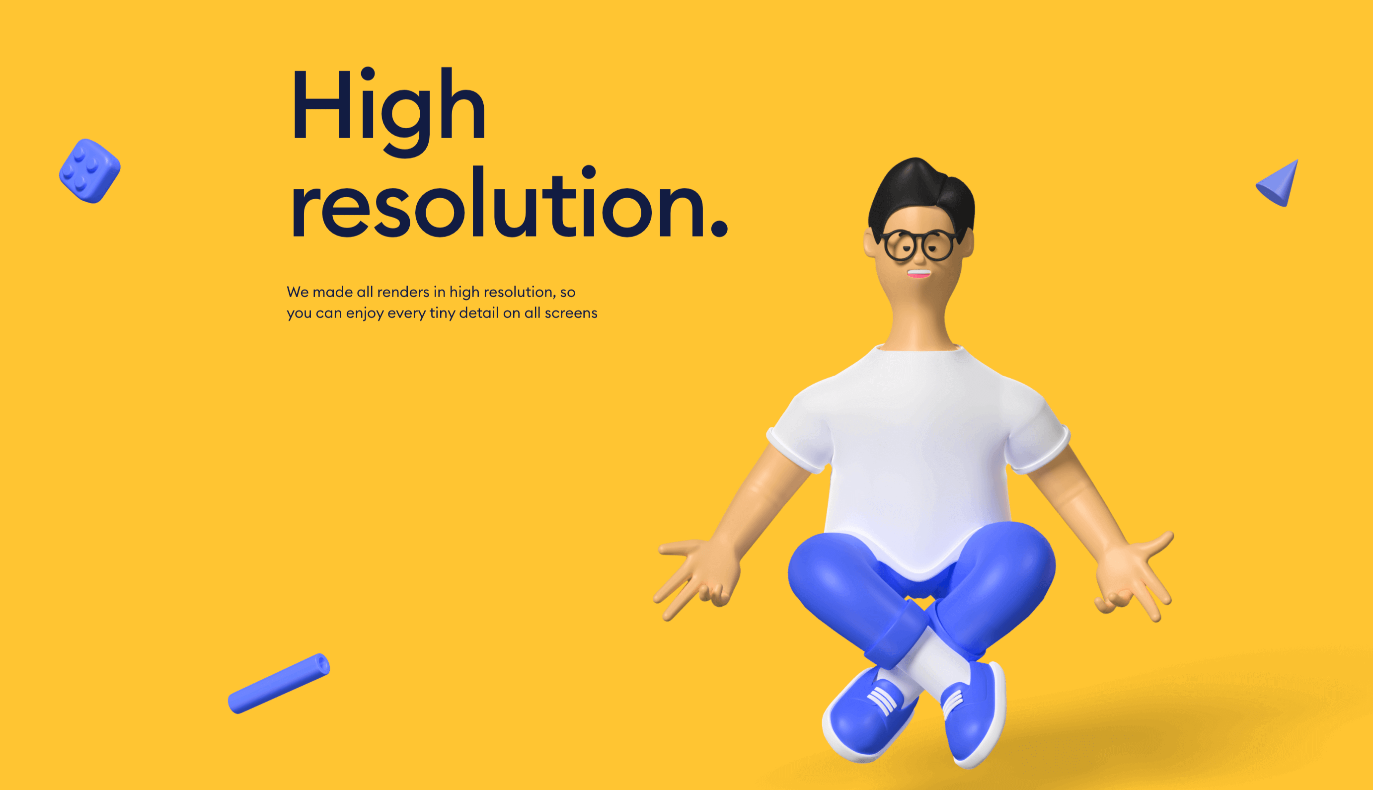
Kukla Kit is a comprehensive library of downloadable 3D elements. The library is made for UI designers, so it makes sense that the website itself is a work of UI design excellence.
Everything about Kukla Kit is, quite simply, delightful: from the cheerful colour palette to the clear, beautifully legible typography and the array of charmingly quirky 3D characters featured throughout.
Kukla Kit makes excellent use of white space and keeps text to a minimum, ensuring a clutter-free, easy-on-the-eye design. What’s not to love!
6. Boldare Boards
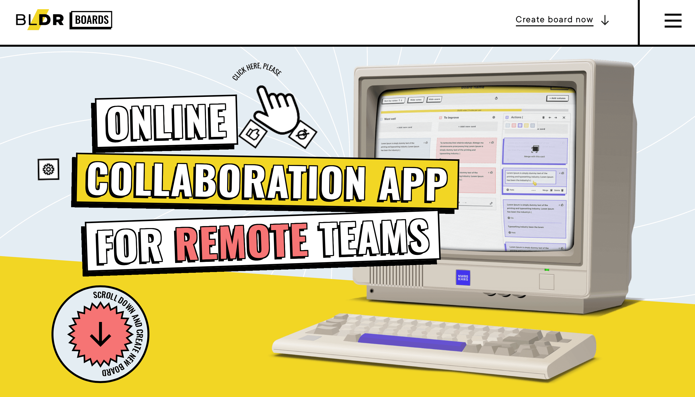
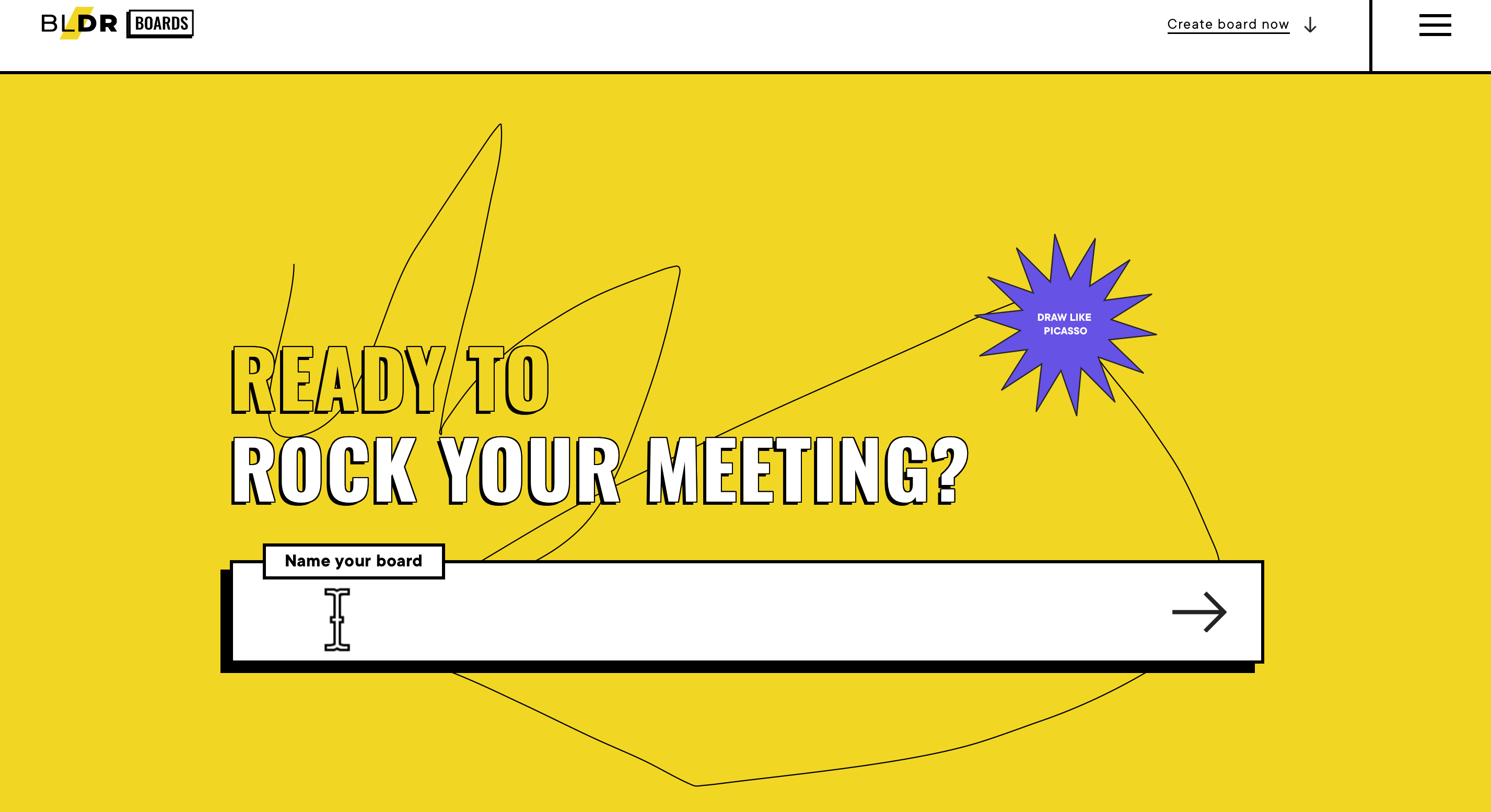
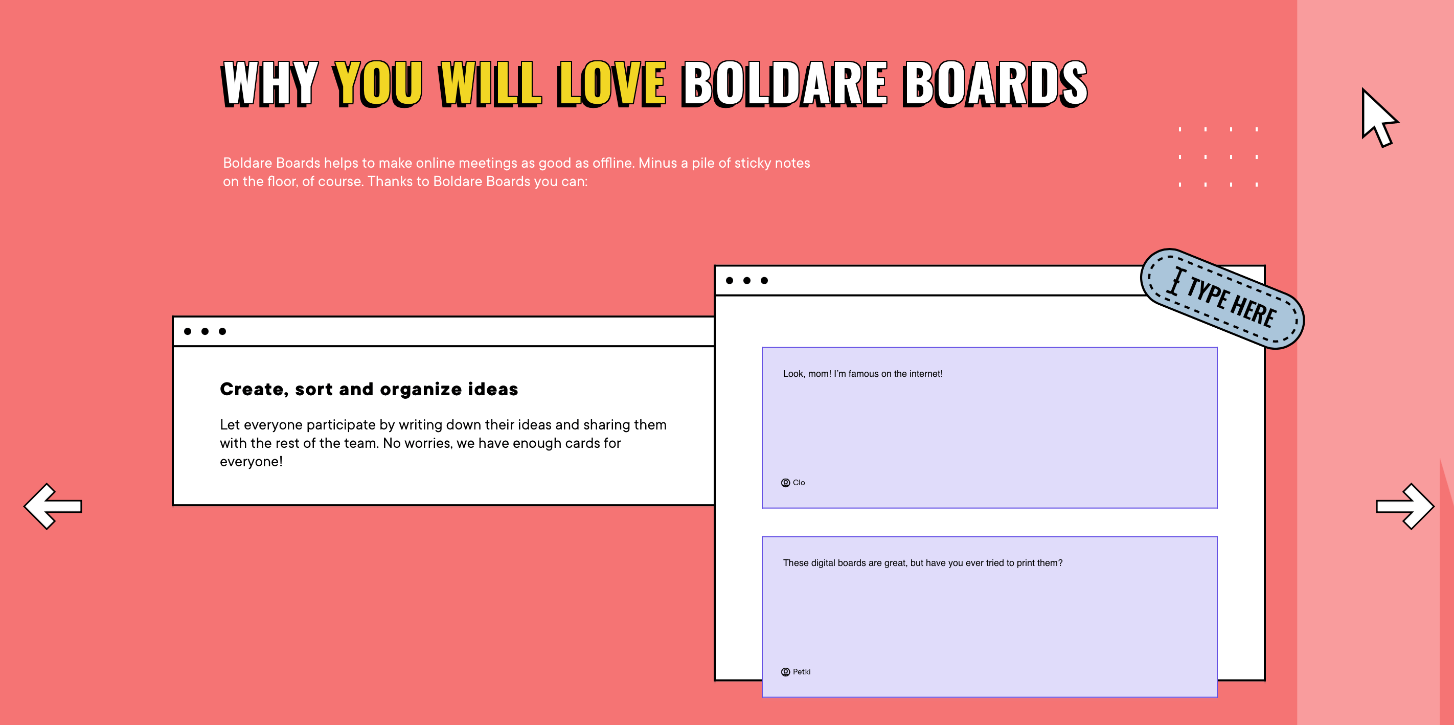
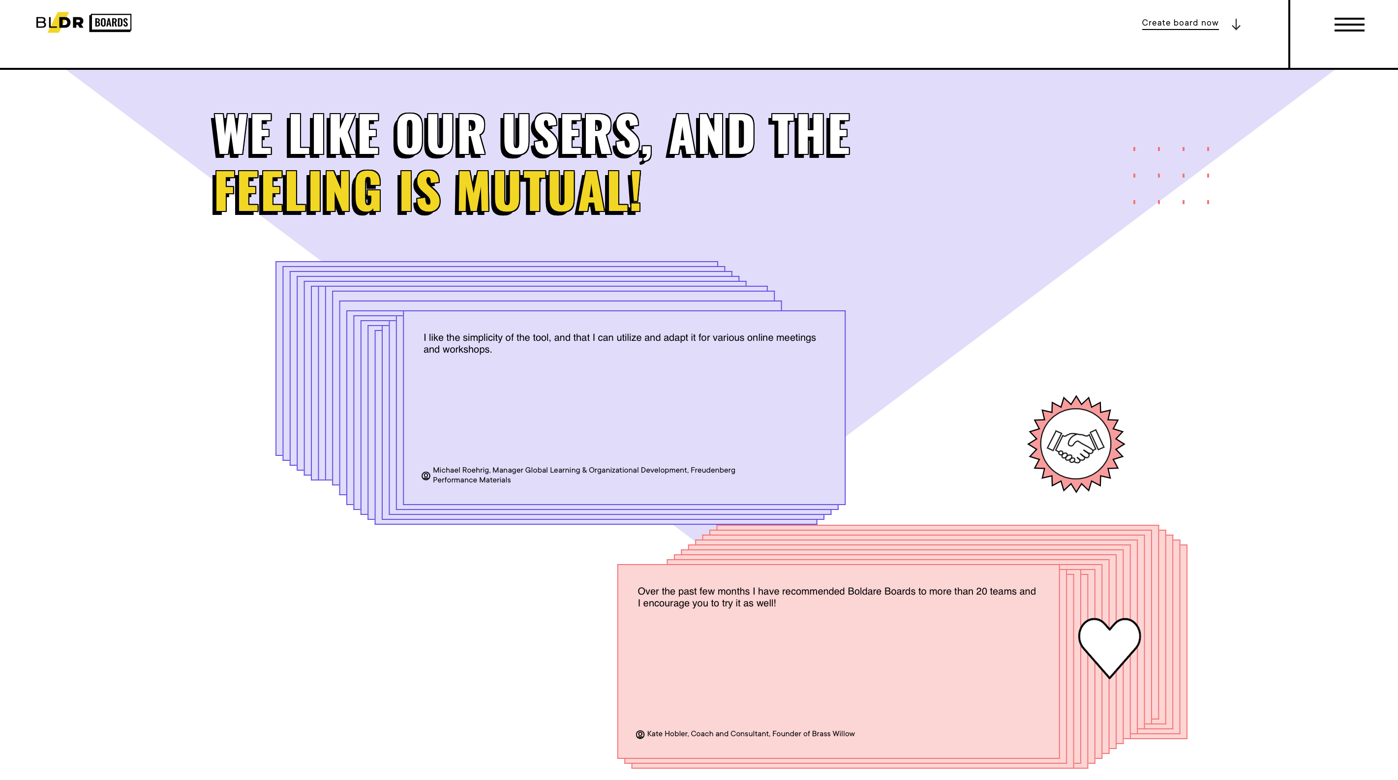
Boldare Boards is an online collaboration app for remote teams and their entire UI design is bursting with personality.
As soon as you land on the website, you’re transported to a retro, pop art-reminiscent world of colour, bold statement text and undeniably cool graphics. As you scroll, you’ll notice how the cursor icon changes from a hand to a large arrow and even to a love heart.
Along the way, you’ll also find an array of spinning animated graphics and smooth transitions from one section to the next.
This is a great example of how to pull off UI design that’s daring, a little bit out-there and entirely unique, ensuring a delightful and wholly unforgettable user experience.
See this awesome UI design for yourself on the Boldare Boards website.
7. Picksell
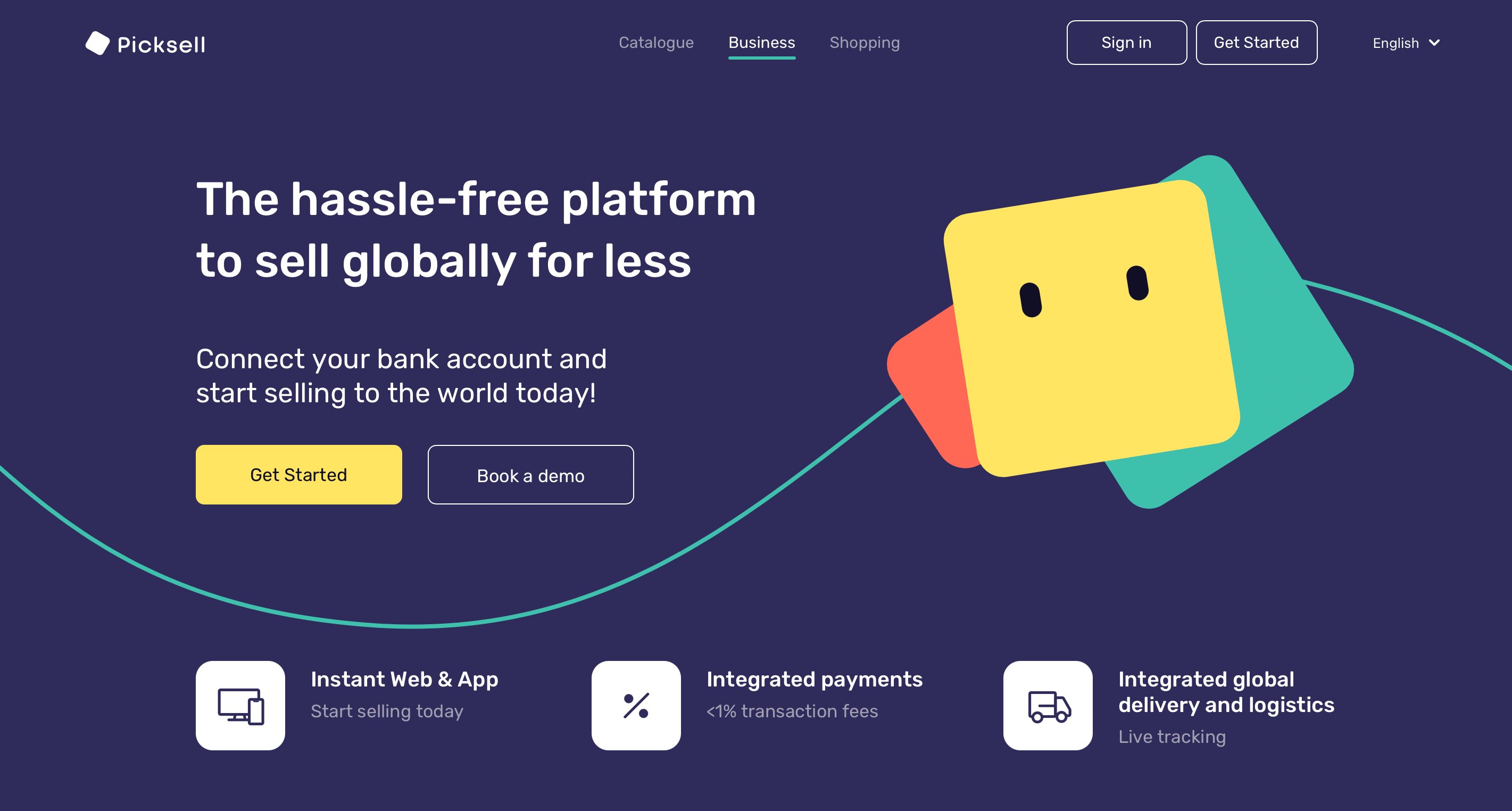
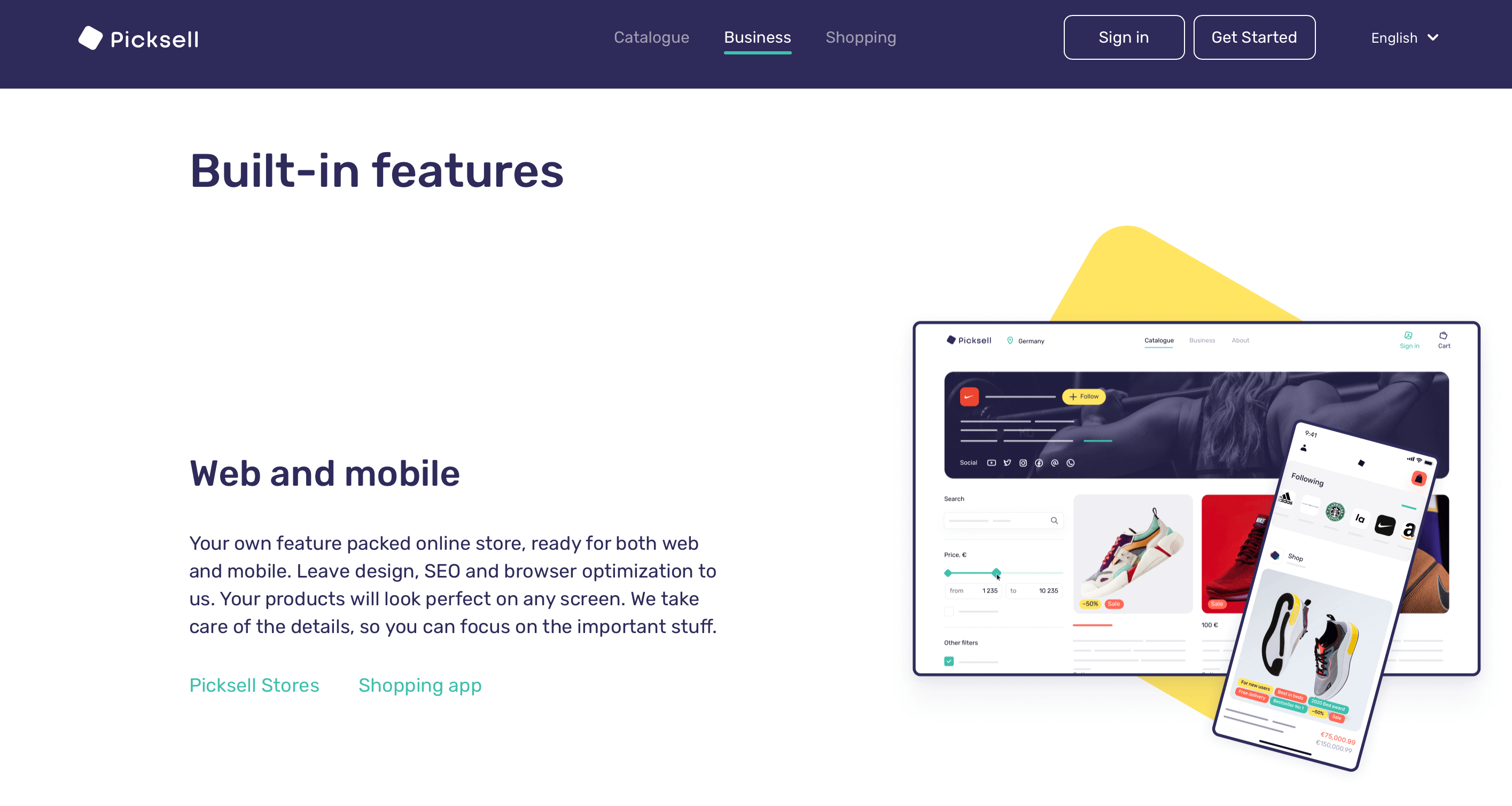
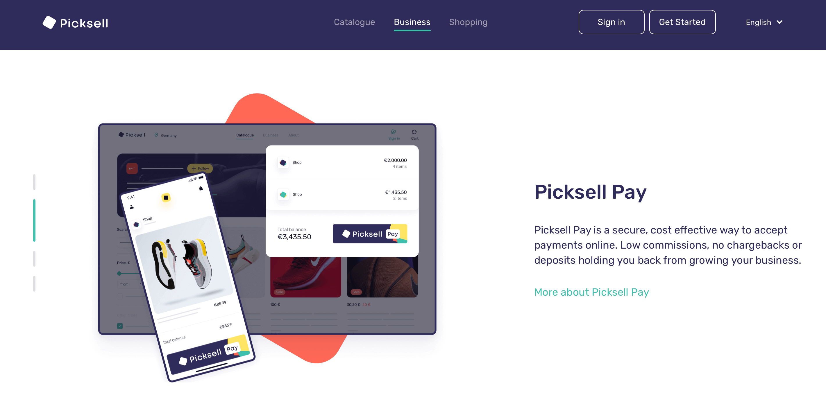
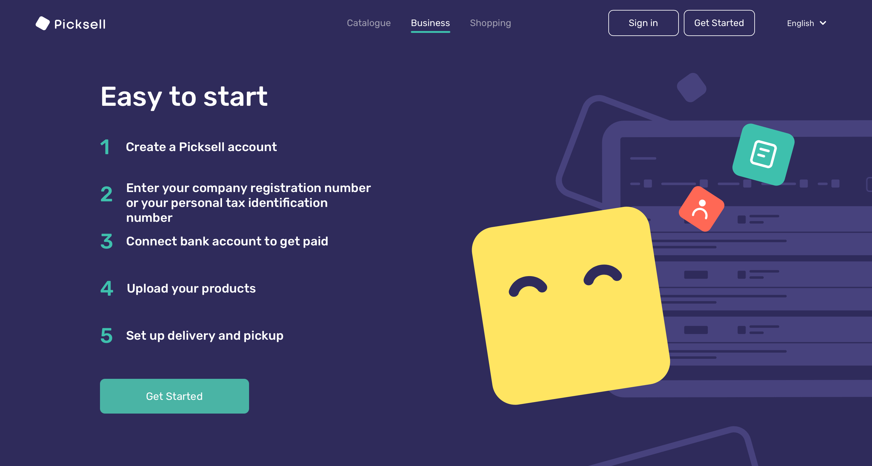
Picksell offers a payment solution for businesses who want to accept payments online. Their website is more information and text-heavy than some of the other UI design examples on our list, but they’ve perfected the art of spacing, card design and clearly divided sections to keep things easy for the user.
We love the bright yet modest colour palette, the simple graphics and clear call-to-action buttons and the neatly contained text blocks with their fuss-free font. Altogether, this evokes a professional yet friendly and accessible feel — right on-brand for the product on offer.
Picksell is a great example of how to present lots of information without compromising on clarity or overwhelming the user.
See more on the Picksell website.

8. Boots Online Doctor
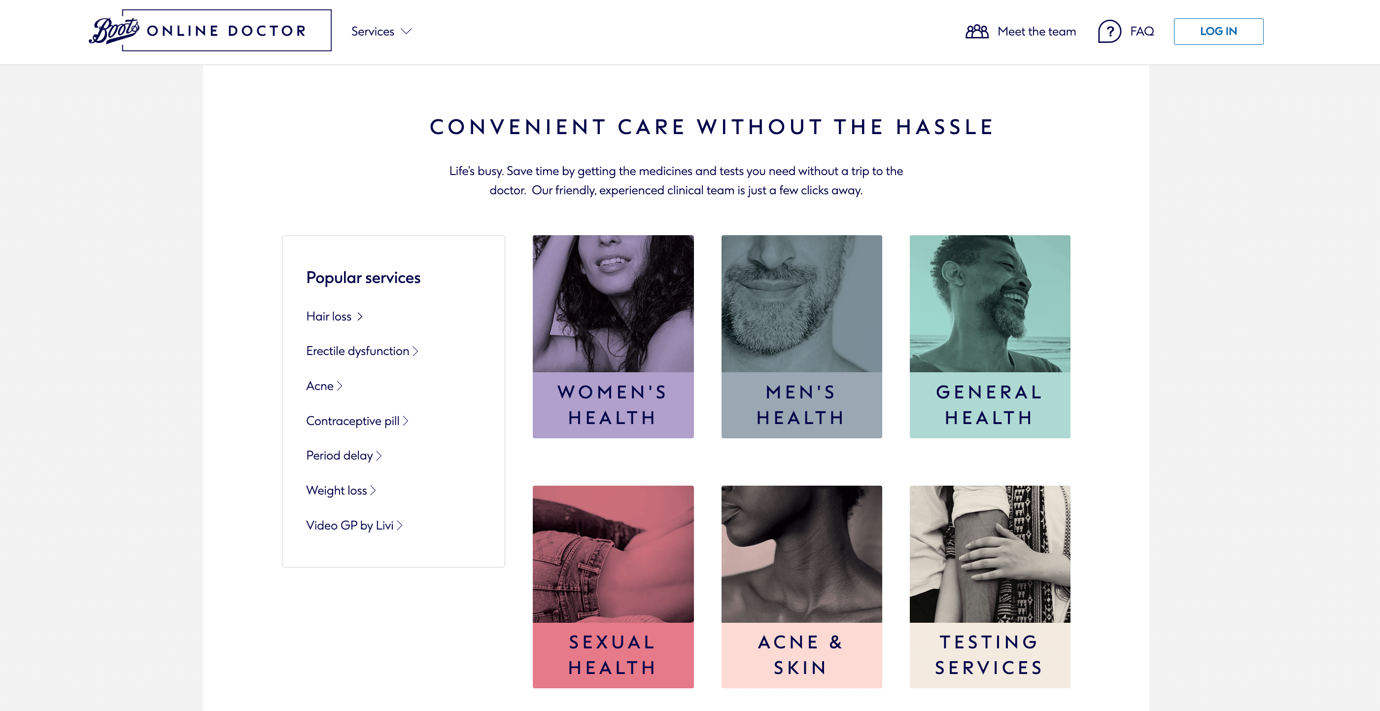
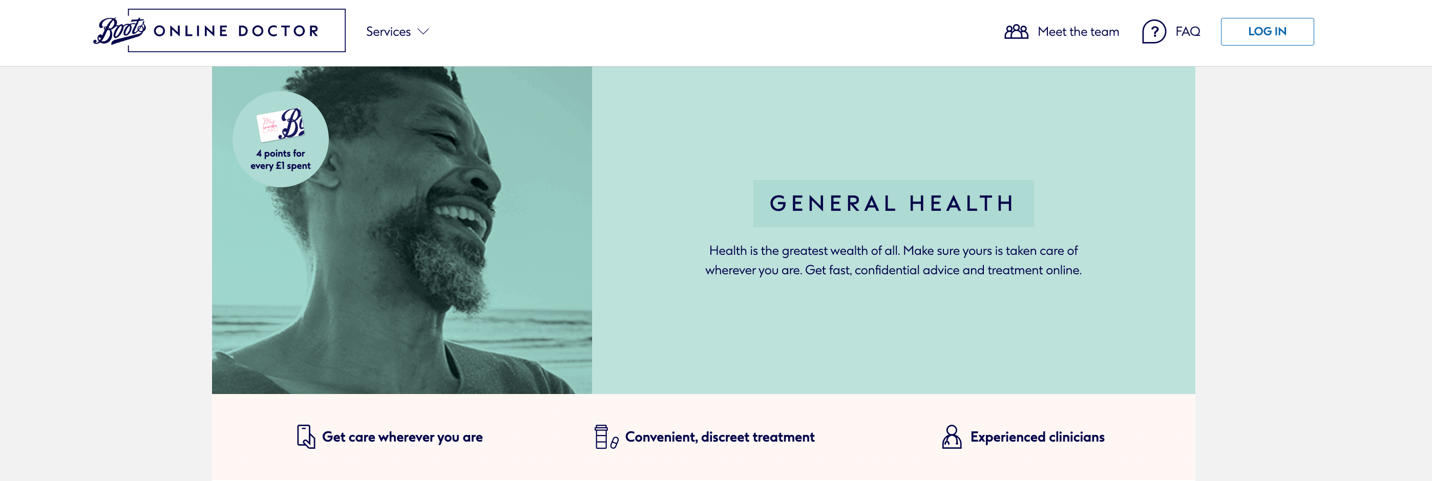
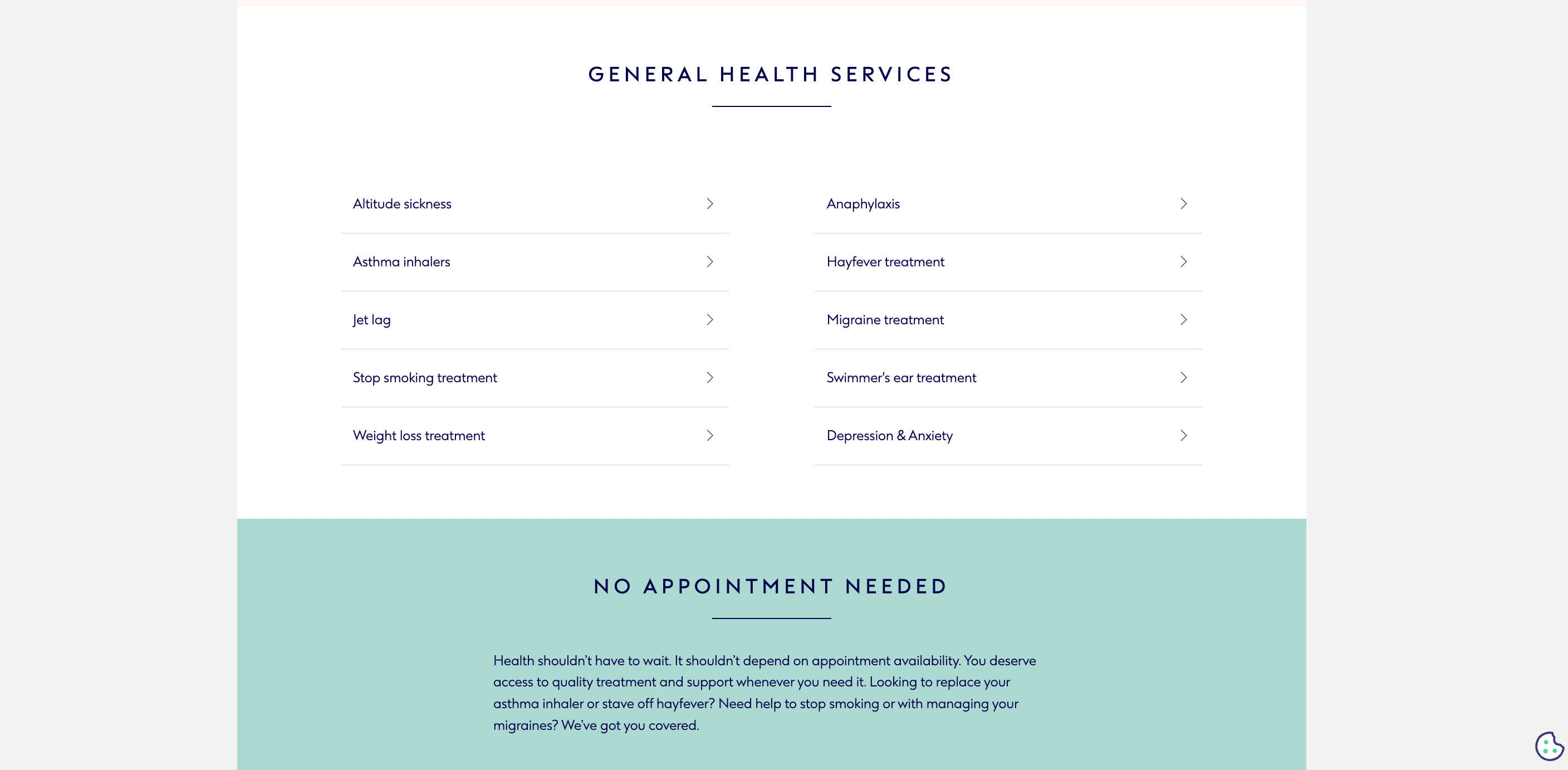
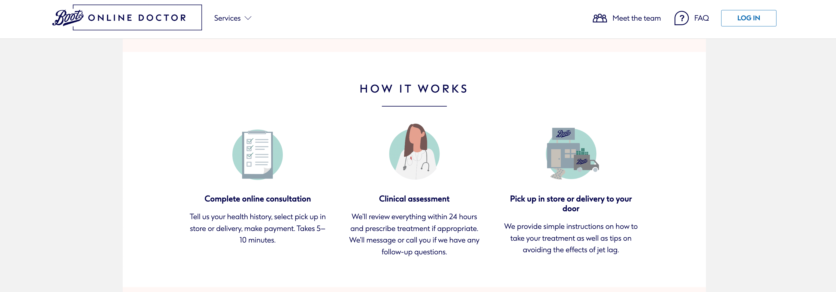
So far, we’ve seen some rather bold and beautiful examples of UI design. But sometimes, you just need to keep things classic and simple, like the Boots Online Doctor website.
The pastel colour palette evokes calm and composure, while the use of card design clearly and neatly divides the different healthcare services and topics into easily identifiable sections. The typography is a plain, no-frills affair, allowing the user to quickly find the information they need.
The simplicity and accessibility of this UI design is no coincidence. In a branch like healthcare, it’s important to opt for a design that conveys credibility, authority and trustworthiness. And that’s exactly what the UI designers behind this website have achieved.
Explore this example of good UI design further over on the Boots Online Doctor website.
9. Built In
Our final example of good UI design comes from Built In, an online community and recruitment solution for startups and tech companies.
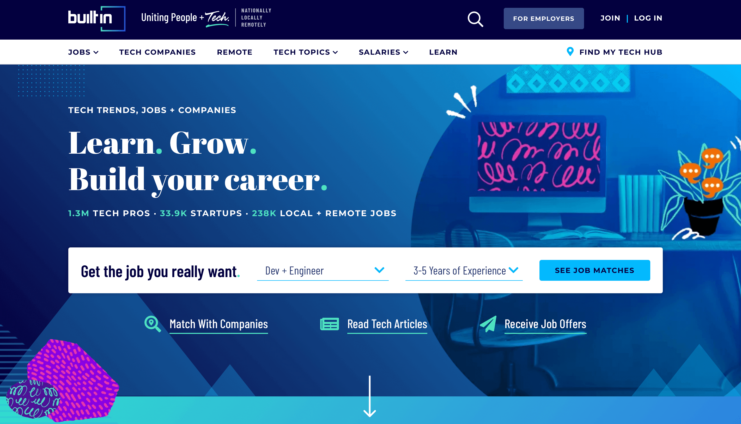
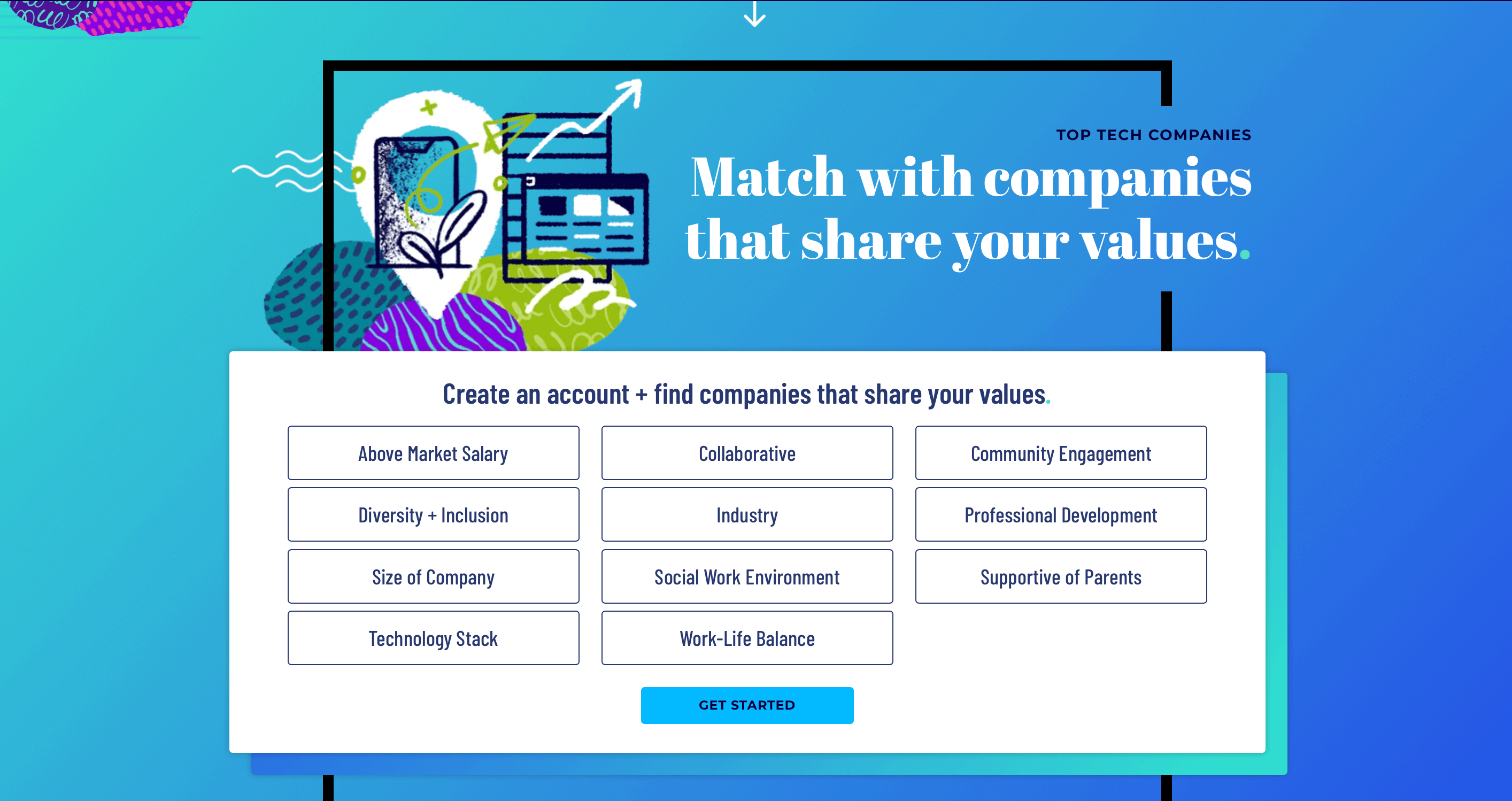
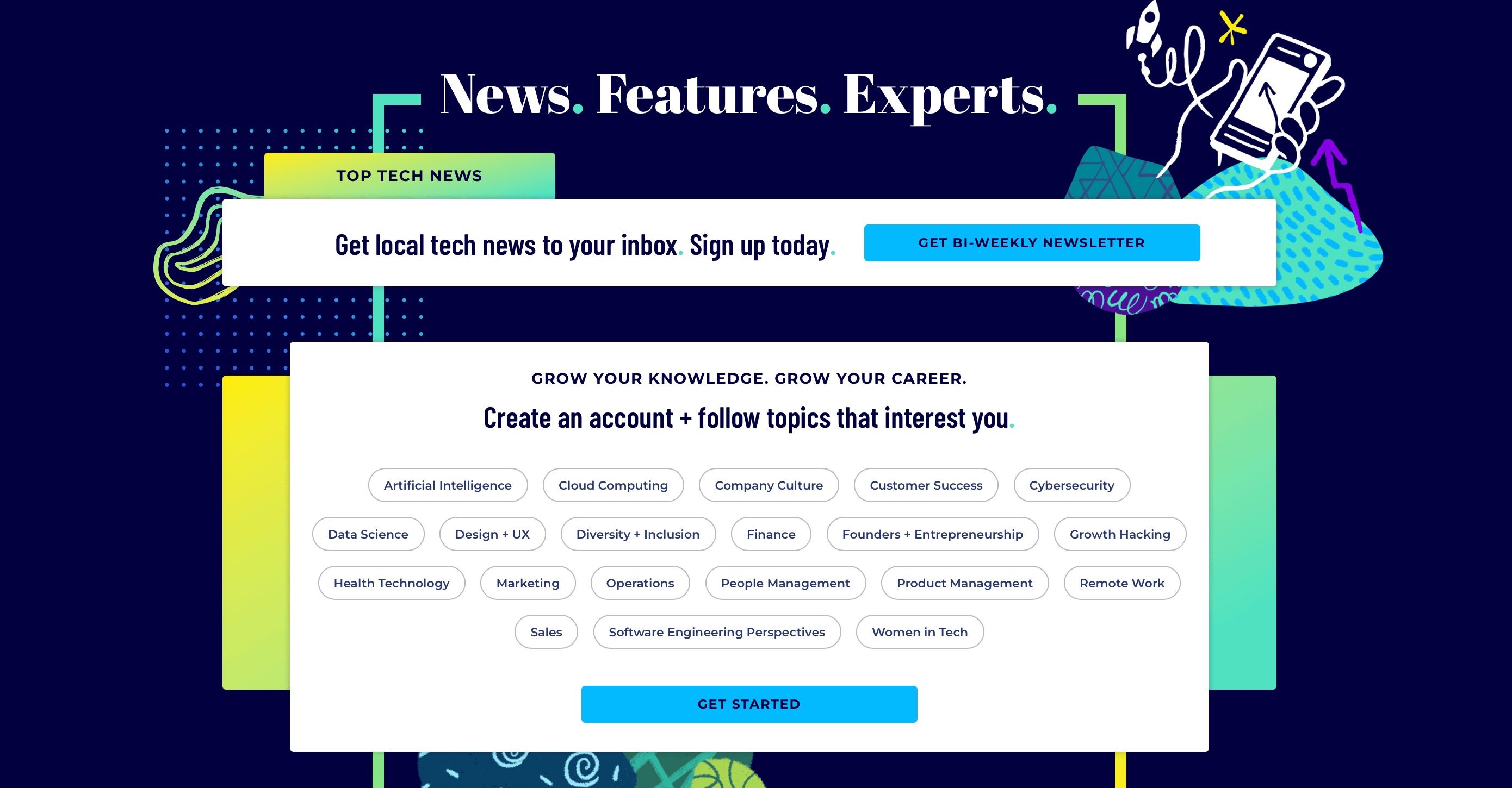
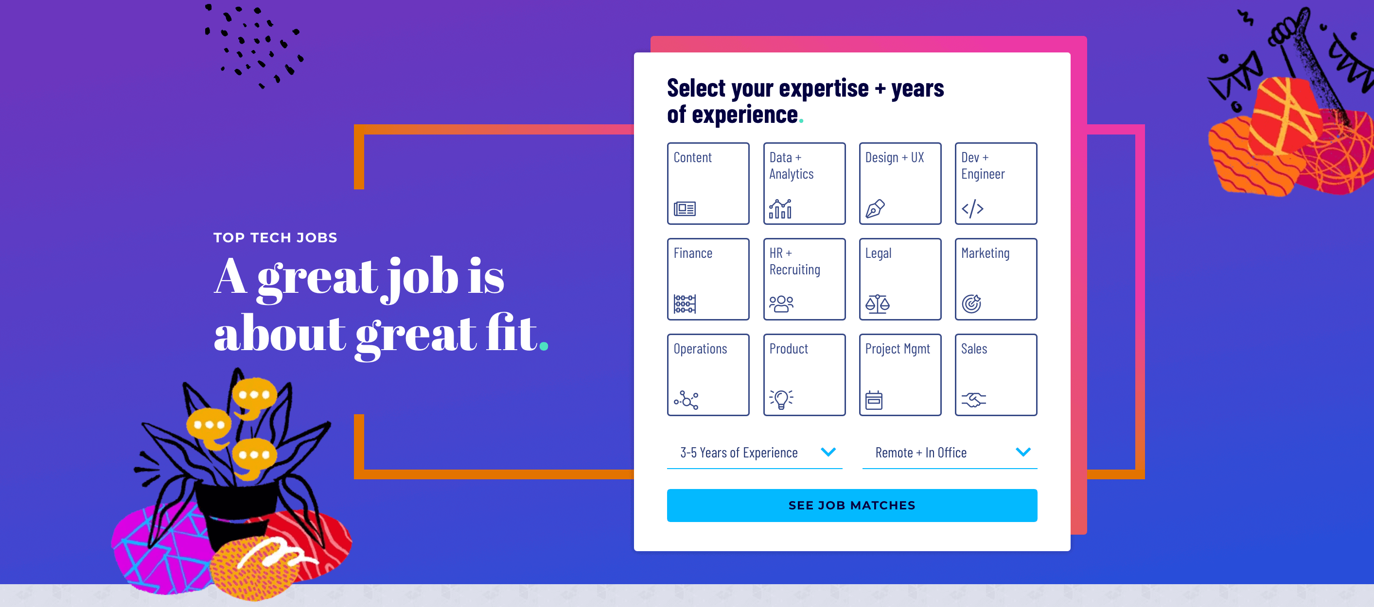
There’s lots going on on the Built In website and this is one of the busier UI design examples we’ve seen. However, it works because there’s plenty of colour contrast, with the most important clickable elements emphasised in white, as well as a clear division between the individual sections.
The colour palette and typography are pretty bold and funky, giving the UI a modern, science-y feel. We especially love the cool, somewhat abstract custom illustrations and bold lines that are featured throughout and the topic tags at the bottom of the homepage are a nice, user-friendly touch.
The team behind this website have done an excellent job of creating something unique and presenting a wealth of information in a logical, cohesive manner.
Scroll through the Built In website yourself to see this example of good UI design in action!
Learn more about UI design
When it comes to creating beautiful, functional, user-friendly UI designs like the ones we’ve explored in this post, there’s a lot that goes on behind the scenes. If you’re curious about UI design and would like to learn more, we can recommend this guide explaining what UI design is, as well as this one exploring what a UI designer does.
Want to become an expert UI designer yourself? Consider one of these UI design courses.

