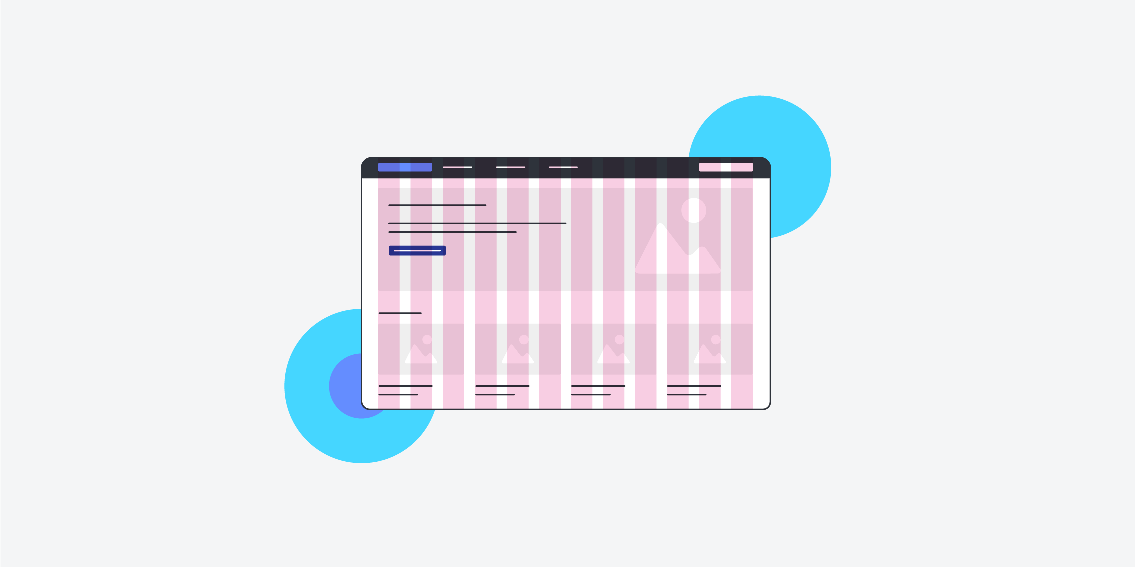
Grid systems are the foundation of well-designed websites. By using grids, web designers can ensure that their websites have a clear hierarchy, are easy to navigate, and look aesthetically pleasing. What’s more, grids facilitate the web design process by providing a guiding structure (and helping designers out of blank-page paralysis mode).
Unsure of how to use grids in web design? In this blog post, we’ll look at the role grids play in a seamless user experience, and discuss five golden rules for incorporating grids into your next project.
Here’s what we’ll cover:
- What is a grid?
- Why are grids important in web design?
- What are the different types of grids?
- How to create a website grid
- 5 golden rules to follow when creating website grids
- Final thoughts
Ready to get started? Let’s dive in!
1. What is a grid?
No matter the subject or style, you’ll notice that many websites follow similar web design conventions. For example, most websites have invisible margins on either side of the page—and the content will fall on certain lines, rather than being placed sporadically around the page. This is because most websites are designed using grids.
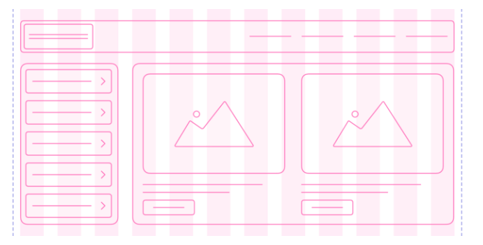
A grid system is an underlying structure that helps organise elements on a page. It combines various columns and rows, allowing designers to arrange UI elements in a consistent pattern or format. This makes it easier for users to navigate through the page or app without getting confused or frustrated.
Think of grids as the skeleton of a website or app.
[Via Muzli]
A well-designed grid system creates balance, symmetry, and uniformity throughout the design. It’s essentially a virtual map that any website designer will use to design the page layout. Attempting to design a digital interface without one would be like trying to build a house without a blueprint.
2. Why are grids important in web design?
One of the most important pillars of web design is usability. If users can’t find what they’re looking for quickly and easily, they’ll likely leave your website without a second thought.
Grids make it easier for users to find what they need by providing visual cues about where things are on the page. They also help create a more consistent experience by ensuring all page elements line up correctly, even when viewed from different devices or browsers. This means that no matter how someone views your website, they’ll have a friction-free experience navigating it—instead of getting frustrated due to misaligned elements or confusing layouts.
In addition to helping users, grids help facilitate a smooth web design process. Rather than having to design each page from scratch, designers use grids to help break down a webpage into individual elements that they can easily place within the existing structure (kind of like a game of Tetris!).
3. What are the different types of grids?
Now that we’ve got a handle on what grids are, and their role in the web design process, let’s look at five of the most common grid systems you’ll find in everyday digital products.
Column grid
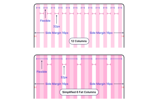
Columns are vertical page divisions that organise content into sections. Each column should have consistent widths throughout the page to allow the layout components to fit proportionally within each row. Websites can have anything from two to 16 columns that span the width of a landing page.
The horizontal dividers between columns are called gutters, and should be as uniform in width as the columns. They provide white space between elements on the page, making it easier for users to distinguish between different components.
[Via Muzli]
Hierarchical grid
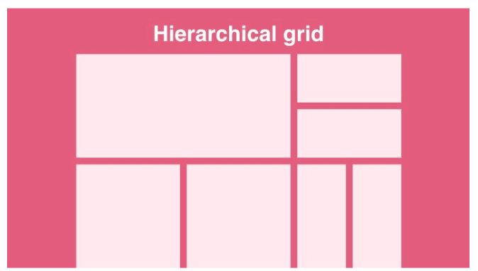
Hierarchical grids are a little more flexible, and help designers arrange content in order of importance. Hierarchical grids divide a page into columns and rows. But unlike column grids, it also introduces a clear hierarchy to the page by emphasising certain elements over others.
Hierarchical grids are especially popular on text-heavy websites, like blogs or news sites, where they’re used to feature the latest content.
[Via UX Collective]
Manuscript grid
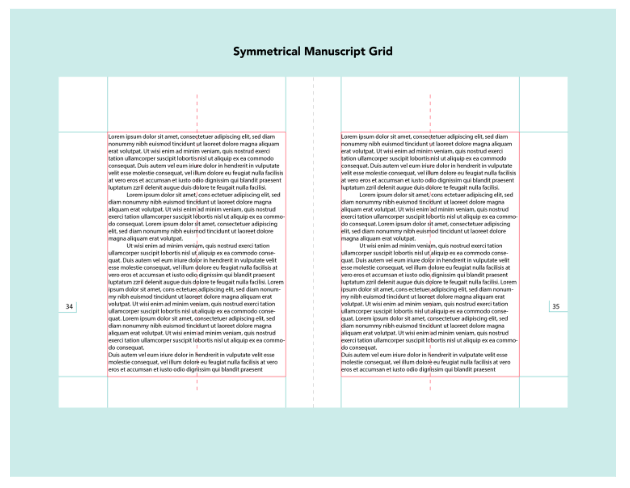
Like hierarchical grids, you’ll find manuscript grids on text-heavy websites like blogs—as well as offline resources like newspapers and magazines. It consists of large, single columns designed to accommodate large amounts of text without overwhelming readers. Manuscript grids also allow for plenty of white space around text blocks so readers can quickly scan through content without experiencing ‘information overload.’
[Via Visme]
Baseline grid
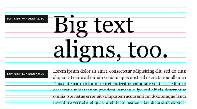
A baseline grid uses horizontal lines rather than boxes or columns. These lines are crucial for ensuring consistent spacing between each textual element, and help make your webpage readable and accessible. Baseline grids are particularly useful for re-scaling content, while maintaining set conventions for spacing and leading between elements.
[Via InVision]
Modular grid
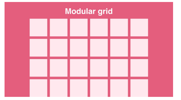
The modular grid combines all four previous types—columns, hierarchy, baselines, and manuscripts—in one unified structure. Modular grids are made up of square or rectangle content blocks that can be arranged according to their size and importance, to achieve maximum visual impact.
[Via UX Planet]
4. How to create a website grid
Now for the fun part: Creating your very first website grid! For beginner designers, creating basic website grids has never been easier. Most best-in-class design tools like Sketch and Figma have built-in grid layouts you can use (and customise).
Let’s take a quick look at how to get set up with a website grid in Figma.
Once you’ve chosen your screen size, the first step to creating a grid system in Figma is to enable the layout grid option. To do this, click on “view” on the top menu bar and select “layout grids” from the drop-down menu. This will display a column of numbers that represent different breakpoints.
Breakpoints refer to different device sizes and orientations. If you’re designing a website for desktop screens, for example, you might want to set your breakpoints at 1280px or 1440px instead of 1024px. It’s key to decide which breakpoints work best for your project before you set your grid dimensions.
Once you’ve decided on your breakpoints, it’s time to adjust your dimensions accordingly. You can do this by selecting “layout settings” on the right-hand side of the screen. There, you can play around with the grid properties—and even change the kind of grid you’re using.
Then, you can start designing your elements according to your grid! To learn more, check out Figma’s own guide to implementing and editing grid layouts.
5. 5 golden rules to follow when using grids in web design
Grids might seem straightforward enough—but when misused, they could make your site more complex. To help guide you, we’ve rounded up some essential rules to follow for an optimal website layout.
Choose the right grid
When getting started with a new web design project, it might be tempting to populate the page with the most common grid (i.e., Column or modular) and go from there. But that might not be the best way forward.
To create an effective grid layout for your website, you need to choose one that best fits with its intended purpose. For example, if you want to create a simple blog or portfolio site, a basic 12-column grid might work fine. But if you need a grid for a more complex project, like an e-commerce site, then it may be worth looking into more dynamic grid systems that allow for maximum flexibility.
Use responsive grids
A cardinal rule of web design is ensuring your website is responsive across all devices. In other words, your website needs to work on various screens and devices. Enter: Responsive grids.
Unlike regular static grids, responsive grids use percentages to distribute the content uniformly regardless of screen size. They’re key for adapting your layout for various screens without distorting the content or dimensions.
Incorporate enough white space
White space (also known as negative space) should always be considered when creating grid layouts for websites. White space provides a visual break between different elements on the page, which helps make them stand out more clearly—and makes navigation easier for users. White space can also help bring focus to certain elements on the page, while still keeping everything organised and neat.
Grids are a valuable tool for ensuring ‘repetition of space’ between your elements—but it’s up to you to ensure the dimensions of your grid allow for enough white space around the page.
Honour the Rule of Thirds
The rule of thirds is a web design concept based on the principles of visual perception. According to the rule of thirds, designers should divide webpages into nine equal parts with two vertical and two horizontal lines. By placing the most important elements on the ‘thirds’ of the grid, users’ eyes will be naturally more drawn to them—which will influence how they navigate the site.
Considering the rule of thirds will influence which type of grid you use, and where on the grid you’ll place important elements.
Consider The Golden Ratio
If you want a pixel-perfect grid layout, it’s worth using the golden ratio. The golden ratio is a mathematical proportion that equals 1:1.618. If we consider this proportion a rectangle, its length would be 1.6180 times the width. This ratio can be applied to any shape or element, and is a helpful reference point when working out how to divide up the page—and how much space to allocate to each component.
6. Final thoughts
When it comes to web design, grids can be an invaluable tool in helping to create engaging and effective designs. By setting up columns, rows, and margins, design elements have room to breathe—and users can quickly get to grips with the interface without getting overwhelmed.
Following these five golden rules of grid usage can help you ensure that your design is clean, organised, and cohesive. If you take all these best practices into account as you approach your next design, you’ll be left with a professional, well-thought-out website that users will love.
To learn more about the principles of great web design, check out these related blog posts:
- 7 examples of good digital UX design
- 7 fundamental UX design principles all designers should know
- Good UX vs. Bad UX

