
 1")
If you’ve ever used a streaming service like Netflix, swiped on a dating app like Bumble or Tinder, or scrolled through a social media feed, you’ve likely encountered card-based design.
In UI design, cards are square or rectangular containers that present a concise unit of content. This is especially useful when you want to display many different types of content on one page without overwhelming the user.
When used in the right context, UI cards don’t just look great. They can also enhance the user experience significantly.
So when is it appropriate to use a card-based layout? And what are the exact benefits of card design? Discover everything you need to know in this guide.
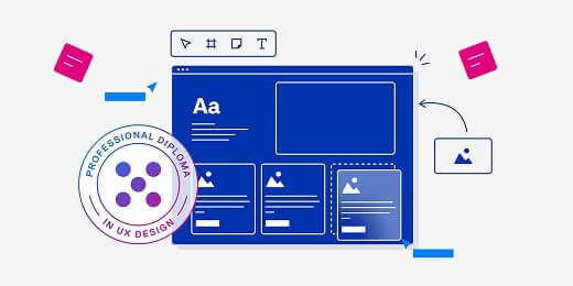
What is card design in UI? (With examples)
When designing a user interface, you want to present information in a way that’s aesthetically pleasing, easy to digest, and straightforward to navigate. Card design is one solution.
Card design involves dividing your content up into a series of cards—with each card representing just one item. The Nielsen Norman Group provides the following definition of a card:
A card is a UI design pattern that groups related information in a flexible-size container visually resembling a playing card.
You can think of each card as a content container with a clear border. This conveys each card as a distinct element, signalling to the user that all the information contained within that border is related—and should be perceived as such.
What’s the anatomy of a UI card?
A UI card typically contains:
- An image
- A heading (and, if necessary, a subheading)
- A short description
- A call-to-action
UI cards are clickable, providing the user with a snapshot summary and inviting them to click on their chosen card to expand on a particular piece of content. As such, UI cards are a doorway to further information—usually housed on a separate page or screen.
UI card design examples
Consider the home screen for Now TV, a British streaming service. Each show is contained within its own card. If you click on a card, it expands to provide more information about that particular program. Click the play button (the call-to-action) and you’ll be taken to a new screen to stream your chosen show.
 2")
 3")
The Fitbit app is another great example of card design in action. Each card represents a different piece of information on the dashboard: sleep duration, exercise days, zone minutes, and so on. Click on a card and you’ll be taken to another screen with a more detailed breakdown of the data.
 4")
When to use UI cards
Card design is ideal when you want to present heterogeneous content items—that is, many different types of content—on one page or screen.
Think of a dashboard that displays various data in different formats; say, bar charts, line graphs, pie charts, and percentages. Cards are a great way to separate each content type into its own distinct container, giving the user a clear overview of all key information on the page.
Card design also works best in contexts where the user is browsing rather than searching. When you log onto Netflix, for example, and don’t know what you want to watch, it’s useful to have a series of cards that you can scan through to find something you’re interested in. If you’re searching for something specific, on the other hand, you’d probably want the results presented in list format.
Card design is a popular choice for:
- Social media feeds. Think of sites like X and LinkedIn, where each individual user post is presented within its own distinct container.
- E-commerce sites. Card design is useful for showcasing individual products—think of sites like Etsy and ASOS.
- Blogs and online magazines, where each card represents a different article.
- Analytics dashboards. Many analytics platforms use card design to present different data points in a variety of formats.
- Project management tools. If you’ve ever used a tool like Asana or Trello, you’ll be familiar with the “Board” view where each project or task is represented by a UI card. You can then drag and drop these cards to categorise them.
- Dating apps. Swipe through apps like Bumble and Tinder and you’ll find individual UI cards to represent different user profiles. Click on a UI card and you can learn more about a potential match.
Now we know what card design is and when to use it, let’s delve deeper into the benefits.
The benefits of card design in UI
There are several benefits of using card design for your UI:
- UI cards are versatile. They can be used for many different content types, and they work well for a variety of digital products—from weather apps to accounting software to dating platforms, and many more.
- Card design is conducive to responsive design. UI cards are easily scalable and can adapt to different devices, screen sizes, and page orientations—ensuring a seamless user experience no matter what.
- UI cards are scannable. People don’t want to be overwhelmed with dense blocks of information; they want bite-size snippets that are easy to scan and digest. With UI cards, you can present many different types of content on one page or screen without sending your users into cognitive overload. That’s crucial for providing a positive user experience!
- Card design helps with consistency. Even if you’re displaying lots of different content types on one screen, UI cards will ensure that your interface is visually coherent. This creates a predictable user experience, enhancing the usability of your interface.
- UI cards are great for creating a clean, clutter-free aesthetic. Card design organises your content into neat containers, bringing structure to the page and creating interfaces that are visually pleasing.
How to design UI cards: a step-by-step guide
Want to incorporate UI cards into your next design project? Here’s a step-by-step guide to get you started.
1. Define the content
Consider the purpose of your UI cards. What kind of content will they present? This will help you determine what elements to include in your cards, and how much real estate to allocate to each.
If you’re designing UI cards to display user profiles on a dating app, for example, you may want most of the card to be taken up with a photo. If you’re designing UI cards for blog articles, on the other hand, you might opt for a smaller thumbnail image and more text.
2. Sketch the layout
With pencil and paper (or a simple wireframing tool), sketch the basic layout for your UI cards. Think about where each element will sit—will you place the headline at the top with an image beneath, or the other way round? Where will you position the call-to-action? Experiment until you’re happy with the structure.
3. Design your UI cards
You’ve got a basic layout in mind. Now it’s time to design your cards. Open up your chosen design tool—Figma, Sketch, and Adobe XD are all popular choices, or you can find more UX and UI design tools here.
Starting from a blank canvas, design your UI card bit by bit. Use the shape tool to create a square or rectangular container, then add your desired elements such as heading and subheading text, an image, and a call-to-action.
4. Style your cards
Next, style your cards to make sure that they’re visually appealing, on-brand, and accessible for the end-user.
Define your colours, ensuring plenty of contrast between text and the card background, and style the text. Use a typeface that’s easily legible, and apply appropriate fonts and font sizes to different text elements.
Need some guidance with this step? Learn how to make effective colour choices with this complete guide to colour theory, and use these 5 simple hacks to take your UI from good to great.
5. Define interactive properties
Last but not least, think about how the user will interact with your UI cards. Will they be able to hover over them? Click to expand them and reveal more information? Swipe them? The interactions you define will depend on the context.
Remember that every interaction should provide the user with feedback. With hover states, for example, the UI card might change colour, get bigger, or produce a drop shadow.
Once you’ve got a working prototype, test your designs to make sure that they look great and function correctly on different devices and screen sizes.
The takeaway
With well-designed UI cards, you can present diverse types of content in a clear, organised, and digestible format. This achieves a clean, clutter-free aesthetic—and, most importantly, it provides a positive user experience, ensuring that your interface is intuitive, responsive, and easy to navigate.
Want more UI design tips and inspiration? Check out these guides:
- Designing for mobile: 5 best practices for UI designers
- A complete guide to responsive grids (and how to use them)
- 8 UI design dos and don’ts (with examples)

Emily is a professional writer and content strategist with an MSc in Psychology. She has 8+ years of experience in the tech industry, with a focus on UX and design thinking. A regular contributor to top design publications, she also authored a chapter in The UX Careers Handbook. Emily also holds a BA in French and German and is passionate about languages and continuous learning.