Designing for speed is becoming an increasingly important pillar of good UX. The more users interact with high-speed web pages and apps, the more frustrated they’ll be when faced with longer loading times.
Unfortunately, load times aren’t always in a designer’s control. But with content-heavy web pages that take slightly longer to load, it’s up to UX designers to find ways to manage users’ expectations and around what exactly they’re waiting for (and how long they’ll be waiting for it). This is where skeleton screens, a user interface (UI) feature, enter the process.
In this article, we’ll unpack the psychology behind why skeleton screens are so effective, the different types of skeleton screens you can use, and when not to use them.
Here are the sections we’ll cover:
- What is a skeleton screen?
- Why are skeleton screens useful?
- Different types of skeleton screens (with examples)
- How to use skeleton screens
- Skeleton screens: The verdict
What is a skeleton screen?
The term ‘skeleton screen’ might conjure up images of halloween-style skeletons you can look at while the page loads — but the reality is less spooky. Skeleton screens help users focus on their tasks by providing a distraction-free view while they wait for content to load. They can also be used to indicate activity and to communicate the purpose of an app or website.
They serve four main purposes. They:
- Show users what’s happening
- Give users some idea of what’s coming next
- Communicate that you’re working on their problem
- Provide users with an indication of how close they are to seeing the actual page
Skeleton screens have been around for a long time but they’re becoming an increasingly popular UX optimisation tool — particularly when it comes to minimising cognitive load. People enjoy using them because it helps them visualise how the page will look when it finishes loading and it provides feedback when there is activity going on in the background.
A skeleton screen isn’t just a blank page or an error message: it’s something that has been carefully crafted with user experience in mind. By providing a distraction-free view while waiting for content to load (like an image of an empty room), skeleton screens help users focus on their tasks while they wait instead of worrying about whether they’re doing everything right.
Skeleton screens are most effective when they’re used alongside other methods such as animated spinners or static images.
Why are skeleton screens useful?
When a user arrives on an app or website page and nothing happens, they’ll assume something’s wrong. To encourage positive user experiences, it’s important to clearly communicate what’s happening when the page loads.
A spinner icon might seem like the obvious choice for communicating that something’s happening or to let the user know that they need to wait. But research shows that empty states without any indication of progress are less successful at encouraging users’ trust.
Skeleton screens can be used as a way to communicate with users that there is activity happening in the background — and, crucially, that it won’t take long. By giving them some visual clues about how long they’ll have to wait before being able to use the site again, you can help build trust between the user and your product.
Long load times can annoy users but skeleton screens provide feedback at key points and make those wait times more bearable. You can also use a skeleton screen to indicate activity. For example, animated skeleton screens can be used as a progress indicator or even as an error message that indicates something went wrong.
Different types of skeleton screens
There are three main types of skeleton screen:
Content skeleton screen
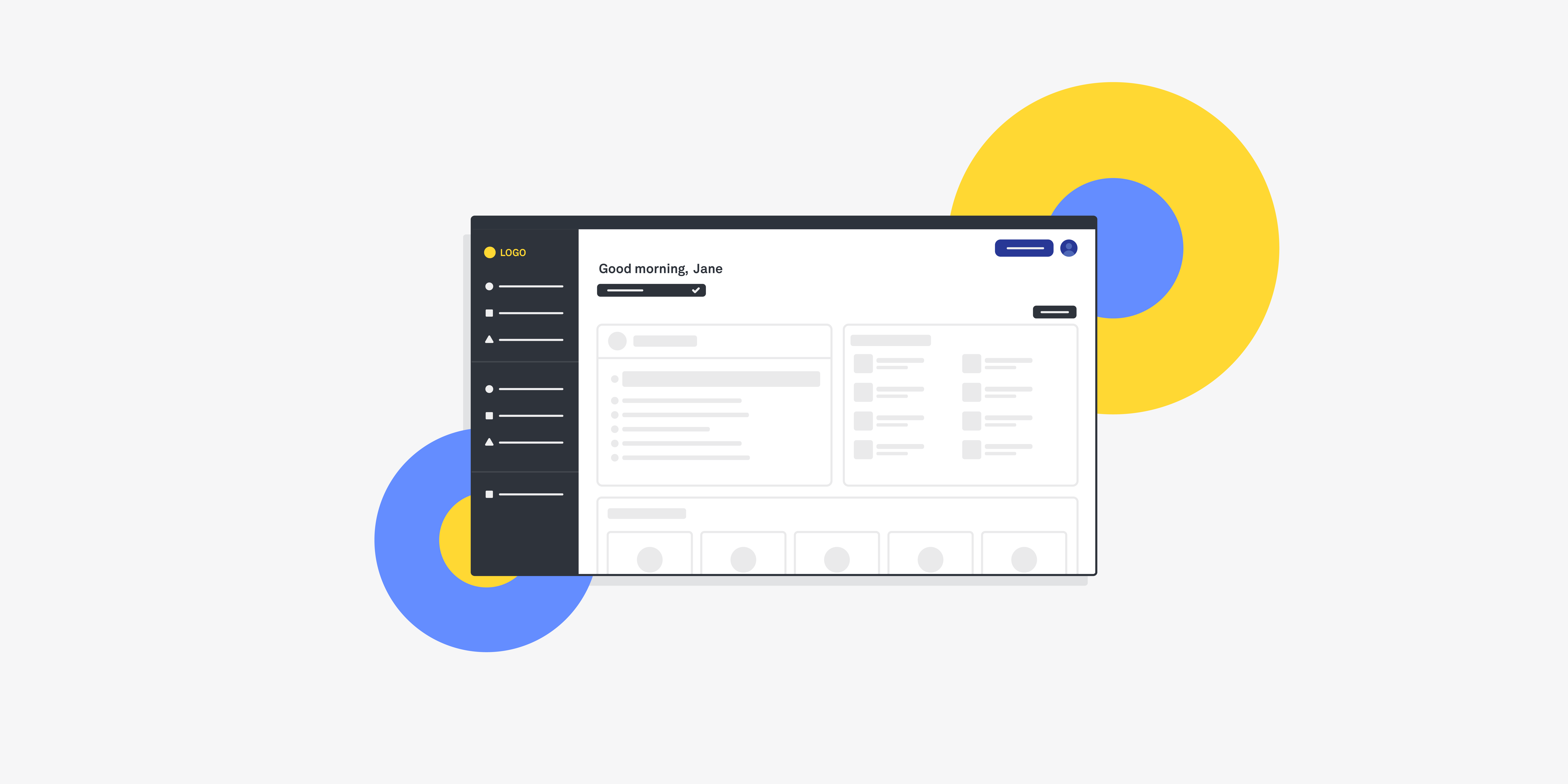
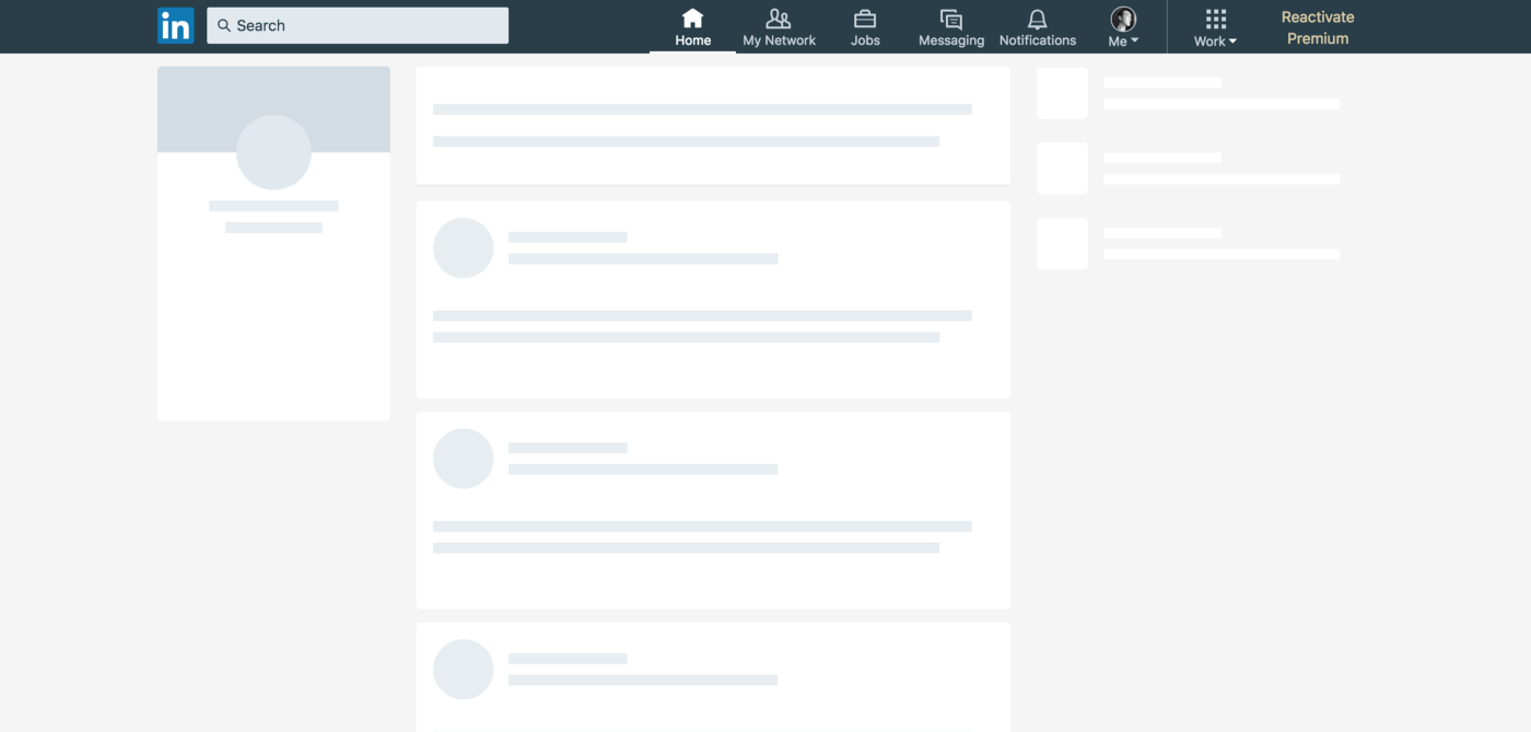
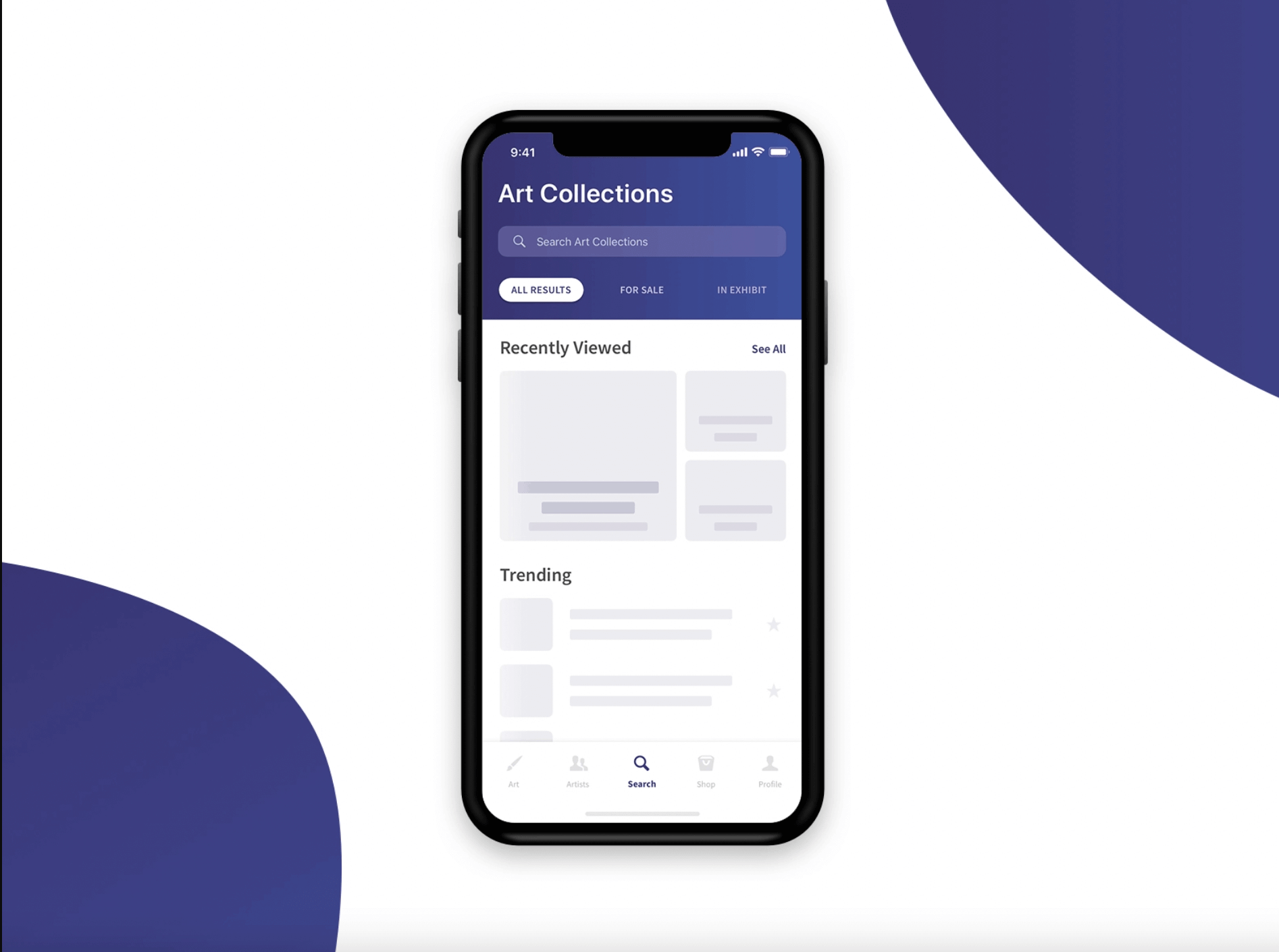
Similar to wireframes, the most common skeleton screen is usually made of basic, static elements. They’re usually designed in greyscale in a way that replicates the actual layout of the page without being distracting. Even high-performing websites like LinkedIn, YouTube and Slack use classic skeleton screens to offset the effects of loading times.
Skeleton screens can be used in tandem with real text, to communicate that the text has loaded but the visual content is still getting there.
[Source – uxdesign.cc]
[Source – Dribbble]
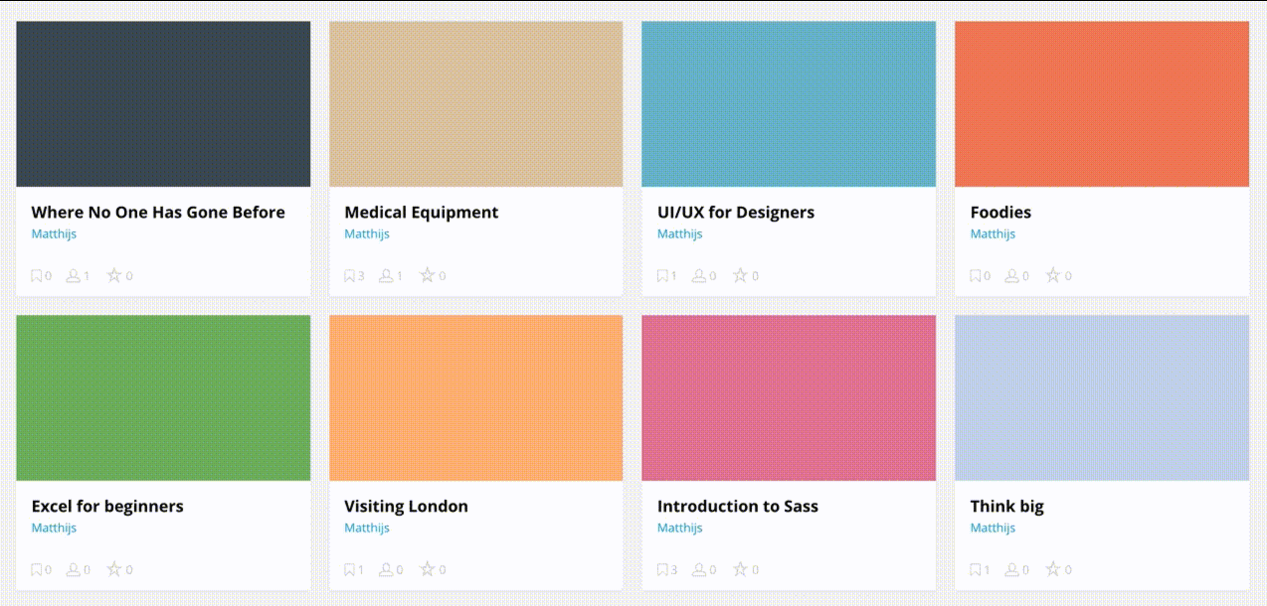
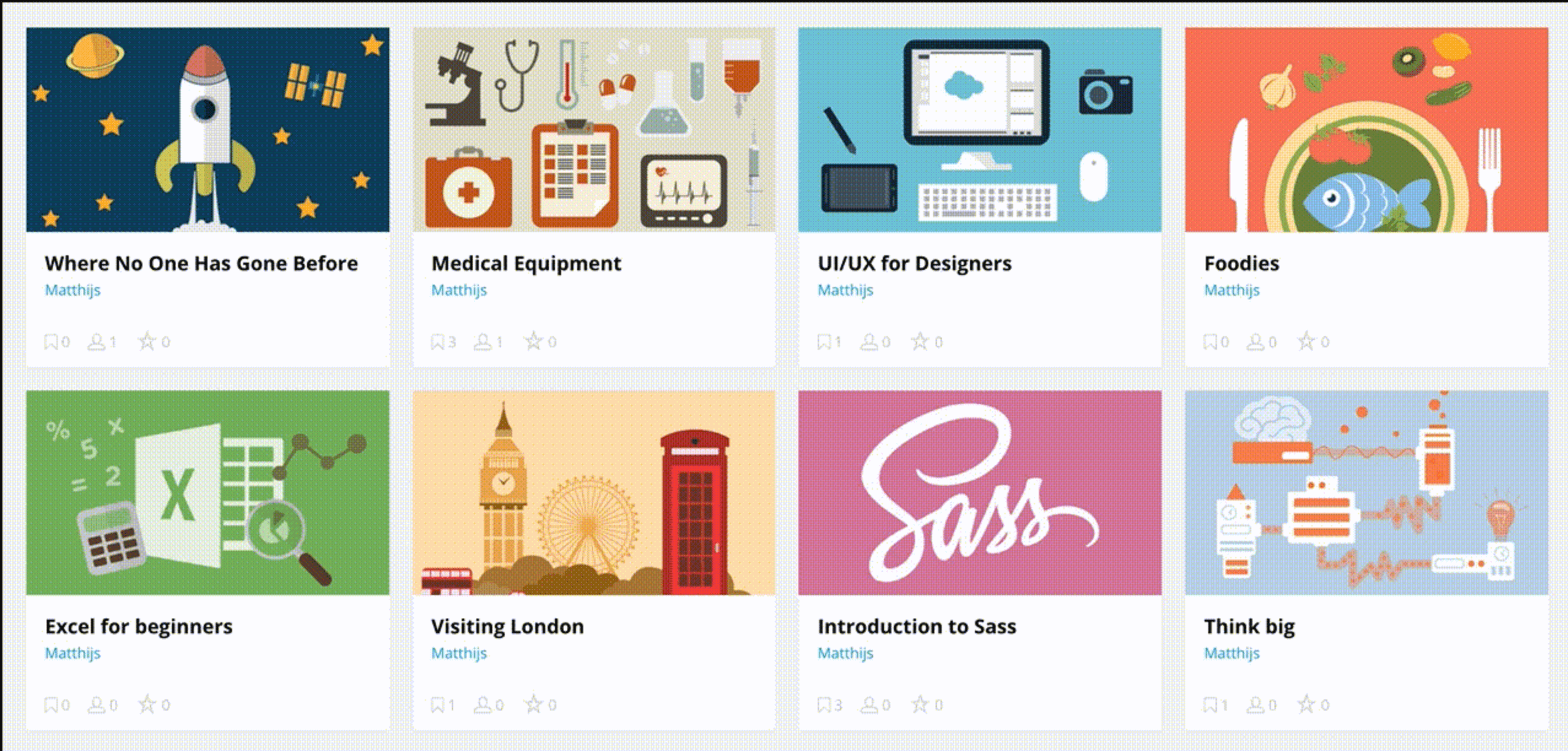
Image-based websites, like Pinterest or Pixabay, rely on colour placeholders while their images load. In addition to simulating the UI layout, colour placeholders display the main colour in the image that’s still loading — making the page more aesthetically pleasing than it would be in greyscale.
Before:
After:
[Source – freecodecamp.com]
Animated skeleton screen
Adding motion to skeleton screens can decrease perceived loading time. Usually, these animations are subtle; such as a shimmer that moves from left to right, impersonating how users would read the content. Some skeleton screens also include pulsating motion – or fading in and out – to indicate progress.
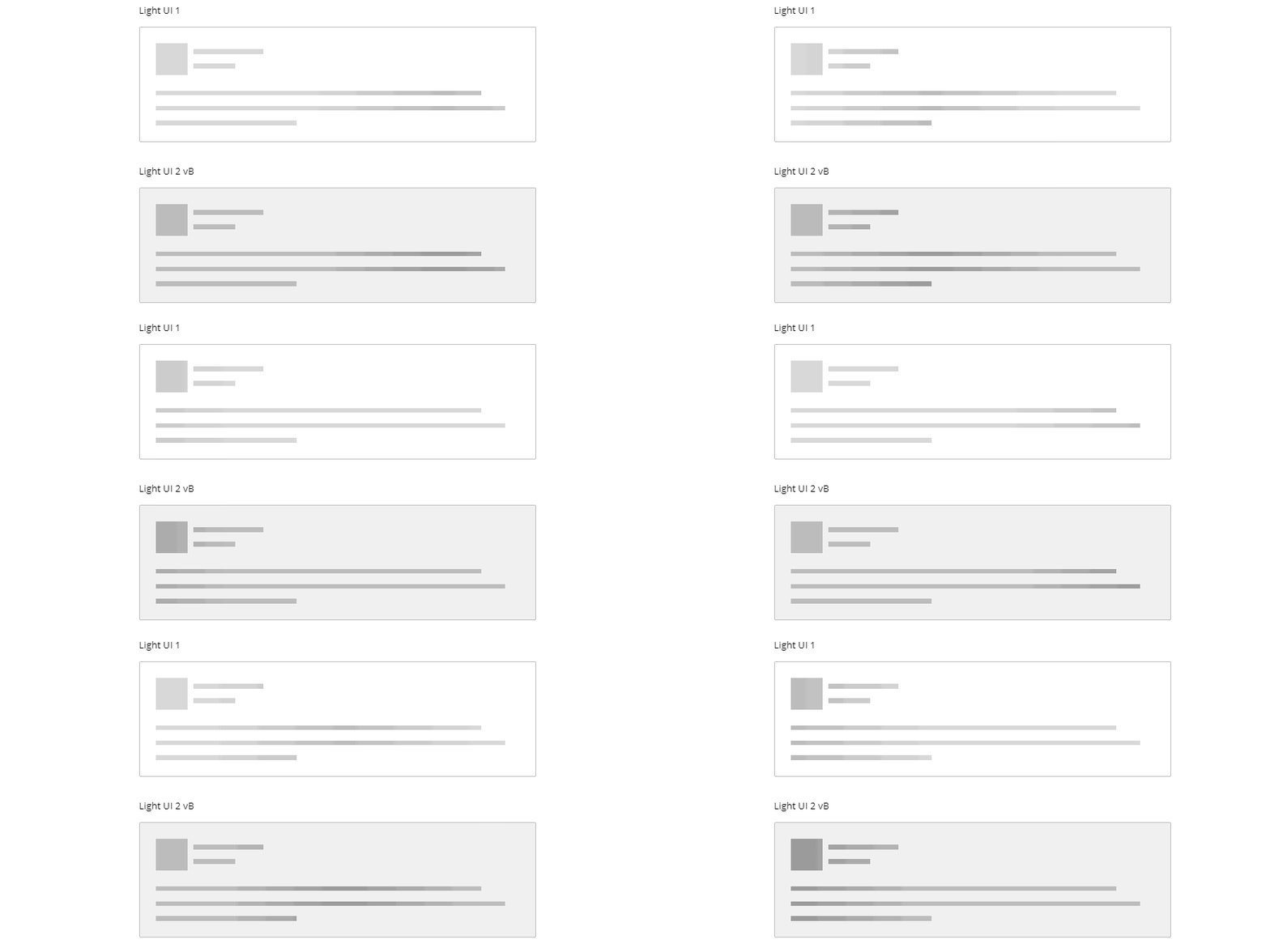
[Source – codemyui.com]
How to use skeleton screens
Skeleton screens are a great way to keep users engaged with your product. But they don’t work in every context and they need to be used strategically.
One of the most common uses for skeleton screens is on content and image-heavy web pages, such as dashboards, cards or lists. If a web page needs to load multiple images at the same time or pull data from several different sources, you’ll likely need a skeleton screen to avoid frustrating your users.
If expected load times are exceedingly long, it might even be worth considering lazy loading instead — the practice of only displaying what’s necessary on the page, while the rest of the content loads in the background.
When not to use skeleton screens
It might seem like there are no possible downsides to using skeleton screens — but depending on your audience, they can cause more confusion than clarity. Here are a few examples of when skeleton screens aren’t the right visual cue (and what to use instead):
- Fast-loading pages. As skeleton screens are most commonly used for slow loading times, there’s no point in your users only seeing them for half a millisecond before the page loads. In this case, you don’t need anything.
- Video content. Spinners are considered the industry-standard sign for video buffering, so it’s best to stick to the script.
- Long-running processes. File conversions, uploads/downloads or data importing should instead use progress bars or text indicators explaining each stage of the process.
Skeleton screen vs. Spinner vs. Blank page

[Source – viget.com]
It’s also important to note that skeleton screens should match the look of the actual content as close as possible. You’ll undo all that trust-building if your users have had to wait and if the content isn’t where the skeleton screen elements indicated it would be.
Skeleton screens: The verdict
Skeleton screens are vital for enhancing a user’s overall experience of your website or app. They’re an effective way to explain an app or website’s value proposition to new users and increase engagement before the content loads. They also provide valuable user feedback even when content is loading slowly.
Unsure whether to go for a skeleton screen, loading bar, spinner or just a blank page? It’s worth testing skeleton screens on your audience to evaluate how effective they are. Skeleton screens are a fantastic tool for UX optimisation — but they’re definitely not a quick fix for long loading times or seamless page-to-page transitions. Testing different loading visualisations for different pages will allow you to design for speed in the most effective way possible.
If you want to learn more about UI features, take a look at our glossary of UI terms and 10 essential UI rules to follow.

