
 design principles all designers should know in 2026 1")
User experience (UX) design is the process of creating products and services that solve a specific user problem, while ensuring that the solution is both easy and enjoyable to use.
If you want to master the art of user experience (UX) design, make sure you follow these 7 essential UX design principles.
No matter what you’re designing, there’s a core set of UX design principles to guide you in making the right decisions and putting your end-users first. These are:
- User-centricity
- Consistency
- Hierarchy
- Context
- User control
- Accessibility
- Usability
We’ll explain them all in detail, together with real-world examples to show you how they apply in practice. We’ll also consider how these principles apply to AI and other emerging technologies.
The 7 UX Design principles (with real-world examples)
While interfaces, devices and interaction models are constantly evolving, the core principles of UX design remain the same. Whether you’re designing a mobile app, an AI-powered assistant or a multimodal interface, these universal principles lay the foundation for how people understand and interact with digital products.
1. User-centricity
The first fundamental principle of user experience (UX) design is user-centricity. In line with this principle, everything a UX designer does should consider what will best serve the end user.
In practice, this means putting real user needs ahead of assumptions or internal preferences. So rather than simply designing for what you think will feel intuitive, or adding features that business stakeholders believe are necessary, you must conduct thorough user research and testing to really understand and serve the people who will use your product.
The evolution of the Heinz Ketchup bottle is a classic example. The original design, an upright glass bottle, actually makes it really difficult to serve the ketchup in a controlled manner. If you’ve ever tried it, you’ll know you either struggle to get any sauce at all, or end up with a too-large dollop after relentlessly whacking the other end of the bottle.
That’s exactly the kind of insight you gain from user research, and it shows why the user-centricity principle is so important. If the Heinz team had tested their design with real people, they’d have caught this big usability flaw early on, before it went into development. Eventually, they did, and we now have a much more user-friendly squeezy bottle.
 design principles all designers should know in 2026 2")
A more recent example of user-centricity can be seen in Google Docs’ AI writing features, which present AI-generated text as suggestions rather than automatically applying changes. When users ask the tool to rewrite or expand content, the output appears clearly in context and must be explicitly accepted before it replaces the original text. Users can also undo changes instantly or refine the prompt further.
This interaction model reflects a user-centric insight uncovered through testing: while people appreciate AI support for speed and ideation, they want to remain in control of the final output and understand exactly what the system is doing on their behalf.
Whenever you tackle a new UX project, make sure you honour the user-centricity principle and do what’s best for your users while balancing the needs of the business.
2. Consistency
The second UX principle is consistency, which is all about creating products and experiences that feel predictable, both visually and functionally.
When interfaces look consistent and behave predictably, your users don’t have to relearn how things work at every step. Instead, they can focus on achieving their goals. This helps to reduce cognitive load (the mental effort required from the user) and build confidence as they navigate your product.
There are several layers to consistency in UX design. At a visual and interaction level, it means using the same components, patterns and behaviours across screens and touchpoints. So, throughout the product, things like buttons, icons and menus should all look and function the same wherever they appear.
A great example of the consistency principle in action can be seen throughout the Google Workspace, where apps like Docs, Sheets and Slides all use a shared visual language and interaction patterns. All icons follow the same design rules and core actions behave consistently across products.
This enables users to transfer their knowledge from one app to another; they don’t need to learn a new set of rules for each app. This consistency makes it easier to move between tools and reduces the learning curve across the product ecosystem.
 design principles all designers should know in 2026 3")
Consistency also extends to meeting the user’s expectations. Whenever we use a new product, we bring our mental models with us, that is, expectations shaped by similar products and tools we’ve used before. When booking flights, for example, we expect familiar patterns such as date pickers, seat selection flows and confirmation screens. While innovation is important, ignoring established conventions can create unnecessary confusion and friction.
When you respect the consistency principle, you create products that are easy and enjoyable to use, with a very low learning curve for the user. That’s an essential part of ensuring a smooth user experience overall.
3. Hierarchy
The third UX principle is hierarchy, which determines how easy it is for users to understand, navigate and prioritise information within a product. A clear, logical hierarchy allows users to quickly identify what matters most and where to go next, enabling them to complete their tasks with minimal effort.
In UX design, there are two key pillars that bring the hierarchy principle to life: information architecture and visual hierarchy.
Information architecture defines the overall structure of the product. It considers how content is grouped and categorised, and how different types of content are connected across pages and screens. Depending on the information architecture, some content is much easier to find, and that’s an intentional decision made by the designer.
Take the example of Stripe, a platform that enables businesses to accept and manage online payments.
Stripe serves a wide range of users, from startup founders to developers and finance teams, but its core goal is to make payments infrastructure easy to understand and adopt. The website’s hierarchy reflects this: primary navigation items (i.e. the menu items you see right at the top of the page) focus on key user goals such as products, solutions and documentation, while more detailed or specialised information is revealed progressively. This allows users to quickly orient themselves and dive deeper only when necessary.
 design principles all designers should know in 2026 4")
Then you’ve got visual hierarchy, which focuses on how elements are arranged within an individual page or screen. Designers use size, spacing, colour and contrast to guide the user’s attention, ensuring that the most important messages and actions are seen first. Supporting details are then placed further down the page.
Now, with the rise of AI-powered products, the hierarchy principle is especially critical. In these products, large amounts of information can be generated or updated dynamically, for example, an AI tool might generate a short summary at the top of the interface, highlight key points or recommendations, and make additional detail available further down. In this context, the hierarchy principle ensures that users get the most important and actionable information first, without being overwhelmed by everything the system produces.
Take the example of Notion, a popular collaborative workspace used for notes, documents and project management. When AI features are enabled, Notion places AI-generated summaries or suggested actions at the top of a page, while keeping the full content visible below. This structured layout allows users to quickly grasp what matters most, while still retaining access to the underlying information if they need it.
In short, the hierarchy principle is all about drawing the user’s attention to the most important elements and information within your product, allowing them to easily find what they need without getting overwhelmed.
4. Context
Next, we’ve got context, a crucial principle that reminds us that users don’t engage with our products in a vacuum. They use them in specific situations, on different devices, and often under certain limitations brought about by the environment.
Designing with the context principle in mind means understanding where your users are likely to interact with the product and under what circumstances. This includes practical factors such as what type of device they’re using (mobile, laptop, or voice-activated speaker, for example) and surrounding conditions such as light or noise. It also includes situational and emotional factors such as urgency, stress, or being distracted.
As a designer, this means asking questions such as: Which devices will people use to access this product? Will they be stationary or on the move? Are their hands or eyes occupied? Are they likely to be multitasking or under time pressure?
Consider Google Maps. When you’re driving, the interface prioritises large touch targets, high-contrast visuals and voice guidance to minimise distraction. When walking, the same product shows more detailed visual information and allows for closer interaction. The experience adapts to the user’s context rather than forcing a one-size-fits-all interface.
 design principles all designers should know in 2026 5")
The context principle also applies to AI-powered and multimodal products, where the system adapts its behaviour based on situational signals.
A great example here is Google Assistant (a voice-activated digital assistant) which adjusts how it responds depending on context. If a user asks a question while driving, the assistant prioritises short, spoken responses and avoids anything that would require visual attention. The same query at home might return a richer, screen-based answer with links or follow-up suggestions.
No matter what you’re designing, you must understand the context around the interaction between your product and the end user. This helps you overcome potential limitations and create more intuitive, user-friendly experiences.
5. User control
Another core UX design principle is user control: giving users an appropriate level of freedom over how they interact with a product, and the ability to recover easily from mistakes.
Nielsen Norman Group co-founder Jakob Nielsen describes user control and freedom as one of the most important usability heuristics. As he explains, users need clearly marked “emergency exits” that allow them to undo or exit an action without having to navigate a complex or frustrating process.
This principle is especially important in products that involve automation or speed, where mistakes are easy to make, like messaging apps, for example.
If you’ve ever tried to delete a message on WhatsApp, you’ll understand exactly why the user control principle is so important. While the “Delete for everyone” option allows you to undo an accidental send, it doesn’t fully restore control. The app replaces your message with a visible “This message was deleted” notice, which often draws even more attention to the mistake you were trying to undo in the first place.
 design principles all designers should know in 2026 6")
From a UX perspective, this shows how partial user control can still leave users feeling exposed or frustrated. A more user-centred approach might offer a brief grace period in which a message can be quietly retracted, or clearer options that explain exactly what will happen when you choose to delete a message. The aim isn’t to eliminate errors altogether, but to give users a realistic way to recover from them without unnecessary stress or friction.
Of course, there are other areas where WhatsApp really nails the user control principle. You can choose to turn off read receipts, for example, meaning the familiar blue ticks don’t appear when messages are read. This gives you full control over how much of your activity is visible to others and allows you to respond on your own terms.
So, the principle of user control is all about helping users correct or reverse errors without throwing the entire user experience into disarray. And, as AI becomes increasingly embedded into everyday products and platforms, maintaining user control is more important than ever.
6. Accessibility
The sixth UX design principle, accessibility, is not only critical to good UX. With recent regulatory changes, it’s now a matter of legal compliance in many countries.
In simple terms, accessibility is about ensuring that products and services can be used by as many people as possible, including people with disabilities, as well as users facing situational or environmental constraints.
In UX, accessibility means considering a wide range of needs from the very start of the design process. This includes visual, auditory, motor and cognitive impairments, but also temporary or contextual limitations such as bright sunlight, background noise, one-handed use, or poor connectivity. Designing for accessibility almost always results in clearer, more usable experiences for everyone.
In recent years, accessibility has taken on increased legal and regulatory importance. In the EU, legislation such as the European Accessibility Act places clear requirements on many digital products and services to meet defined accessibility standards. Similar regulations are emerging globally, shifting accessibility from a “nice to have” to a legal and ethical necessity.
One example of accessible design in action is the use of sufficient colour contrast. This ensures that text remains legible for users with visual impairments or colour vision deficiencies. Clear typography, readable font sizes and strong contrast ratios also improve usability in challenging conditions, such as when users are viewing a screen outdoors or on smaller devices.
See how every element on the Shopify website is easily distinguishable? That’s thanks to accessible design choices
 design principles all designers should know in 2026 7")
Ultimately, accessibility is about removing barriers. By designing with inclusive principles in mind and aligning with established accessibility standards, UX designers can create products that are not only compliant with regulations, but genuinely easier, safer and more enjoyable to use.
For more practical tips on how to implement the accessibility principle, familiarise yourself with the Web Content Accessibility Guidelines (WCAG) and refer to our UX design accessibility checklist.
7. Usability
The last of the UX design principles is usability, which measures how easy a product is to use. If users struggle to complete basic tasks, no amount of visual polish or advanced functionality will result in a good user experience. In that sense, usability underpins all other UX principles.
There are five components of usability to consider:
- Learnability: How easy is it for users to get to grips with your product the first time they use it? Things like consistency and information architecture can enhance the learnability of a product.
- Efficiency: Once users are familiar with the product, how quickly can they complete their desired tasks?
- Memorability: When users come back to the product after a while of not using it, is it easy for them to re-familiarise themselves with how it works?
- Errors: How many errors do users typically make when using the product and how severe are these errors? Is it easy for users to recover from errors? This relates to the principle of user control.
- Satisfaction: Overall, is the experience pleasant and enjoyable? Does it provide a satisfying user experience or a frustrating one?
One of the best examples of usability in action is Uber. The app is designed to get users from intent to outcome with minimal effort: opening the app immediately centres the experience around booking a ride, key actions are clearly labelled and progress is visible at every step. Users can see pricing, confirm their pickup location, track their driver in real time and receive clear feedback throughout the journey, no instructions needed.
Uber also demonstrates how usability evolves alongside technology. Features such as suggested pickup points, estimated arrival times and proactive notifications reduce friction and decision-making for the user, while still keeping the core flow simple and predictable. These AI-supported enhancements improve efficiency without complicating the experience.
 design principles all designers should know in 2026 8")
As a UX designer, usability should always take precedence over aesthetics. Regular usability testing helps uncover friction points, validate design decisions and ensure products remain intuitive as they grow in complexity. When usability is prioritised, users can focus on achieving their goals, not on figuring out how the product works.
Applying classic UX design principles to AI and emerging technologies
Technology is constantly changing, which means that you’re rarely designing for just a website or mobile app. You’re also thinking about AI features, automation, voice interactions and experiences that change based on how the user behaves in a given moment.
This raises an important question: Do the classic UX design principles still apply, or do these new technologies require a completely new rulebook?
In practice, the fundamentals of UX design remain just that: the foundational building blocks of a seamless user experience, regardless of the product or type of interaction. But, of course, they do need to be adapted, and how you apply them will change depending on what exactly you’re building.
Let’s take the example of AI-powered features. They can greatly enhance the user experience, but they also add a layer of unpredictability. Content is generated on the fly, suggestions appear dynamically and actions can happen automatically in the background. If not handled correctly, that can really impact user trust and confidence.
So that’s where principles like user control, hierarchy and consistency are critical. They enable users to get the most out of the experience without feeling like AI is taking over.
The same goes for multimodal experiences. When users can switch between typing, tapping, speaking, or letting the system act on their behalf, principles like context and usability matter more than ever. An interaction that works well on a screen might be frustrating, or even unsafe, in another situation. Designing with context in mind helps ensure the experience adapts to the user, not the other way around.
Emerging technologies also put new pressure on accessibility. As interfaces become more dynamic and automated, designers have to work harder to make sure experiences remain usable for people with different abilities and access needs. Recent regulatory changes have reinforced this shift, but the underlying goal remains the same: removing barriers and making products easier to use for more people.
All that to say: designing for AI and other emerging technologies doesn’t require a whole new set of rules and principles. Rather, it’s about extending those existing fundamentals and figuring out what they mean for different types of products and experiences.
The takeaway
No matter what you’re designing, the fundamental principles of UX design always apply. Whether it’s a website, an app, an AI-powered product or a Virtual Reality experience, your goal remains the same: to create products and experiences that feel intuitive, accessible and genuinely helpful for the end user. And you can only do that if you prioritise those seven key principles we’ve covered here.
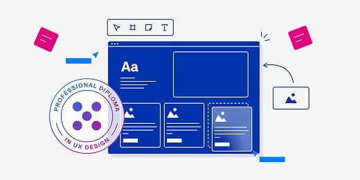
If you’d like to learn more about UX and gain practical, industry-relevant skills, consider the UX Design Institute’s Professional Diploma in UX Design.
|
Want to discover even more UX principles, concepts, and trends? Check out the following:
- The 21 laws of UX
- The top UX design trends in 2026 (and how to leverage them)
- 13 visual principles of design (with examples)

Emily is a professional writer and content strategist with an MSc in Psychology. She has 8+ years of experience in the tech industry, with a focus on UX and design thinking. A regular contributor to top design publications, she also authored a chapter in The UX Careers Handbook. Emily also holds a BA in French and German and is passionate about languages and continuous learning.