Accessibility is a major topic right now, and it’s not just a passing trend. With regulations like the European Accessibility Act (EAA) coming into force, inclusive design is now a legal requirement.
UX and UI designers are under mounting pressure to create digital products that work for everyone. For many, that means quickly getting to grips with an unfamiliar discipline and learning new skills.
At the same time, AI is reshaping many aspects of the designer’s work, including how we approach accessibility.
It feels like a lot to contend with. But actually, one of your go-to design tools is already built to support accessible design and help you leverage AI.
Yep, we’re talking about Figma. If you know where to look, it’s packed with tons of features, plugins and workflows that enable you to design inclusively by default.
In this guide, we’ll help you level up your Figma skills to become a more inclusive, accessibility-conscious designer. We’ll highlight the most relevant skills to focus on, and show you how to use AI to boost your workflow.
Designing for accessibility in the age of AI: what skills do you really need?
There are two major shifts taking place in the digital design industry right now: the rising demand for accessibility, and the growing influence of AI.
For UX and UI designers, this raises a big question: which of my existing skills still matter, and what new skills do I need to learn?
We know that AI is great at speeding things up. It can generate layouts, components and microcopy in seconds. It can even flag accessibility issues like low contrast colour pairings or missing alt text.
But what AI can’t do is think like a human.
It doesn’t understand your users, their needs and emotions, or the context around what you’re building. Nor can it account for social nuance or show cultural sensitivity. That’s where your human touch is critical, especially when it comes to accessible design.
Today’s UX and UI designers must learn how to use AI to move faster and streamline repetitive tasks, and they must also double down on the skills that machines can’t replicate. That means understanding accessibility principles, thinking critically about inclusive design patterns, and making sure that every design decision is grounded in empathy and real user needs.
And this is where the dots start to join. Accessibility and AI aren’t opposing forces. In fact, they can and should work together.
First, you need to build a strong foundation in accessible design. Then you can use AI to help scale it, creating design systems and workflows that prioritise accessibility by default.
So here’s the takeaway. The most successful designers will be skilled in using AI to accelerate their workflow, but they’ll also know when to pause and think. They’ll have the ability to leverage smart tools and features, and the knowledge to make informed, human-centred decisions.
It’s all about striking a balance, and one of the best tools to support that balance is Figma. In the next section, we’ll take a closer look at why Figma has become the go-to platform for inclusive design.
Read also: Will AI replace UX designers?
Figma is your go-to tool for inclusive design: here’s why
When it comes to building accessible digital products, Figma has become the go-to platform for most UX and UI designers.
Why? Because it’s the same versatile, user-friendly tool we’ve always known and loved, and now it’s full of additional features and capabilities that support inclusive design.
Here’s what makes Figma such a powerful tool for designing accessible, inclusive products:
- It’s built for collaboration. Figma is a space where designers, developers, UX writers and accessibility specialists can work together in real-time. This encourages and enables meaningful conversations about accessibility early in the process, rather than leaving them to the very end.
- A powerful plugin ecosystem. With tools like Stark, Able and Contrast Checker, you can bake accessibility into your Figma designs from the very start. These plugins help you check colour contrast as you go, annotate your work with accessibility notes and review designs for keyboard and screen reader navigation.
- An active community full of knowledge and resources. Figma’s user base is full of accessibility champions who have created templates, shared design systems and documented best practices for all to use.
- Real-time updates and component-based design. You only need to update a component once in Figma and every instance will follow. This makes it easy to scale accessibility across your product and maintain consistency.
Now add AI into the mix and you’ve got a truly mighty tool at your fingertips.
Figma has a whole host of AI features and third-party tools that can identify accessibility issues, automate fixes and suggest improvements. You can get real-time feedback on your designs and use smart suggestions to refine things like alt text, heading structure or touch target sizes.
You can learn more about how to make the most of Figma AI in this guide.
How to create accessible designs in Figma: the top 5 skills for UX & UI designers (plus how to leverage AI)
Designing for accessibility means creating experiences that work for everyone, including people with disabilities. Master these five skills in Figma and you’ll be well on your way to more accessible, inclusive design.
1. Auto layout and responsive design
With Figma’s Auto Layout feature, you can create designs that automatically adjust to different screen sizes and content changes. This is especially important for accessibility as it ensures content doesn’t get cut off, overlap, or become hidden on smaller screens or when users increase text size.
Let’s say you’re designing a card layout for a mobile app. With Auto Layout, you can make sure the text inside the card expands or wraps neatly, even if someone changes their font size settings or uses a smaller device. Without it, your content might overflow or disappear off screen, rendering it unreadable and therefore inaccessible.
Here’s how to get started:
- Select your frame or component in Figma
- Click “+” next to Auto Layout in the right-hand panel
- Set padding, spacing and alignment to keep content structured
Use Auto Layout in buttons, cards, modals and navbars; anywhere that content might expand or shift.
2. Advanced prototyping with accessible interactions
Figma’s prototyping tools aren’t just for showing flows. They’re also powerful for simulating accessibility features like keyboard navigation, focus order and interactive states (like hover or focus).
Why does that matter?
Well, many users rely on keyboards or assistive technology like screen readers. If your product doesn’t support proper navigation or state cues, those people will struggle to use it.
So let’s say you’re designing a modal window. Try creating a prototype that allows users to tab through the close button, form fields and action buttons in the right order. And remember to add focus states to highlight where the user is.
Tips to try:
- Use the Prototype tab to define interactions and focus flow
- Include focus rings or visible cues for keyboard users
- Set appropriate animation delays and transitions to avoid disorientation
Read also: A complete guide to prototyping.
3. Plugin-powered accessibility auditing
Another critical skill is being able to spot accessibility issues early before they reach the end user. But don’t worry: this doesn’t need to be a purely manual effort.
Figma plugins like Stark, Able and A11y Annotations can check colour contrast, suggest improvements, and help you add semantic cues like alt text or roles. Alt text ensures that images can be interpreted by screen readers, while roles tell assistive technologies how an element behaves (e.g. whether it’s a button, heading or image).
So if you’re designing a sign-up form in Figma and you’ve got the Stark plugin installed, it will alert you if your text and background colours don’t meet Web Content Accessibility Guidelines (WCAG), and it’ll automatically suggest more accessible combinations.
Try this:
- Use Stark to run a colour contrast check on your latest design
- Use A11y Annotations to add notes for developers about alt text and roles
- Try switching one of your colour choices to a WCAG-compliant option and note how it changes the overall visual hierarchy
Read also: The best Figma AI plugins for UI designers in 2025 (and how to use them).
4. Using built-in tools to test and iterate
Accessibility isn’t a one-and-done checklist. It’s something you need to keep testing and refining as your design evolves. Luckily, Figma includes several built-in features that can help you test how your design behaves for different users.
You can use the Outline view in the Layers panel to check how your content is grouped and structured. This is especially important for users navigating with screen readers.
Then you’ve got the Inspect panel which helps you verify spacing, font sizes and heading levels, ensuring your layout has a clear visual hierarchy.
If you’re working with interactions, you can also use Prototype mode to preview animations and transitions, so you can assess whether they’re too fast or disorienting for people with motion sensitivity.
Let’s say you’re designing a sign-up flow for a mobile app and you want to check how it performs for users with visual impairments or motion sensitivity. These tools can help you catch issues early and make informed design choices.
Try this:
- Open the Outline view to check the order and structure of your layers. Rename anything that isn’t clearly labelled or logically grouped.
- Use the Inspect panel to review text size, contrast and spacing. Make sure your headings and body text are clearly distinguished.
- In Prototype mode, test any animations or transitions. If they move too quickly or are overly complex, slow them down or offer a reduced motion alternative.
- Build these checks into your regular design workflow; don’t wait until the handoff stage.
5. Crafting effective prompts for AI
Last but not least, here’s a skill that will serve you both in and outside of Figma: the art of prompting.
AI tools can be powerful helpers in your design process, whether you’re generating ideas, copy or accessible elements. But to get the best results, you need to know how to ask the right questions. In other words, you need to master the art of prompt-writing (or prompt engineering).
In the context of accessible design, clear, specific prompts help AI understand your accessibility goals, like creating alt text, suggesting high-contrast colours or writing easy-to-understand microcopy.
For example, say you want AI to write alt text for the logo and hero image on your website header. A vague prompt like “write alt text” will likely yield generic results. But if you say, “write clear, concise alt text describing the logo and hero image for users with visual impairments,” you’re more likely to get useful, accessible suggestions.
Try this:
- Be specific about accessibility needs in your prompts. Mention things like contrast, font size or screen reader friendliness depending on the context.
- Ask AI to create accessible copy, like clear error messages or button labels that work well with screen readers.
- Use AI-generated alt text as a starting point, then review and tweak it to add context or personality.
- Experiment with different prompt styles to discover what yields the best results.
If you want to dive deeper into prompt engineering beyond Figma, check out this guide on how to use Midjourney in UI design, complete with prompt examples and frameworks you can follow.
With these five skills, designing accessibly and inclusively in Figma will start to become second nature. Next, we’ll look at how to incorporate these practices into your everyday workflow for maximum impact.
Tying it all together: how to build accessibility into your Figma workflow
The skills and tools we’ve covered so far each play an important role in accessible design. But the real impact comes when you combine them into a clear, repeatable process, or what’s known as an accessibility workflow.
This is essentially a well-defined ‘routine’ that helps you consistently prioritise accessibility and inclusion by default. It’s a series of key steps that weave accessibility best practices into your design process, from the first wireframe to the final designer/developer handoff.
A strong accessibility workflow will save time and, most importantly, help to ensure that accessible design scales throughout the product. Here’s how to get started.
1. Define accessible foundations upfront
Set up accessible colour palettes, typography and spacing styles using shared styles and components. This ensures consistency and saves time later.
AI tip: Use AI-powered tools or plugins to help generate accessible colour combinations and font pairings based on WCAG guidelines.
2. Design responsively and inclusively as you go
Use Auto Layout to make components adapt to different screen sizes and user settings. Organise and label layers clearly to support screen readers and keyboard navigation.
AI tip: Leverage AI to auto-generate alt text for images and create clear, user-friendly microcopy.
3. Conduct regular accessibility audits
Run plugin audits with tools like Stark or Able at key design stages to check colour contrast, focus order, alt text and other accessibility factors.
AI tip: Use AI-enabled plugins that scan your designs and suggest improvements automatically.
4. Test for assistive technology and motion preferences
Simulate keyboard navigation flows in prototypes and preview animations with motion reduction to accommodate users with motion sensitivities.
AI tip: Use AI-driven tools to help generate diverse user scenarios, including those with disabilities, for thorough testing.
5. Collaborate, document and hand off clearly
Add accessibility annotations, ARIA roles and keyboard instructions directly in your Figma files. Share your work early with developers and accessibility experts to get feedback and ensure proper implementation.
Final tips to embed accessibility in your workflow
And here are some final tips for building a robust and scalable workflow that prioritises accessibility:
- Create reusable Figma templates with built-in accessible styles and components.
- Schedule accessibility audits throughout your design process using plugins and AI tools.
- Build keyboard navigation into your prototypes from the start.
- Use Figma’s commenting and version history to track accessibility feedback.
- Collaborate closely with developers to ensure your designs translate into accessible code.
- Review all AI-generated suggestions carefully. AI is a helpful assistant, not a replacement for human judgement.
By making accessibility an integral part of your Figma workflow and leveraging AI thoughtfully, you’ll design more inclusive products and work more efficiently. Everyone’s a winner!
Final thoughts
Accessible and inclusive design is now a critical skill for every designer, and learning how to leverage tools like Figma is just the beginning. Truly inclusive design starts with an accessibility-first mindset grounded in a solid understanding of accessibility principles, real user needs and best practices that go beyond checklists.
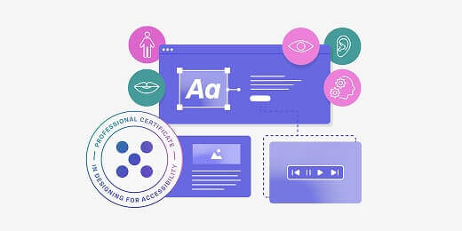
If you’re ready to level up your skills and get ahead of regulations like the European Accessibility Act (EAA), consider the UX Design Institute’s Professional Certificate in Designing for Accessibility. You’ll go beyond the basics with practical exercises and an expert-led curriculum, equipping you with both the skills and confidence to design better, more inclusive products.
|
You’ll also find plenty more guides and resources on the blog, including:
- The ultimate UX accessibility checklist that every designer needs
- Making accessibility real: practical insights from Heather Hepburn, Head of Accessibility at Skyscanner
- Accessible vs. inclusive vs. universal design: what’s the difference?

Emily is a professional writer and content strategist with an MSc in Psychology. She has 8+ years of experience in the tech industry, with a focus on UX and design thinking. A regular contributor to top design publications, she also authored a chapter in The UX Careers Handbook. Emily also holds a BA in French and German and is passionate about languages and continuous learning.