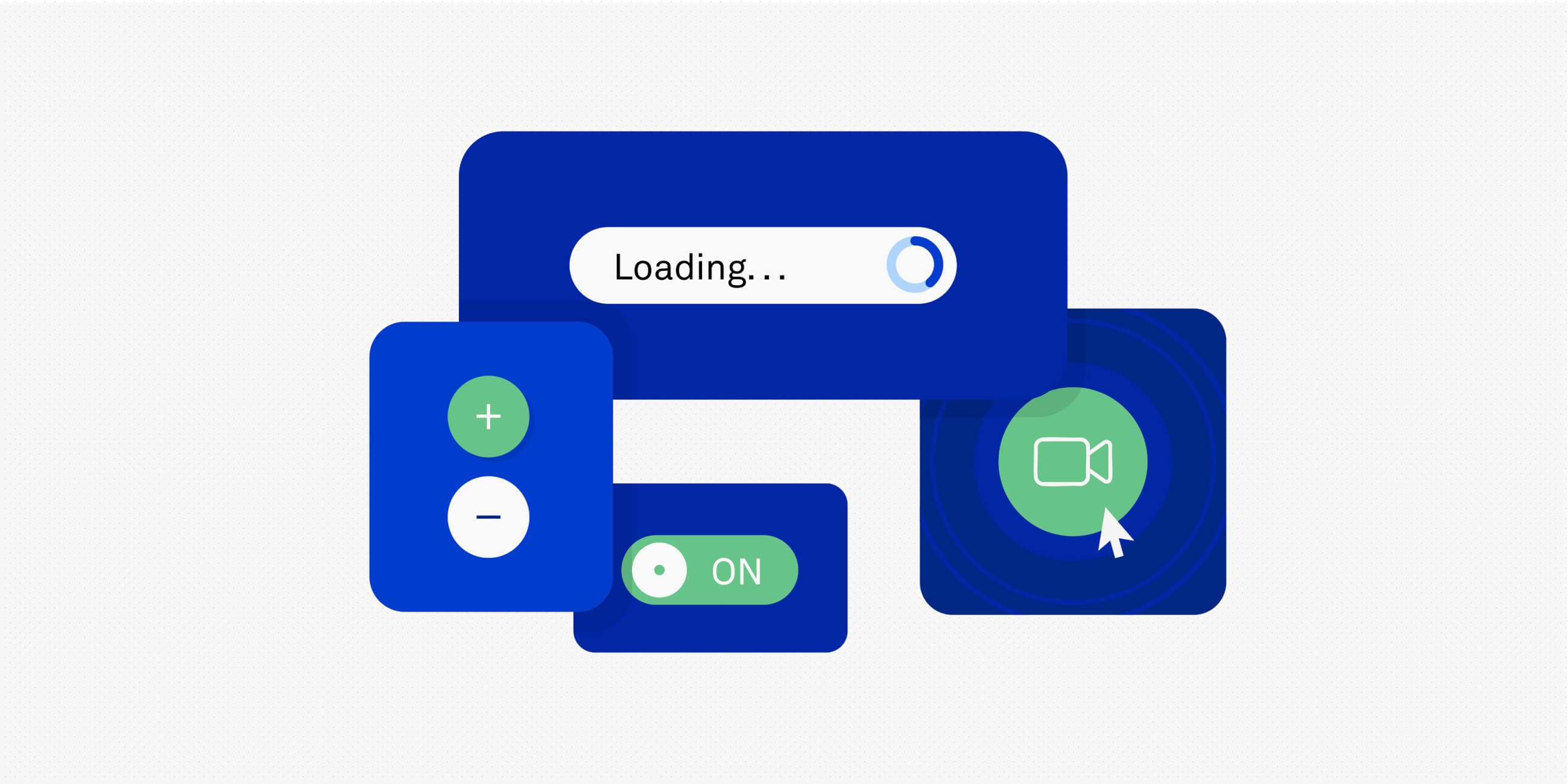
Micro-interactions, those small interactions that get you to another page on an app, say, or play an animation to tell you that you’ve completed a task, are must-haves for good UI design. That’s because micro-interactions are crucial to the user experience, letting users know a website, app, or other product is connecting to them by doing things like communicating the status of an interaction, providing error prevention, and generally keeping users engaged. Micro-interactions offer intuitive cues and set up tiny moments of delight in otherwise routine tasks.
In this post, we’ll tell you how to design micro-interactions, including the best tools to create them and how to design them with accessibility in mind. But first, let’s take a deeper dive into what exactly micro-interactions are.
There are a ton of micro-interactions, but at their core, what all these have in common is that they are small interactions between a user and a digital product that serve one specific purpose. For example, a digital alarm is triggered when the system reaches a user-set condition, such as an alarm set for 8:30am. Alternatively, pulling to refresh an email program or browser window at the bottom of the page gives visual feedback in the form of a changed state when the system refreshes.
These interactions always consist of four components: a trigger, rules, feedback, and loops and modes.
1. Trigger
The trigger is the action that starts the micro-interaction. To get users to do what they need to make the interaction work, the trigger should be visible and intuitive.
A trigger can be either:
- Explicit, or user-initiated. For example, pulling on the bottom of a page to refresh your browser or hovering over a title so it lights up or underlines.
- Implicit, or system-initiated. For instance, setting an alarm that is set to go off 30 minutes before the user has to be somewhere or displaying a notification.
2. Rules
Rules guide the way the digital product reacts to the trigger. This includes whether the system responds by doing something like serving up autocomplete suggestions or playing an animation to indicate an interaction was successful. Plus, it will take into account whether there are any constraints to the interaction, like error messages that pop up when a condition is not met. For instance, when a password is entered incorrectly.
3. Feedback
Feedback is a system telling the user about the status of the micro-interaction. Whether the action succeeds or fails, visual or auditory cues, vibrations or small movements confirm that the user’s input has been received. Colour changing when it’s hovered over with a cursor or an animation playing when you’ve correctly chosen the correct answer in a quiz are both examples.
4. Loops and modes
Loops and modes define what happens during and after the micro-interaction. A loop determines the length of the interaction and whether things repeat or change because of it. For example, a microwave may continue to ding every 30 seconds if the door isn’t opened.
Meanwhile, a mode determines the different ways the system responds based on context. For instance, your smartphone’s “airplane mode” alters the usual things your phone will do in response to your input.
To learn more about the ins and outs of micro-interactions see this article: The Impact of Microinteractions on UI Design.
How to design micro-interactions (step-by-step guide)
To design powerful micro-interactions, follow these five steps:
Step 1: Identify key user goals
A micro-interaction can serve many purposes, so you should know the various user goals you could be addressing and the expectations that these interactions create. To do this, look for points of friction where users will do things like click or tap, fill out forms, or otherwise interact with the digital product you’re designing. Make sure you understand why they are doing this. In other words, you should understand what problem their actions are trying to solve.
Step 2: Define the purpose
Once you’ve determined the key user actions in the digital product, you need to clarify what the micro-interaction should do. Micro-interactions can, for example:
- Show progress
- Give feedback
- Guide the user
- Secure confirmation, or give an error message
- Establish delight
- Teach functionality
If a user is filling out a form to get into their Instagram, for instance, they expect once they hit enter to either be taken to the app or to get an error message because they entered their password incorrectly. One way they can be sure they entered their password correctly is by seeing it, so while the password initially just shows a dot for each letter that is typed, the app gives the user the option of hitting the “Show” button to see what they’re typing.
Understanding what the user needs, sometimes before they even realise it, makes micro-interactions easy and effortless.
Step 3: Keep it simple and fast
When designing micro-interactions, don’t slow the user down. Instead aim for smooth, minimal reactions from the system. For example, when you click or tap the “subscribe” button under a YouTube video, a simple animation happens and the button changes its state. It doesn’t take a lot of time, but it makes the interaction delightful.
That’s what users are looking for. Nothing should make the user feel overwhelmed. Users should be able to complete tasks easily, with intuitive and simple interactions.
Step 4: Make it consistent
Make sure the system behaves consistently and predictably to every micro-interaction. This promotes familiarity, ensuring users know what to expect, reducing errors as a result.
For instance, when you have all your emails together in your email program on your iPhone, it doesn’t matter if the email is from Google, Yahoo, or a different program, all emails behave the same way on your smart phone. So, swiping and deleting emails works on any email no matter what service it originated on. This makes it simple to manage all of your email and ensures users will always know how an individual email will respond.
Each action, whether it involves clicking a link or filling out a form, should have a uniform pattern for how it will behave. That means, you should plan your micro-interactions with others in mind, so if one rollover of a button makes it change colours, the same should happen with the next rollover.
Step 5: Test and refine
Before anything goes live you should test it with real users. This means prototyping your micro-interactions so you have a visual representation of how they work and conducting usability tests with the prototypes so you can gather feedback. Then you can use the feedback to make improvements to your micro-interactions, ensuring each one is intuitive and effective without being distracting.
Learn more about the Certificate in AI for Prototyping here.
The best tools and resources for designing micro-interactions
There are more tools than ever available to design micro-interactions. The key is finding the right ones. This can make the difference between an interaction that’s clunky and one that’s seamless. When choosing the tools you’ll use, you should consider key features such as:
- ease of use
- prototyping
- animation capabilities
- testing
- collaboration features
Here are some of our favourites:
- Figma: Ideal for prototyping, animation and testing in one simple workflow
- Principle: Focuses on crafting smooth animations and transitions for micro-interactions
- ProtoPie: Enables advanced, high-fidelity prototypes that go far beyond basic animated effects
- LottieFiles: Lets you create and implement lightweight animations with ease
- After Effects with Bodymovin: Combines the power of Adobe After Effects with the Bodymovin plugin to produce detailed, web-optimised animations
How to design accessible micro-interactions: a quick accessibility checklist
To make sure that your micro-interactions are accessible to everyone no matter their capabilities, follow these five best practices:
1. Micro-interactions should be accessible with just a keyboard
Ensuring people who use keyboards, and not mice, can access micro-interactions means interactive elements should have visible focus states that show what is currently selected.
2. Use colour and contrast carefully
Visual cues should have high contrast and be combined with other visual cues, such as shape and labels, to make them understandable for users with colour vision deficiencies and low vision.
3. Micro-interactions should have alternate text
Screen readers should be able to access alternative text and descriptions for every micro-interaction encountered.
4. Users should be able to disable animations
Provide an option to turn off or reduce animations without losing essential feedback. To meet different user needs, the timing and duration of micro-interactions should be adjustable as well.
5. Micro-interactions should be tested with users of all abilities
Feedback from user testing with a diverse group of people can tell you whether you’re designing micro-interactions for everyone.
The takeaway and next steps
Creating micro-interactions that are seamless and intuitive, means keeping things simple, while not skimping on delight. To design micro-interactions that really work, first, identify key user goals; then, define the purpose of the micro-interaction; next, keep things simple and fast; fourth, keep things consistent; and finally, test and refine your micro-interaction.
If you’d like to get a complete education in micro-interactions and everything else in UI design, take the UX Design Institute’s Professional Certificate in UI Design. It will teach you the principles, techniques, and craft of designing high-quality user interfaces.
Or if you’re not quite ready to take the plunge, check out further UI guides on our blog including: How to design intuitive user interfaces and Your ultimate guide to form design


