If you want to skip straight to the checklist, just use the clickable menu to jump ahead. Otherwise, let’s first consider why accessibility is now more urgent than ever.
Why does accessibility matter?
Accessibility is about designing products and services that everybody can use. Without accessible design, you’re missing a fundamental aspect of human-centred design and that’s problematic for ethical, legal and commercial reasons.
Here’s why accessibility matters:
Accessible design = a more inclusive world
Above all else, accessibility matters because it creates a more inclusive world for everybody.
When you prioritise accessibility, you’re automatically prioritising the user experience. That’s because accessible design is synonymous with good design, often resulting in cleaner interfaces, clearer language and better navigation.
You’re not only creating exceptional products and services that your users will love. You’re removing barriers and creating a digital world that everybody can access and enjoy. Accessible design is, quite simply, the right thing to do.
Accessibility is a legal imperative
In many countries, businesses are required by law to meet certain accessibility standards.
One such law is the European Accessibility Act (EAA) which passed an important deadline in June 2025. From now on, all new products and services launched within the European Union must comply with the Act. Existing products and services have an additional five years to meet accessibility standards.
Even if you’re not affected by the European Accessibility Act and similar laws, it’s important to be aware that, under such regulations, accessibility will soon become the norm, something consumers expect.
If you fail to keep up with industry standards and consumer expectations, you risk falling behind your more accessible, inclusive competitors. You may also be excluded from certain markets.
Learn more: What is the European Accessibility Act (EAA) and what does it mean for the UX industry?
Ignoring accessibility is bad for business
While accessible design is synonymous with good design, inaccessible design is synonymous with bad business.
According to the World Health Organization, 1 in 6 people live with a disability. That’s over 1.3 billion people worldwide.
Now consider the fact that, globally, people with disabilities control $1.9 trillion in disposable income.
When you ignore accessibility, you not only risk losing out to more inclusive competitors. You’re also actively choosing to exclude a huge segment of the population, people who will spend their money elsewhere.
That’s bad for your reputation and your bottom line.
So why does accessibility matter? Three big reasons:
- Ethically, it’s the right thing to do
- Legally, it’s an imperative in many countries
- Commercially, it’s good for business
Ultimately, if you want to design user-friendly, inclusive and competitive products, you have to care about accessibility.
Learn more: What is accessible design? (And why it matters)
The four main types of impairments and disabilities
When considering accessible design, it’s important to understand the different types of disabilities that can affect how people interact with digital products.
There are four main categories of impairments and disabilities:
Physical disabilities
Physical disabilities affect a person’s mobility, dexterity, or motor control. They can be permanent, like paralysis or limb loss, or temporary, like a broken arm. Physical disabilities can impact how someone uses a mouse, keyboard or touchscreen.
For example, a person with limited hand mobility might struggle to tap small buttons on a mobile app. As a designer, you can make the experience more accessible by ensuring large, well-spaced touch targets and full keyboard usability.
Sensory disabilities
This includes visual and auditory impairments, ranging from low vision and colour blindness to complete blindness or deafness.
A user with vision loss might rely on a screen reader to interact with a website, for example. In that case, an accessible experience would include considerations such as alt text for images and semantic HTML.
Developmental disabilities
Developmental disabilities affect cognitive functions such as memory, comprehension, problem-solving and attention. They include conditions like dyslexia, Cerebral Palsy, autism spectrum disorders and learning disabilities.
For example, a user with dyslexia might find dense blocks of text difficult to read. Design choices such as using plain language, clear headings and plenty of white space would all support a more accessible experience.
Behavioural disabilities
This includes anxiety disorders, depression, PTSD and other mental health conditions that may affect how users respond to digital interfaces.
Users with anxiety might feel overwhelmed by sudden pop-ups or auto-playing media, for example. To create a more inclusive experience, designers can strive to keep interactions predictable, give users control over animations and avoid unnecessary interruptions.
Once you start to consider the diverse ways in which people experience digital products, you can begin to design more thoughtfully and be more intentional about removing barriers.
The POUR principles of accessibility
Understanding the different types of disabilities is a crucial first step, but how do you translate that awareness into practical design decisions?
This is where the POUR principles come in. They were developed as part of the Web Content Accessibility Guidelines (WCAG) and they offer a framework to help you think more systematically about accessibility.
POUR stands for Perceivable, Operable, Understandable and Robust, four key qualities that make digital experiences more inclusive and accessible for everyone.
Here’s a breakdown of what each principle means:
- Perceivable: Can users perceive or take in the content, regardless of their sensory abilities?
- Operable: Can users operate (i.e. navigate or interact with) the interface using a range of input methods?
- Understandable: Is the interface and content clear, consistent and easy to follow?
- Robust: Will the design work well across browsers, devices and assistive technologies?
The POUR principles encourage you to ask the right questions and make inclusive design decisions and our accessibility checklist will help you put these principles into action.
|
UX design accessibility checklist (the essentials for designers)
To help you get started with accessible design, we’ve put together a practical checklist you can follow throughout the UX process.
Note that this is not an all-encompassing guide and ticking off all the items on the list doesn’t mean you’ve “completed” accessible design. Use it as a starting point, a set of key areas to focus on and a springboard for further learning and testing.
Use high colour contrast between text and background
Make sure all text is easy to read against the background. Aim for at least WCAG AA contrast levels (use WebAIM’s contrast checker to test your colour combinations).
Don’t rely on colour alone to communicate meaning
Not everyone perceives colours the same way (or at all). So, if you’re using colour to communicate something to the user, like red for an error, or green for success, make sure you also include text, icons, or patterns.
If you’re designing a form, for example, you might highlight input errors by turning the form field border red. However, users with colour blindness wouldn’t be able to perceive that. Adding an error message and a warning icon next to the field helps everyone understand that something’s missing or incorrect.
Add meaningful alt text to images and icons
Alt text describes images for users who rely on screen readers, or when images don’t load. Add alt text to all images and icons and make sure the text explains the purpose of the image, not just what it looks like.
For example, for a shopping cart icon, use alt text like “View your shopping cart,” not just “shopping cart.”
Write in clear, simple language
Use plain language and short sentences to make content easy to read and understand for everyone, including people with cognitive disabilities or those reading in a second language.
If you’re designing a job portal, for example, “Start your application” is more straightforward and user-friendly than “Commence the application process.”
For people who can’t use a mouse, it’s critical that they can interact with the interface using just a keyboard or other assistive devices. Make sure all buttons, links and form fields can be used as such.
Show a visible focus state
When users are navigating by keyboard, they need a clear visual indicator to show which element is currently selected or active. Otherwise, they’ll quickly get lost and struggle to complete their desired tasks.
A simple solution is to add an outline or highlight around buttons and links when focused (i.e. selected or active).
Use the same menus, buttons and page layouts across your site or app to avoid confusing users. Consistency helps everyone, especially those with cognitive disabilities, predict what will happen next.
For example, place the main navigation in the same spot on every page.
Label forms clearly with helpful instructions
Every form field should have a clear label explaining what to enter, plus any additional instructions if needed. This helps screen reader users and reduces errors for everyone.
For example, label a field “Email address” and add “We’ll never share your email” as supporting text.
Avoid time limits (or let users control them)
Time limits can be extremely stressful for some users and can even make completing certain tasks impossible. So if your website or app logs users out or moves on after a set time, give users a way to extend the time or pause the countdown.
For example, you might add a “Keep me logged in” option or include a prompt that asks users if they need more time.
Add captions to videos
Captions show dialogue and important sounds in text form, helping people who are deaf or hard of hearing or those watching without sound. Captions also improve comprehension for many users.
If the user experience features video tutorials or webinars, for example, make sure you always include synchronised captions.
Use proper HTML structure
Use headings, lists, buttons and other elements correctly so assistive technologies can interpret your content properly. This improves navigation for screen reader users.
For example, use <h1> for main titles and <button> for clickable actions, not just styled <div>s.
Test your designs with just a screen reader and keyboard
Many people will interact with your product using just a screen reader and keyboard, so it’s essential to test how the experience feels solely from that angle.
Use popular screen readers (like NVDA or VoiceOver) and your keyboard to navigate the product and identify barriers. For example, check that all interactive elements are reachable and understandable.
Manual testing helps to catch issues that automated tools might miss, so don’t skip this step.
Learn more: The ultimate guide to usability testing for UX.
Avoid flashing or blinking content
Rapid flashing or blinking can trigger seizures or cause discomfort. If you must use animations, keep them subtle and give users a way to disable them.
Provide clear feedback and helpful error messages
When users make mistakes or complete actions, give immediate, clear and actionable feedback. Avoid vague messages like “Error occurred” and actually tell the user what’s gone wrong.
For example, say “Please enter a valid email address” and highlight the problem field.
Make sure touch targets are big enough
Small buttons and links can be hard to tap, especially on mobile devices or for users with motor impairments. Aim for at least 44×44 pixels for touch targets, add padding around buttons and keep links well spaced out.
Let users zoom or resize text without breaking the layout
Some users need larger text to read comfortably. Your design should remain usable and readable when users zoom in or increase font size.
Use responsive grids and flexible layouts to keep content from overlapping, getting cut off or requiring horizontal scrolling when zoomed.
And remember: accessibility is an ongoing practice, not a checklist
Use this checklist to guide you as you make product decisions and view it as a starting point for more accessible, inclusive design.
And remember that, while this checklist is a great foundation, true accessibility goes beyond ticking boxes. It’s both a mindset and a skillset, and it requires a long-term commitment, not just from designers, but from all key stakeholders involved in the customer experience.
If you want to grow as an accessible designer, it’s worth investing in proper training and continuing to build your knowledge. That means learning how to collaborate with disabled users, staying up to date with accessibility standards, using the right tools and integrating accessibility into your everyday design practice.
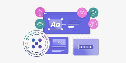
For structured, industry-relevant training, check out the UX Design Institute’s Professional Certificate in Designing for Accessibility. You’ll learn how to research, test and design with accessibility in mind, ensuring full compliance with global accessibility standards.
The takeaway and next steps
If you want to design user-friendly products that are competitive, legally compliant and enjoyable for all users, accessibility must become an integral part of your design process.
Start with our essential accessibility checklist to get into the habit of making thoughtful design decisions. At the same time, make sure you stay up-to-date with accessibility requirements in your country and general best practices within the industry.
For more expert tips and insights, check out the following:
- Making accessibility real: practical insights from Skyscanner’s Head of Accessibility, Heather Hepburn
- Accessible vs. inclusive vs. universal design: what’s the difference?
- The biggest UX design trends shaping the industry right now (and how to navigate them)

Emily is a professional writer and content strategist with an MSc in Psychology. She has 8+ years of experience in the tech industry, with a focus on UX and design thinking. A regular contributor to top design publications, she also authored a chapter in The UX Careers Handbook. Emily also holds a BA in French and German and is passionate about languages and continuous learning.