
 1")
There’s a lot to remember if you’re going to create a successful design as a UI designer. Which is why we’ve compiled this list of visual principles of design. Sometimes having these foundational elements separated out so you can understand them individually can make all the difference.
Here, we introduce you to thirteen visual principles of design, including what they mean, why they matter, and how to use them. Let’s get started!
What are visual principles of design and why do they matter?
Visual principles of design are the fundamental building blocks of all you do as a UI designer. They matter because they ensure your user interfaces are usable and enjoyable. Whether it’s making sure to achieve hierarchy or contrast or choosing the best colours for your project, all of these things should be considered while you’re designing.
While you probably won’t examine them each individually like we do in this article, instead dealing with the design as a whole, they all play an important role. And you should know about each of them so you know how to place elements on a website or app. In particular, they help shape user experience, making your project more usable and more understandable through their use of these visual principles.
The 13 visual principles of design (with examples)
1. Colour
Colour in UI design is used to convey emotions, add variety, and include visual interest. It’s also used to differentiate one website from another. Colour is extremely psychologically important and colour theory heavily influences our understanding of the use of various colors.
For example, if you haven’t seen a stop light before you may be surprised to learn that green means go and red means stop. This is learned behaviour, but it becomes so ingrained that we can use red and green in other contexts to convey stop and go too. For example, see the use of the color red in the example under #3 Contrast below. That example wouldn’t work if red didn’t mean stop to those of us familiar with red lights.
2. Typography
Typography isn’t the content of your text but how that text looks. It’s the way the text is arranged on the page including fonts used, spacing and size, and the way different text, like header and body copy, relate to one another. Different typefaces convey different things and while you can usually stick to the classics, some things that are especially zany or original might call for different typefaces.
For example, on the page dedicated to Lilo & Stitch on the app Disney+ there’s a lot going on, but because only the Disney logo and the Lilo & Stitch title are in odd fonts, it works. The Lilo & Stitch font in particular, is a bit strange but, because it’s bigger than everything else and works perfectly for the movie it’s attached to, it doesn’t raise eyebrows.
 2")
3. Contrast
Contrast is all about making elements of your design stand out, whether it’s through color, size, or additional aspects. Contrast is a great way to emphasise different elements of your design.
For example, using red for a button for an action that can’t be undone is a great way to make sure that button stands out and evokes caution, such as in the world clocks app below. The app has a red-button next to each city when you’re in edit mode. Hit it and that city is gone.
 3")
Contrast is an important aspect of accessibility, as a lack of contrast can make the details of your design difficult to see. In particular, text may not be able to be read for people with visual impairments, so make sure your contrast is sufficient.
4. Balance
The design elements you lay out on a page create balance because each element has a weight to it, whether soft and fleeting or heavy and eye-catching.
This balance can be symmetrical or asymmetrical. When you use design elements that each carry equal weight, such as equal squares across a page, you’ve created a symmetrical design. This kind of design makes people feel tranquil and serene. When you use design elements that carry different weights, such as squares of different sizes, you’ve created an asymmetrical design. This kind of design makes people feel tense or edgy.
For example, TranscriptionPuppy opts for a symmetrical layout describing their transcription process and why you should choose them.
 4")
On the other hand, the razor company Harry’s opts for an asymmetrical layout on their home page with an image of their razors.
 5")
5. Emphasis
Emphasis stresses whether an element stands out on the page. Parts of a design can either be important and, therefore, emphasised, or unimportant and, therefore, deemphasised. Different levels of emphasis will either increase or decrease the impact of certain pieces of information through color, contrast, scale, positioning, and more.
For example, on Fly.io homepage below they emphasise the headline in big, bold type followed by a more in depth description. But you’ll probably look at the purple “Deploy in 5 minutes” button before the in depth description because of its bright purple color.
 6")
6. Visual Hierarchy
Another principle that goes with emphasis is visual hierarchy. Visual hierarchy dictates that content that is more important should appear more important. So different levels of emphasis should go together to create the order in which people take in the information on a website or app. This can be seen in headings, subheadings, and body text on pages.
For example, notice the hierarchy amongst the various pieces of text in the below website, with “Book your escape today” bigger and bolder than the welcome message, and the welcome message bigger than the body copy below it.
 7")
7. Repetition
Repetition means repeating something in a design, such as the same colors, shapes, design element, typeface, or other element. It can bring unity to a design and can reinforce ideas when needed. In UI design this can be especially important as designers place the logo of the business and the menu items in the same place on every page.
For example, on this page you’ll see the logo for the UX Design Institute in the top left of the page followed by a series of menu items. If you go to another page on the site, these will remain in the same place even if the content in the body of the page is completely different. Articles on the UX Design Institute blog are also good examples as the headings create a repeated pattern that can be identified by readers as meaningful.
8. Rhythm
Related to repetition is the visual principle of rhythm. The spacing between repetitive elements create a sense of rhythm, just like musicians create rhythm in the gaps between notes. There are five types of basic visual rhythm: random, regular, alternating, flowing, and progressive.
A random rhythm has no regular interval, such as pebbles on a sidewalk. A regular rhythm has consistent regular space between each element that can be created with a grid. An alternating rhythm follows a set pattern of variations between elements, such as the checkerboard pattern on a chess board. A flowing rhythm has repeated elements that follow bends or curves, such as the way waves of the ocean flow. A progressive rhythm changes as it goes along. For instance, if we have a page full of squares but each subsequent row is slightly larger, this is an example of progressive rhythm.
In the screen below from Spotify each row has a regular rhythm to it that gives equal weight to each element in the pattern.
 8")
9. White Space
White space, also called negative space, is the space around your design elements. In effect, it’s blank. But blank doesn’t mean bad. In fact, both the positive space of your design and the negative space of the white space around it, called figure/ground, work together to create the complete design. The white space helps the design have the space to breathe and makes design elements easier to see and understand.
The clothing brand Museum of Peace & Quiet exemplifies the use of white space. A big hero image of someone wearing one of their sweatshirts is on the right but on the left, the place where most users will expect content, is blank until the final three lines on the page. As a result, the Museum of Peace & Quiet’s home page lives up to its name.
 9")
10. Unity
Unity is all about creating a visual and conceptual sense of a harmony. Design elements should have a relationship to one another and unity helps ensure that they work together effectively. Good unity guarantees messages are being relayed in a clear, coherent manner and that they are of high authority. For example, Ethan Allen’s home page showcases everything in neutral colors with the exception of the green 25% off box that’s right in the middle, but even that isn’t a showy color. The whole has a calming visual and conceptual unity.
 10")
11. Scale
Scale is about using the size of an element to signal its importance in relation to other elements in a design. The reason for this is simple: the bigger the element, the more likely it is to be noticed and, therefore, deemed important. Having a range of sizes also creates variety within your design.
For example, on the Target home page below you can tell what’s most important and what’s less important by the size of the boxes each element of the website occupies.
 11")
12. Pattern
Patterns are the same elements being repeated in a design. This can be seen in wallpaper and floor tiles for instance. In UI design, however, it can also refer to the pattern for how various elements are designed. For example, top navigation or sending a text to a friend are both design patterns that most users have experienced.
13. Alignment
Alignment is the way different elements are arranged on a page. UI designers typically use a grid to organize everything, making sure that elements are grouped and arranged in a balanced, structured pattern. Even if the page has chaotic design elements, you must do so purposefully, using a grid to create order from the chaos.
For example, in any newspaper or magazine online, things will be neatly aligned in columns and rows. Take the New York Times movie reviews below. Every entry has a heading and body copy that is left aligned, followed by an image from the film.
 12")
Further reading
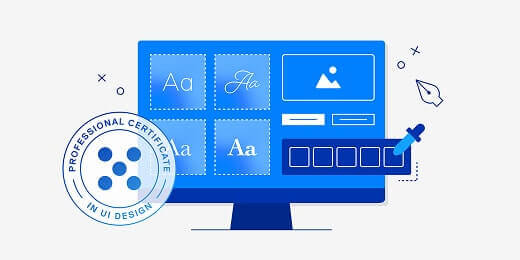
If you’d like to learn more about UI design, including the visual principles of design, take UX Design Institute’s Professional Certificate in UI Design. It will teach you everything you need to know to launch a career as a UI designer.
And if you want to read more from the blog, check out these posts:
How to design intuitive user interfaces,
What are the Gestalt principles and how do designers use them?, and
7 fundamental UX principles all designers should know


 design principles all designers should know in 2026 15")