Examples of UX are everywhere — not just in the apps and websites we use, but all around us in the physical world too. UX applies to anything that people can experience, from shops and restaurants to healthcare services and tangible products, just to name just a few.
Anything that has been designed for people has the potential to provide a good or bad user experience. To show you how UX exists beyond the digital world, we’ve gathered 6 everyday UX examples, both good and bad.
1) The Oral-B iO electric toothbrush: Mostly good UX with one design flaw
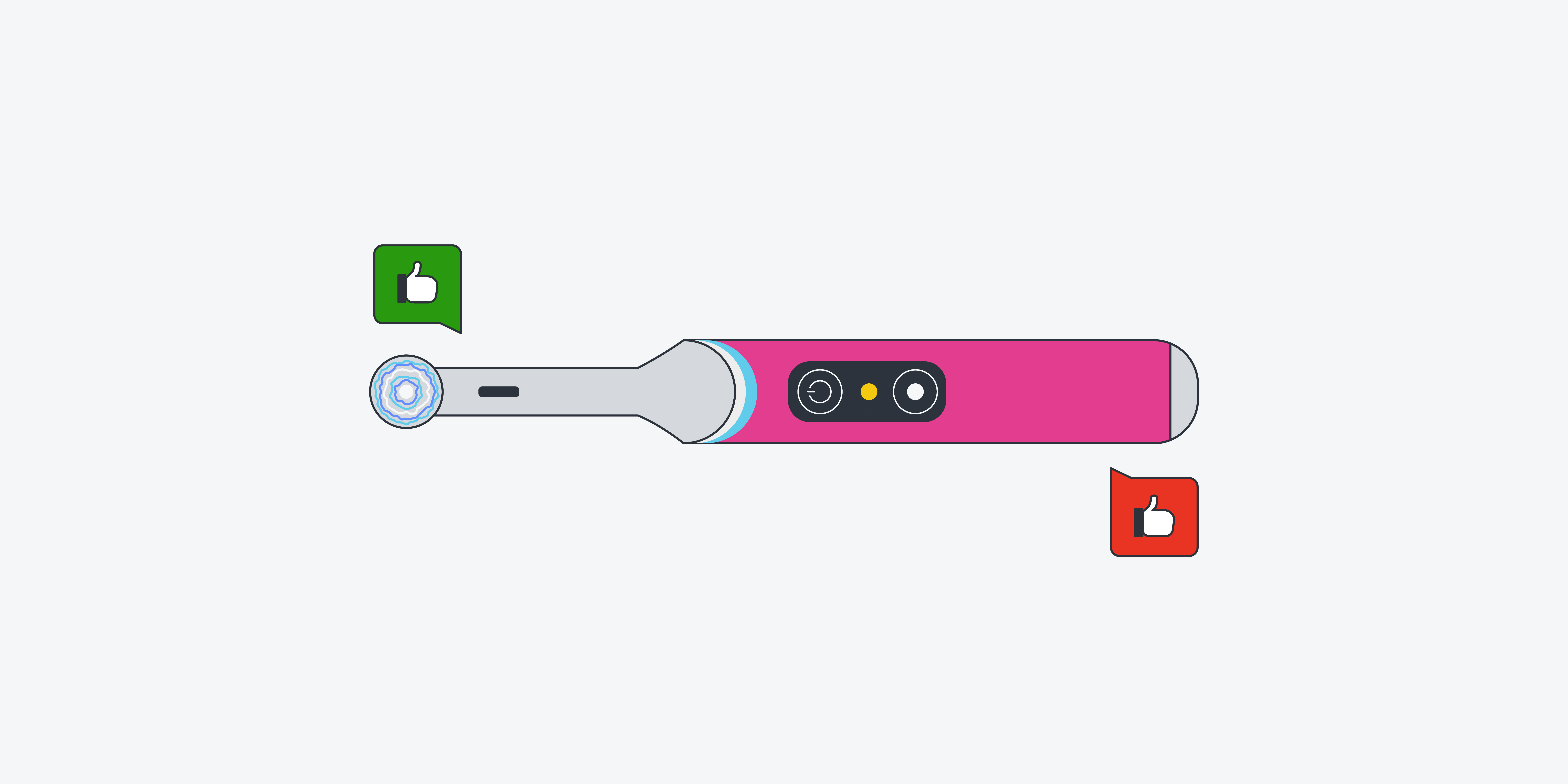
There’s lots to love about the Oral-B iO electric toothbrush. The design of the toothbrush itself is sleek and elegant and it delivers that “dentist clean feeling” the advert promises. Then there are all the different cleaning modes which you can switch between at the touch of a button and the smart pressure sensors that light up in different colours if you’re brushing too hard or too soft.
So far, so good in terms of the user experience. But there’s one major design flaw: the precarious charger.
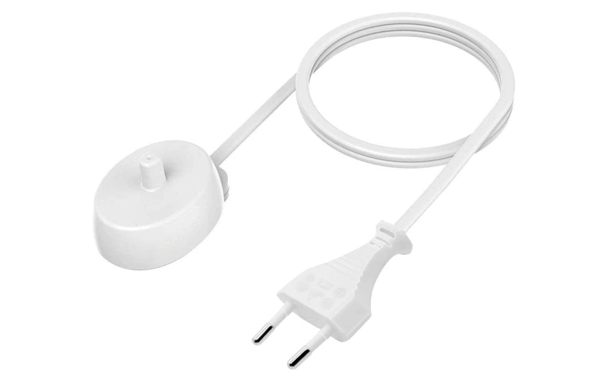
Where other electric toothbrush chargers have a sort of prong in the middle to keep the toothbrush securely in place, this one is an almost-flat magnetic charger. Accidentally knock the toothbrush even slightly and it falls right over (into the sink, if you’re lucky, and onto the floor… or worse).
An example of where more rigorous UX testing would have come in handy!
2) Concert venues: How UX can make or break the experience
When you buy tickets to a concert, you don’t only hope for an amazing audio experience. You also expect to be able to see the artists in all their glory. So imagine your disappointment when you locate your spot for the evening, only to find that your view of the stage is partially blocked by a huge pillar.
Or, perhaps you have an awesome view but the acoustics are terrible. As you listen to your favourite musician play at this poorly-designed venue, you wish you’d stayed at home and continued to enjoy them through your own much more satisfactory sound system.
On the flip side, how amazing is it when all the design aspects of the venue are on point? You probably won’t even notice them; you’ll just be absorbed by the spectacular experience you’re having. That’s the thing about UX: when it’s bad, it sticks out like a sore thumb. When it’s good, you won’t notice it.
The overall design of a venue can make or break the entire concert experience. Next time you have tickets for an event, pay attention to how the overall experience has been designed and see if you can spot examples of good and bad UX.
3) Inaccessible bathrooms for wheelchair users: UX gone horribly wrong
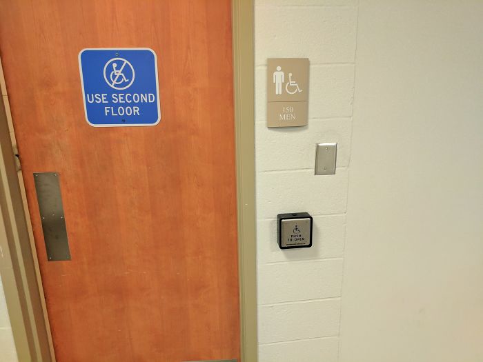
This has got to be one of the worst examples of UX gone horribly wrong: inaccessible bathrooms for wheelchair users. Unbelievably, there are cases of so-called accessible bathrooms being placed at the top of a flight of steps, rendering them entirely inaccessible to the people they’ve supposedly been designed for, or located on floors that aren’t accessible via lift or elevator.
Search the internet for accessible design fails and, unfortunately, you’ll find far too many real-world examples. From ridiculously steep wheelchair ramps to “accessible” pathways that would be fine if you didn’t have to mount a step to get to them, the world is full of ill-thought-out design choices.
These not even half-hearted attempts at inclusive and accessible design are, quite frankly, offensive, and serve as an important reminder of the responsibility that UX designers have in making the world a better place.
To learn more about accessible UX, read a breakdown of our live event with Deque.
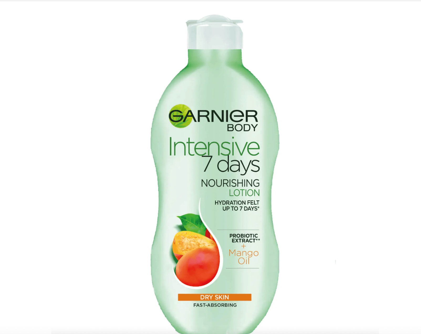
4) Body lotion bottles: Good vs. bad UX
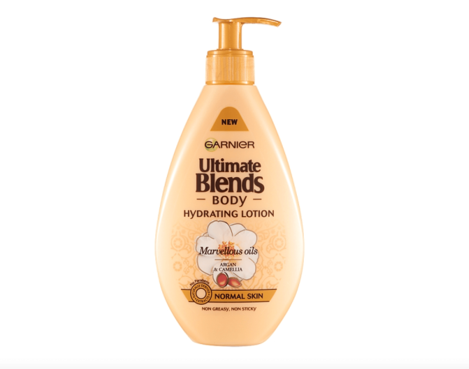
Another everyday example of UX that you’ll encounter everywhere is bottle and packaging design. Pump bottles for body lotion are convenient, until you start reaching the end of the bottle and can’t get the last bits of cream out.
You know the scenario. You’re pressing the pump and nothing’s coming out, yet you know there’s plenty of lotion left in the bottle. You end up unscrewing the lid, shaking the bottle upside down to get the remains out or scraping the rest of the cream out with the pump.
Compare this user experience to that of the squeezy lotion bottles with the narrower opening at the top. You can easily squeeze out every last drop, and the smaller opening stops you from getting too much out at once. Much better.
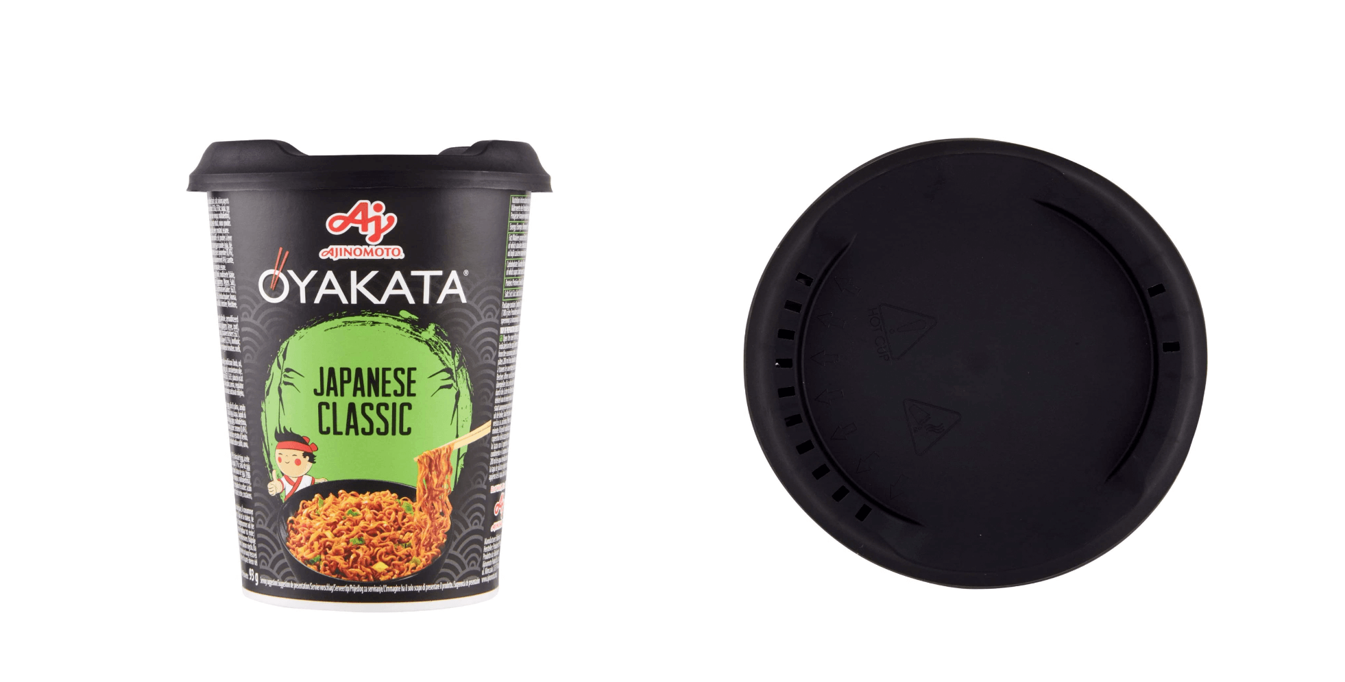
5) OYAKATA instant noodles: Excellent UX for ultimate convenience
If you’re eating instant noodles, it’s clear that you’re after a quick, convenient and low-effort dining experience. And it doesn’t get more user-friendly than the OYAKATA instant Japanese noodles.
The packaging is one of the best examples of good UX when it comes to a ready-made meal. You literally open the lid, pour boiling water into the pot, replace the lid for a few minutes, then turn the pot upside down to drain the water through the conveniently-placed holes in the lid — no sieve or other utensils needed. It’s genius!
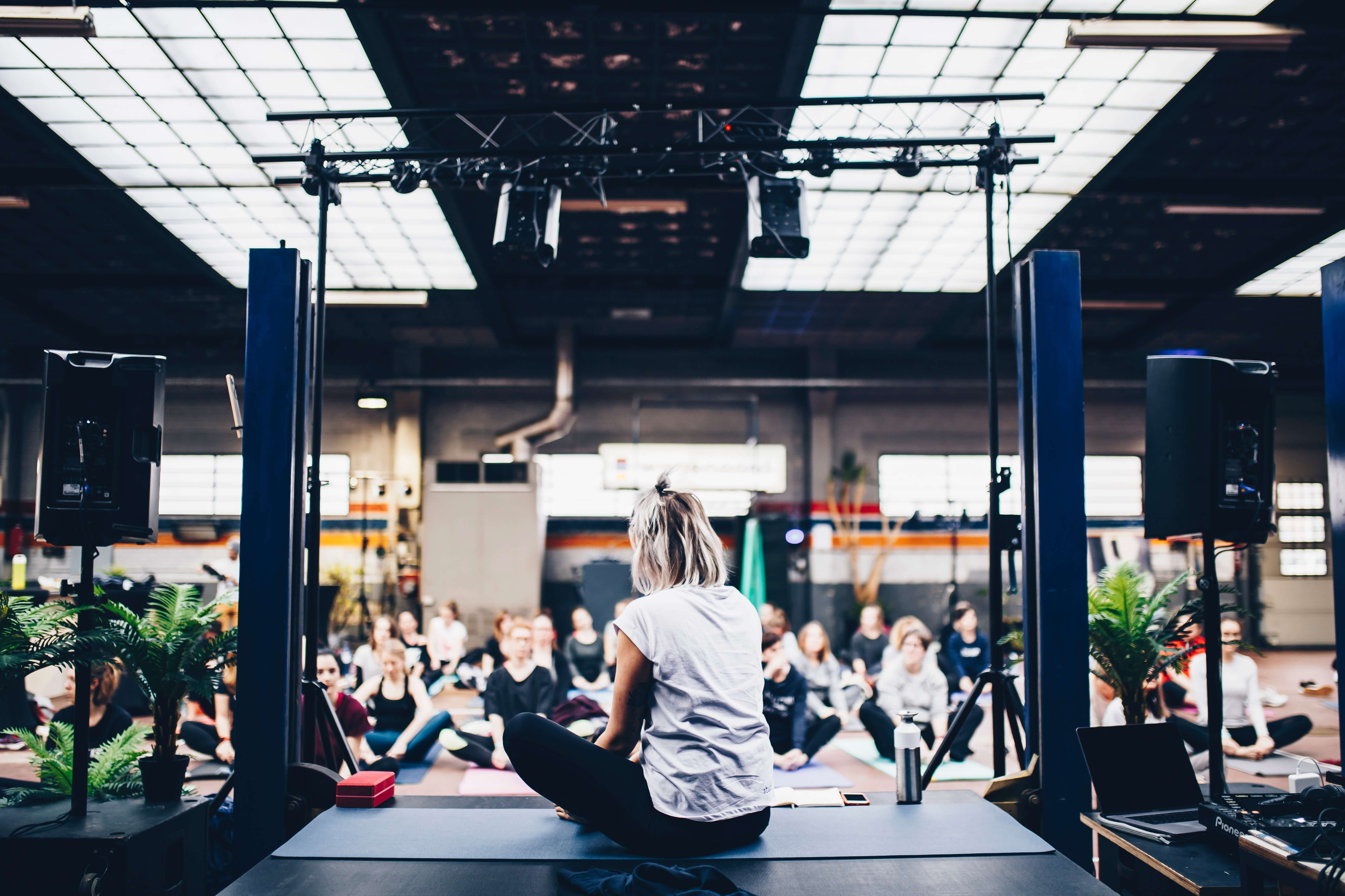
6) The studio at the gym: An unfortunate design detail
Much like badly designed concert venues, this is yet another example of how UX applies to the physical spaces all around us. Studios are often where live class are held but in many cases, the space has not been designed for people to partake in the class and watch the instructor at once.
Why? Because a concrete column from ceiling to floor is place in the middle of the room. Or the instructor’s space can only be viewed from the space directly in front of them.
So, if you attend a class and don’t get there early enough to secure a good spot, you might find yourself stuck at the back of the room behind this giant pillar, unable to see the instructor at all. Or standing too far right or left of the instructor, unable to see what moves you are meant to be copying.
Classes aren’t pre-bookable, either, so they often get overly full — another flaw in the user experience.
While the pillar is a necessary part of the building’s infrastructure, the location of the instructor should be carefully decided so that everybody who has signed up for the class has the same experience.
Those are just a handful of everyday UX examples found in the world around us. You can learn more about good vs. bad UX in this guide. If you’re more interested in UI, check out these 9 real-world examples of what good UI design looks like instead.

