As a UX designer, one (major) aspect of your role is to make the end users happy. The second (also major) aspect is to provide value to the business.
But how do you connect the two? And, perhaps most importantly, how do you demonstrate—in concrete terms—that all your good UX work has a direct impact on the company’s success?
The answer lies in UX KPIs.
KPIs (or key performance indicators) allow you to measure and track certain aspects of the user experience. This gives you hard data to work with, providing great insight into the overall health of your product’s UX and connecting that to wider business goals.
If UX design KPIs are unfamiliar territory, you’ve come to the right place. In this beginner-friendly guide, we explain:
- What are KPIs?
- What are UX design KPIs?
- Behavioural vs. attitudinal KPIs: What’s the difference?
- Why do we need KPIs in UX design?
- How to use KPIs to improve the user experience (and meet business goals)
And, in a follow-up article, we identify the most important UX KPIs you should be tracking (and show you how to do so). But for now, let’s start from the beginning…
What are KPIs?
KPI stands for ‘key performance indicator’. In business, KPIs provide an objective, quantifiable measure of progress towards a particular goal.
For example, a popular KPI for email marketers is open rate—how many recipients actually open the email. Sales professionals might track KPIs such as conversion rate (what percentage of leads actually turn into sales?) and cost per lead (how much money does it cost the company to generate leads?)
Through regularly measuring KPIs, you can see if you’re on target to achieve your overall objectives by a certain point in time—or if you need to change course. As the name suggests, they give you an indication of your performance so far, allowing you to either keep going or rethink your strategy for success.
What are UX design KPIs?
UX design KPIs translate subjective user experiences into objective data. They help to capture, in numbers, how quickly and easily the overall design allows the user to complete their desired tasks, as well as how enjoyable the experience is.
Some examples of UX design KPIs include:
- User error rate: The user error rate measures how many mistakes a user makes when completing a certain task. For example, if they are filling out a sign-up form, they might enter their date of birth incorrectly. If they’re looking for a specific piece of information, they might accidentally navigate to the wrong page. This KPI gives you insight into how user-friendly your design is, and helps you to identify pain-points.
- Task success rate: This measures the percentage of users who are able to successfully complete a particular task. For example, you might deem the task of signing up to be completed once the user hits ‘submit’ on their registration form. Measuring task success rate allows you to gauge the usability of your designs.
- Time-on-task: The time-on-task KPI measures how long it takes users to complete a given task. Usually, a shorter time-on-task indicates efficiency—enabled by high usability. If it takes users longer than expected to complete a task, there may be some usability issues that need fixing.
As you can see, UX KPIs hone in on certain aspects of the user experience to provide insight into the overall usability of the product and how it makes the user feel. Those are just a few examples—we outline all the most important UX KPIs (and how to measure them) in this guide.
Behavioural vs. attitudinal KPIs: What’s the difference?
When measuring UX design KPIs, it’s important to distinguish between behavioural KPIs and attitudinal KPIs.
Behavioural UX KPIs measure what the users actually do and how they behave. For example, if you were looking at the KPI ‘time-on-task’, you’d be measuring how long it takes users to complete a certain action. This would be based on them actually performing the task.
Attitudinal UX KPIs, on the other hand, track what users say and how they report feeling either during or after an interaction with your product. An example of an attitudinal KPI for UX might be net promoter score (NPS) which asks the user to say, on a scale from 0 to 10, how likely they would be to recommend the product to a friend.
It’s a bit like user research data which can be gathered either through observing the user’s actions directly or asking them to talk about an experience and how it made them feel.
Why do we need KPIs in UX design?
UX design is a balancing act between business and user needs. The goal is to create useful, enjoyable experiences for the end user while also meeting certain business objectives. Without KPIs, it can be difficult not only to evaluate the user experience on an ongoing basis, but also to directly link the UX team’s work to the achievement of business goals.
Ultimately, measuring UX-related KPIs has benefits for the end user, the business, and the UX design team themselves. Measuring KPIs in UX helps you to:
- Get stakeholder buy-in and secure the budget you need
- Quantify and demonstrate the value you bring to the organisation
- Keep a health check on your product’s UX
- Improve your UX strategy
- Achieve UX maturity in your organisation
Let’s explore these benefits in more detail.
KPIs help UX designers to get stakeholder buy-in (and budget)
As a UX designer, you know the value of UX design. But, without concrete, objective data, it can be difficult to get buy-in from decision-makers or secure the budget you need to move forward with UX initiatives. Tracking KPIs and showing how your UX work ties in with specific business goals should make it easier to demonstrate the value of UX and put forward a strong case for your needs as a team.
They allow you to quantify the value you bring to the organisation
In addition to getting stakeholder buy-in, being able to tie your UX work to measurable value is important for your own career. If you can show, through KPIs, that you’ve contributed to an overall improvement in the user experience—and therefore to the achievement of business goals—you can advocate for yourself in performance reviews and job interviews alike.
KPIs enable you to keep a health check on your product’s UX
If you keep track of certain KPIs on a regular basis, you’ll get ongoing insight into how your product is performing. You’ll spot problem areas and pain-points quickly, allowing you to make improvements continuously and reactively. This is much better for the overall ‘health’ of your product’s UX compared to, say, waiting til the end of the year to conduct a major UX audit.
Tracking KPIs will improve your UX strategy
Ongoing performance measurement doesn’t only allow you to promptly address issues. It also gives you an overview of your UX progress over time, which in turn helps you to evaluate the effectiveness of your overarching UX strategy. You can look back over the last six or twelve months and assess whether or not things are moving in the right strategic direction. You can learn more about UX strategy (and how to define one) in this guide.
KPIs are a key step towards UX maturity
UX maturity describes how committed an organisation is to UX design. Companies with higher levels of UX maturity tend to allocate sufficient resources to UX initiatives, use data to drive design decisions, and are generally prone to putting the customer/end user first. The more ‘mature’ a company is in their adoption of UX, the better equipped they are to provide excellent user experiences (and reap the business benefits). Starting to identify, track, and act upon design KPIs and data will move you closer to the higher echelons of UX maturity—which is good news for you, your team, your end users, and the business.
How to use KPIs for better UX
We now know what KPIs are and why they’re so important for UX design. So where do you begin? Here’s how to get started with tracking KPIs for better UX.
1. Identify the most meaningful UX KPIs for your product
There are lots of KPIs you could use to measure and track UX, but not all of them will tell a meaningful story about your product. Before you decide which UX metrics to track, think first and foremost about how you are defining a good user experience.
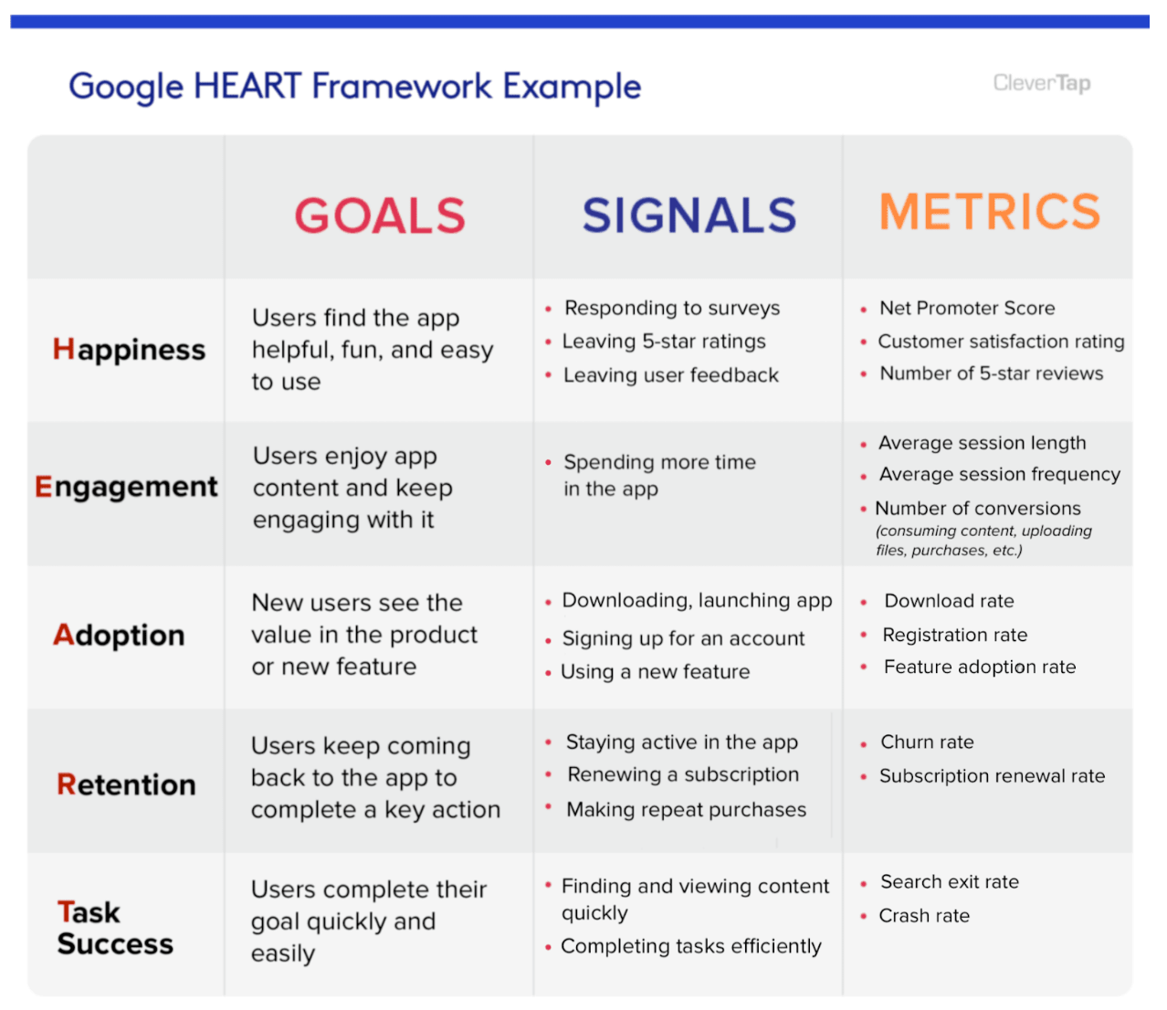
To do this, we recommend using Google’s HEART framework.
HEART stands for different aspects of the user experience you might want to measure: Happiness, Engagement, Adoption, Retention, and Task success. Choose which of these elements are most important for your product and then define the KPIs you’ll measure accordingly.
For example, if it’s important that users are able to complete certain tasks quickly, you might focus on the ‘task success’ pillar, tracking KPIs such as time-on-task and user error rate. If the goal of your product is to keep users engaged—for example, an educational app where you want to encourage users to spend at least 15 minutes a day learning via the app—you might focus on the ‘engagement’ pillar, tracking KPIs such as average session length and session frequency.
Source: CleverTap
2. Tie your UX KPIs to business KPIs
Once you’ve determined which UX KPIs you’ll track, connect them to specific business goals.
For example, if you’re measuring user engagement with KPIs such as average session length and session frequency, what does this mean for the business? Perhaps it can directly be related to the customer lifetime value (CLV).
If you’re looking at task success with KPIs such as time-on-task and user error rate, you could equate this to an increase in revenue (through, for example, more successful purchases made possible through good UX).
You may need to collaborate with other teams to understand what business KPIs they’re tracking and how your UX metrics contribute.
3. Always consider the wider context (and remain human-centric)
As you become more data-driven, keep in mind that KPIs alone will rarely tell you the full story. It’s important to consider the context surrounding each KPI and do any necessary digging to uncover the whole picture.
You may look at the KPI ‘task success rate’ and see that an impressive 84% of users were able to complete the given task successfully. However, this doesn’t automatically mean that all of these users had a positive user experience in the process.
Maybe your customer satisfaction rating is miserably low, pointing to an issue that your task success rate KPI isn’t highlighting. This should prompt you to conduct further research and testing—perhaps with a focus on interviews to hear users’ thoughts and feelings about the task in question.
The goal is to use data and KPIs to guide you while bearing in mind that humans are complicated. Don’t necessarily take each individual KPI at face value, and certainly don’t shy away from further investigation.
Using KPIs for better UX: The takeaway
In our increasingly data-driven world, tracking the right KPIs will allow you to refine your UX strategy and gain deeper, ongoing insight into how your end users interact with—and enjoy—your product. And, as a designer, a data-driven approach makes it possible to quantify the value you bring to the business.
As long as you remain human-centric and don’t rely solely on KPIs to drive your design decisions, you can use them as one of many tools to help you achieve better UX.
Want to learn more about creating awesome user experiences? Discover how to use storytelling in UX design or read about how to leverage AI for better UX.


