UX writing is the unique art and skill of crafting concise, compelling microcopy that enhances the user experience. It guides the user through a product, helping them to navigate from A to B and complete their desired tasks. UX writing can even provide a few words of encouragement or motivation at crucial touch points.
Are you looking for UX writing inspiration? Then look no further than this post. There are some outstanding UX writing examples out there—and we’ve rounded them up to inspire and delight you.
Here’s what you’ll find in this post:
Let’s get started!
What is UX writing?
UX writing is the process of crafting the copy a user sees or hears when they use a digital product. These brief pieces of text are known as microcopy, which means they’re precise and specific. There is no need for a lot of words; the copy is designed to help the user interact with the interface as efficiently as possible. This includes buttons, menus, error messages, and more.
The main objective of UX writing is to concisely convey what the interface offers and to guide the user as they interact with a product—all while making sure the messaging corresponds to the brand image. If the UX writer does their job well, the user will be able to easily navigate the product and, as a result, have a positive association with the brand.
What are the fundamental principles of good UX writing?
While UX writing may be brief by design, that doesn’t mean it’s easy. Writing microcopy involves finding the right balance of being clear and concise while still finding a way to incorporate a hint of personality. Plus: it all has to work seamlessly with the user experience design of the product itself.
Here are the eight key principles of good UX writing:
- Be concise: Convey messages as concisely as possible. There shouldn’t be any extra words that make it more complex to read and understand.
- Avoid jargon: Your UX writing shouldn’t contain any jargon or technical wording. Make sure your writing is free of anything that could confuse users. Instead, use plain language that makes the objectives at each part of the interface clear.
- Use the active voice: Using the active voice helps the UX writer be clear and direct. You’ll be more apt to engage the user by effectively writing in the active voice.
- Write with simplicity: Always write with simplicity, not complex sentences that require the user to stop and think. Make it easy for the user to understand where they are and what they need to do in the interface.
- Prioritise conversational language: Grammar is important, but sometimes grammatical rules can be broken. Be conversational instead of precisely correct.
- Use the right voice and tone: Get the voice of your company’s personality right and adopt the tone that is most appropriate for them, such as casual, funny, or matter-of-fact.
- Don’t blame the user: Sometimes users make mistakes. Rather than blaming them for it, helpfully explain what they can do to correct it.
- Write for inclusivity and accessibility: Write inclusive and accessible content for every part of the product. Everyone should be able to understand how pressing a button or accessing a menu item may impact them, whether they’re accessing the interface via reading, via a screen reader, or some other way.
Learn more: 7 UX writing guidelines to optimise your content.
10 UX writing examples to inspire you
Here are 10 examples of exceptional UX writing.
Lemonade
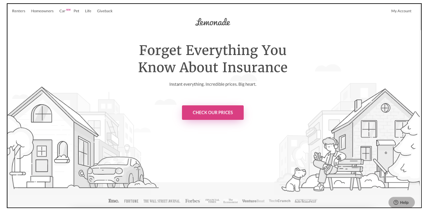
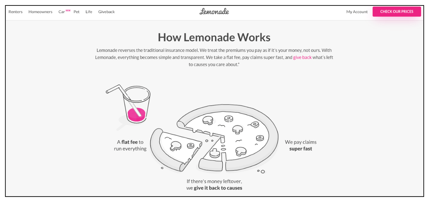
Lemonade is not your parents’ insurance company. Instead, it does things a little differently. It treats the money you pay into the insurance as yours, so you can get your claims paid quickly. On the homepage of the website, it concisely tells you that Lemonade is different.
Then further down the page it shows you how things work. Using the pizza as a metaphor, it shows you the way they run things, and that they give back to causes if there’s any money left from your premiums. It’s a simple and concise way of getting the user to come around to Lemonade’s way of thinking.
Merriam-Webster
Source: UX Writing Hub
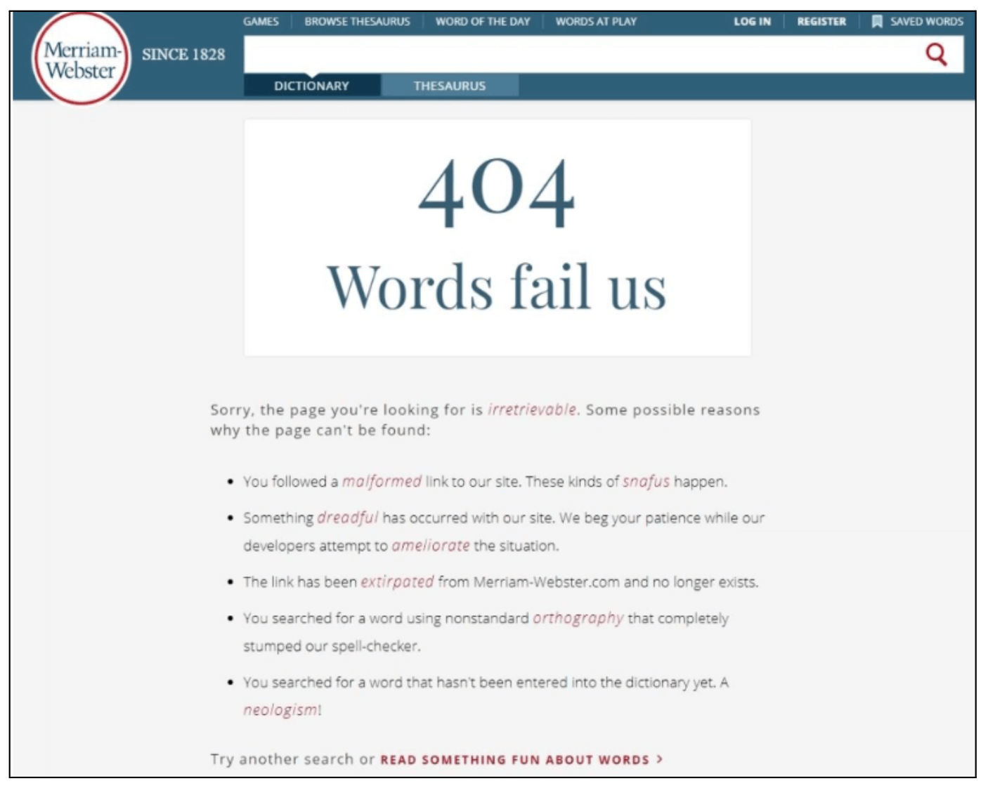
While you don’t want your users to run into a 404 page too often, if they do, it should be relevant to your product or business. Merriam-Webster nails this with a classic example of a 404 page that does what they do best: define words. While most 404 pages don’t require too many words, people won’t mind the fact that this one does because everything on there is relevant to both the company and the situation.
Dollar Shave Club
Source: Dollar Shave Club
Dollar Shave Club doesn’t overdo it with the brand speak. It just layers it in very lightly, but it’s still unmistakable. By adding the “baby” to the end of this headline on the home page and then asking users to “check it out,” they get across their brand personality but don’t sacrifice clarity to do it.
Medium
Source: UX Writing Hub
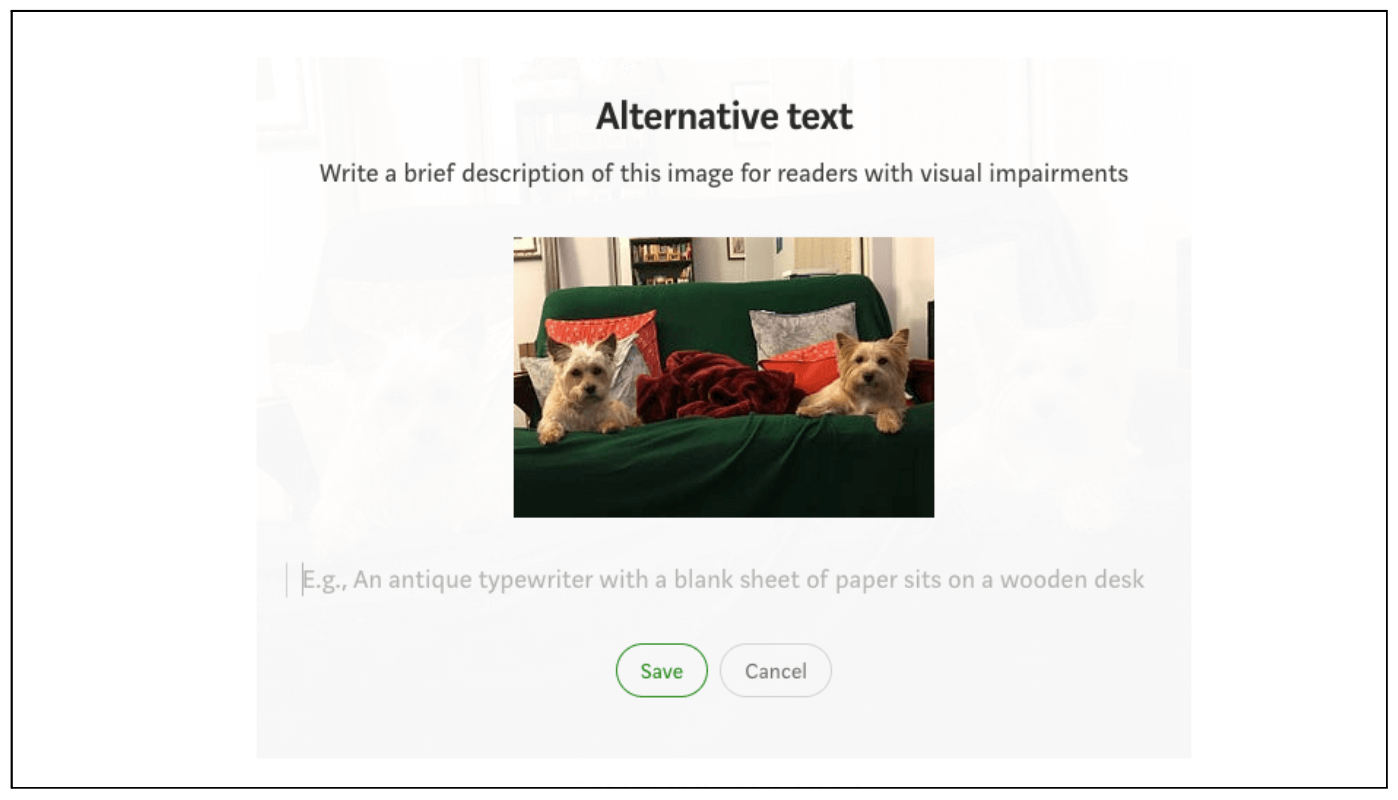
Medium does a great job of explaining why you need alternative texts with your images, and even gives an example of one so the user understands even better. This is an example of briefly but fully explaining alt text so writers actually do it.
Route
Source: Route app
The route app has a very simple page on which to choose either sign up or sign in. It couldn’t be any easier to tap one and go, but the other thing the sign up-page does is introduce you to the app. It has three panels, all of which describe, in concise language, what you can do with the app, so you know what you’re getting into before you’ve signed up. It doesn’t take away from choosing sign up or sign in and it elegantly fills in any blanks you may have.
Typeform
Source: Log in | Typeform
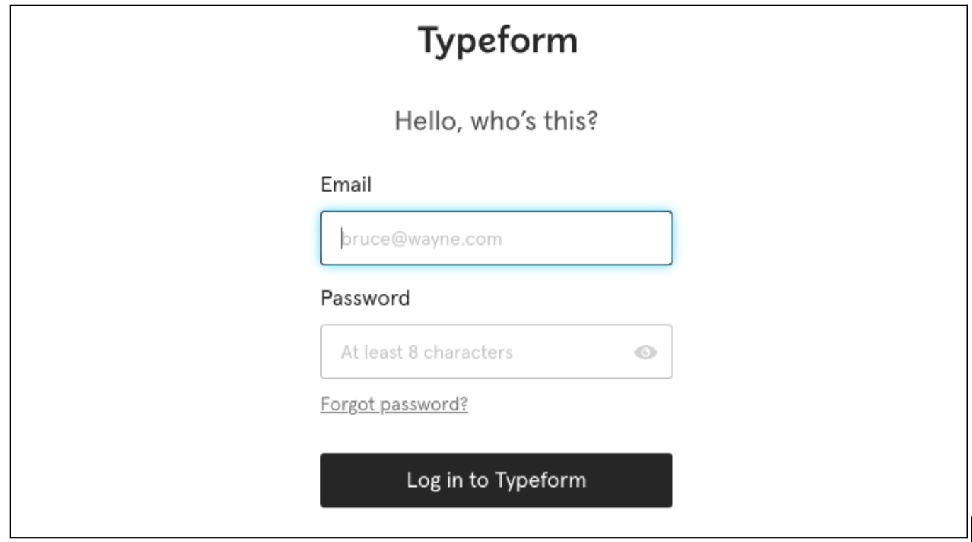
Typeform is intended to help you make better forms and surveys—but that doesn’t mean there’s no room for humour. The phrase “Hello, who’s this?” has that covered. People will read it and enjoy the gentle humour of the form.
And for those in the know, it pumps up the humour a notch with the email address for Bruce Wayne. If you’re not a fan of Batman, you’ll just see it as just another example of an email address, but if you know who Bruce Wayne is, you’ll get an extra laugh.
Duolingo
Source: Duolingo app
This message could be generic and formal, but the UX writer has chosen to take a conversational tone. By keeping things human and conversational from the headline “Wait, don’t go!” people are more likely to read on to see the rest of the message and may even take it to heart when they do.
Netflix
Source: Netflix
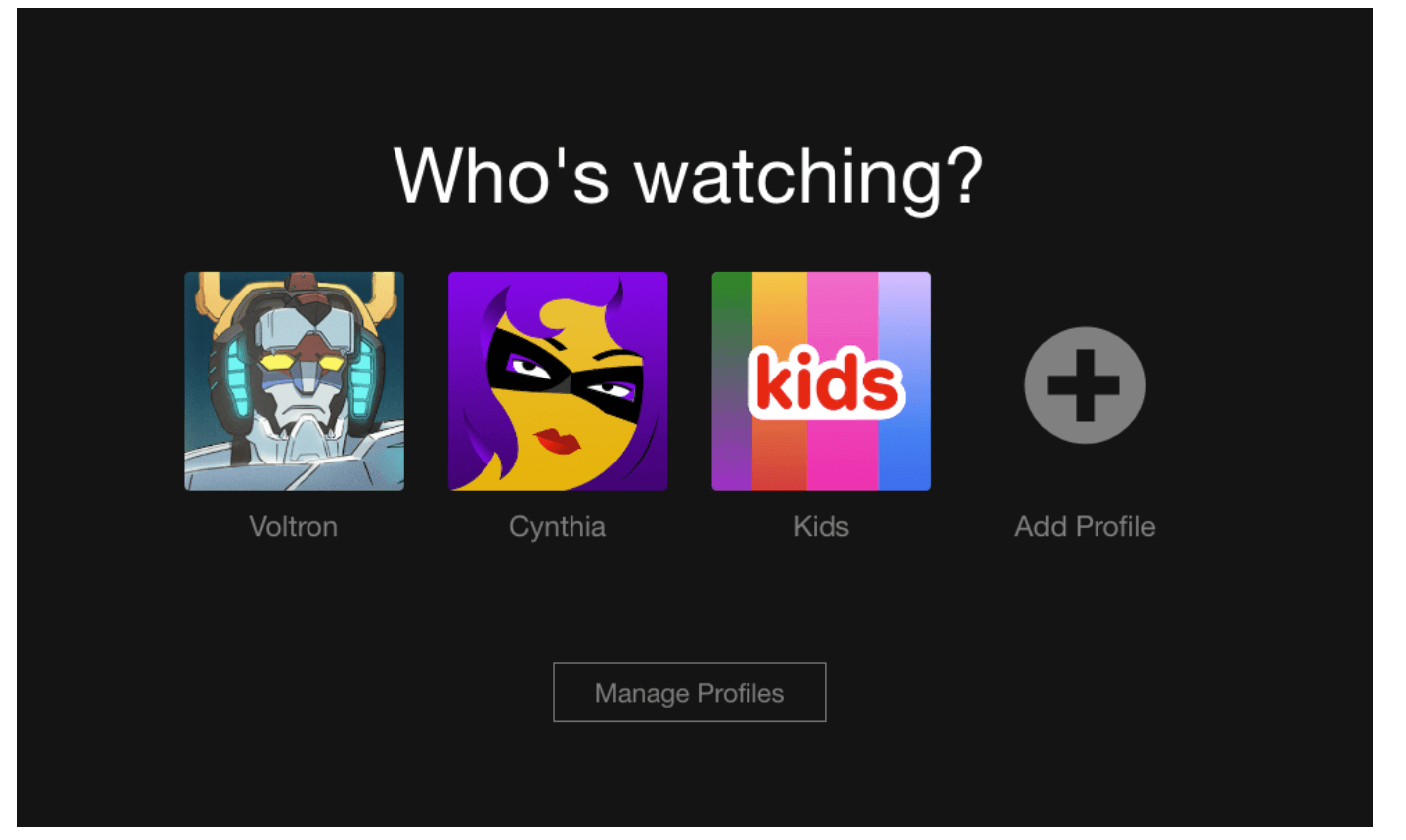
UX writers tend to tell users exactly what to do, such as “Pick one” or “Start here,” but sometimes a question works better. Netflix is the first streaming app to do this, and all the others have followed their lead. This is a better solution than saying something like “Pick a profile.”
Bumble
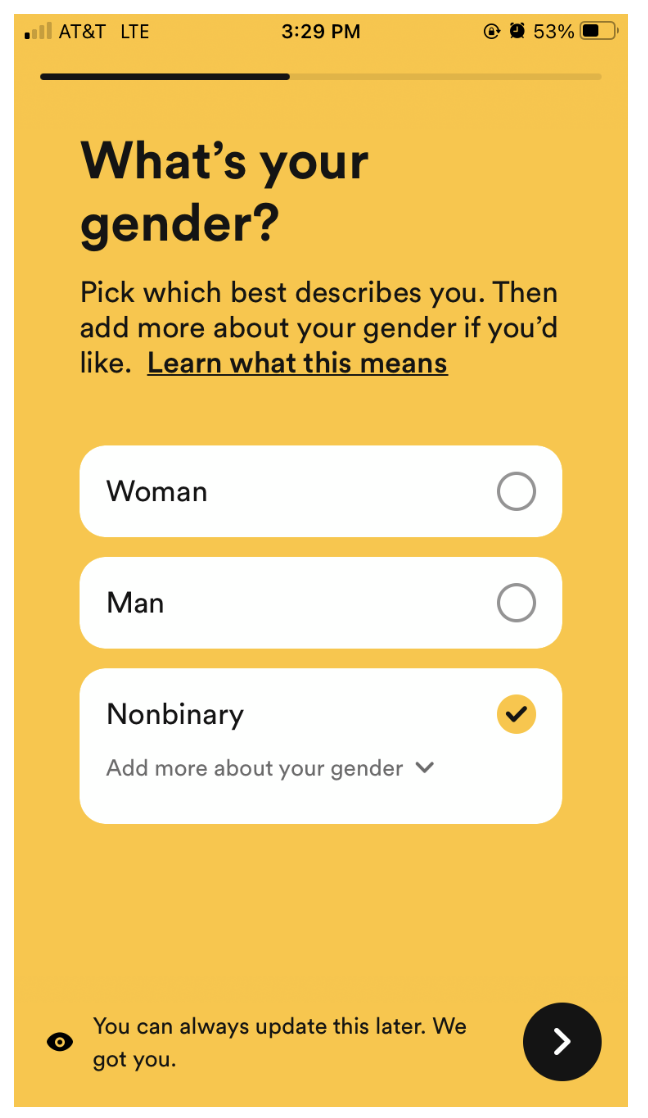
The Bumble dating app provides a great example of inclusive UX writing, providing the user with three gender options, as well as the option to add more detail if they wish. Whether you select woman, man, or nonbinary, there’s a lengthy list of additional, more specific genders to choose from, plus an opportunity to tell the app if it’s missing something.
Wufoo
Source: Wufoo
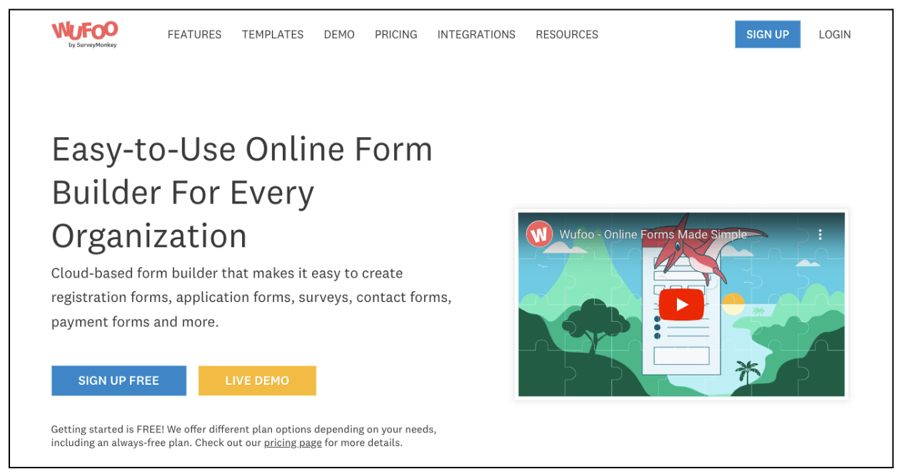
This website uses a light and breezy way of getting information across, but it doesn’t go big on humour. That is, except in the login, which shows a “Rawrr!” if you roll over it with your mouse. It’s a subtle touch, but it’s delightful and you surely know about it if you’ve logged into the website.
How to improve your UX writing
The goal of UX writing is to provide copy that can take the user through the interface in a clear and concise way. To do this, you have to master the brand voice and tone, avoid jargon, and never, ever blame the user.
You can put the principles and tips from this article into practice to improve your UX writing skills. You can also take the UX Design Institute’s Professional Certificate in Content Design to really level up your UX writing skills—and get a credible, professional qualification to show for it.


